the new colored icons are good, but some hard strong colors. And other don’t have any color.
Zebus is a few shy, so I want to ask… Could be something like this?
I don’t follow the thread about this icons. So I don’t know if this was discard for some reason, but my thoughs
- Red is actually excesive saturated. With a few less saturation the result is similar but also a pleasure for the eyes
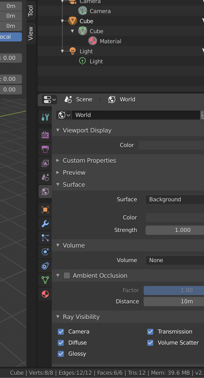
- World is not only a material, it have render parameters in cycles. I doesn’t have reason to be red. Also with this change we can make better the tabs for the eyes.
The purple and blue tool icons are secondary, but the red and world are the real question.