Hello everyone.
I apologize for your disturb.
As I understood, in that topic Blender users discuss about icons for Blender 2.8 UI.
I actively use Blender, so I also want to make a proposal for improving UI.
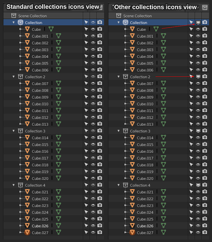
As You see on screenshot, when in Blender scene present many objects and collections, and all collections opened, then very difficult to see where is the icon of collection for turn off it for hide the collection (ctrl+h the hotkey)(left side of the screenshot).
If You want, You can create the similar collection hierarchy in Blender scene (like on the screenshot) and see the difficult perception Yourself.
I want to suggest to change the collection hide icon (icon with eye) on other, (right side of the screenshot).
This icon may be have another view, did not right like on screenshot. This may be any (thematic) noticeable icon.
I very hope that the developers read my message. That is be very cool.
P. S. English is not my native language, but I hope that You understood meaning that I wrote here. And I hope that my sentence has an meaning…
