The N-Panel is a marvelous tool, but the way it’s designed is not optimal. People live and die by their Blender Addons, and the way the N-Panel exists now, it makes it counter intuitive to work with and is a big detractor --not in the thought behind it, but the way that it’s executed.
Writing the tabs vertically instead of Horizontally is my first issue. If you have a lot of Addons, it makes it nearly impossible to find what you are looking for because the names get truncated if there are a lot of tabs.
The next thing that is counter intuitive, is that there’s no way to Pop out the panel if you work with it intensely. It needs to have it’s own window.
You also need to be able to organize it so that it works for you. Arbitrarily listing the tabs in order of installation is… well… stupid. There’s no other way to say it. You can’t re-arrange the tabs without turning off the plugins and re-enabling them in the order you want them. You also can’t group together Addons by function.
I created a Mockup of what I think would be a better way to implement the N-Panel which allows the user to organize their Addons and alleviate the clutter of the way it is now.
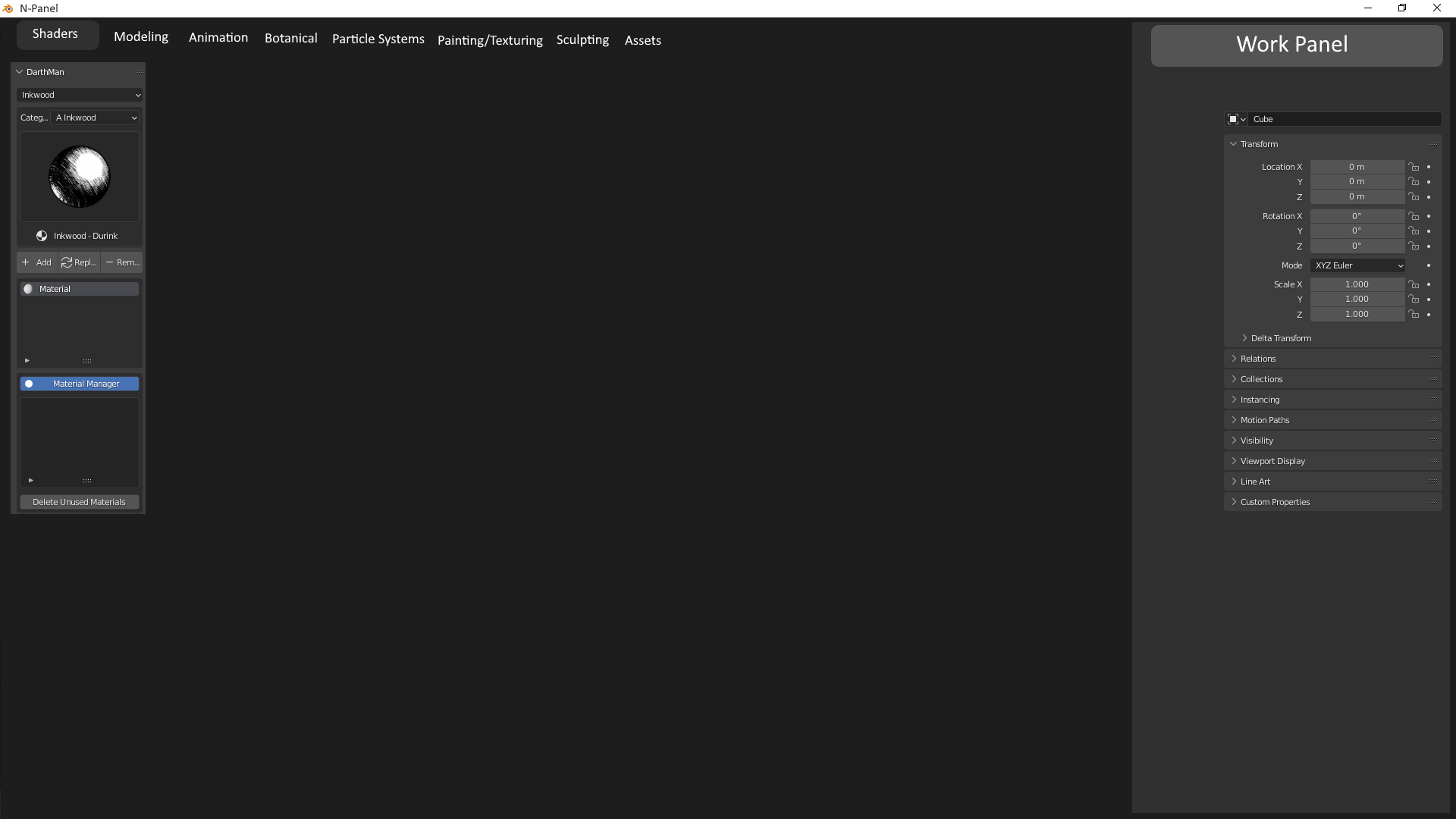
You basically set it up in it’s own window where the user can create tabs and organize their tools the way that best works for them, rather than an arbitrary way that it is now. In addition, you add the associated functions on the work area so that the user doesn’t have to leave the N-Panel in order to make changes. This way you can organize and work the way that suits you best.