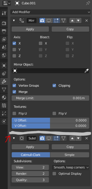
I love the new UI in 2.8. It’s very clean and modern. But I noticed that some part of the UI are to blended with each other thus making its hard to see its section such as Modifiers. Whenever I want to to adjust some modifier value, I have to look very carefully as I need to really ‘find the modifier’ which needed to be adjusted.
May I suggest that we have a bar or a header indicator for each modifier? This is to make it easier to detect the modifier which needed to be adjusted with a bunch of other modifiers.
The whole UI for modifiers needs an overhaul. It’s difficult to re-order them, the order of execution is not clear, we can’t add sub-panels here etc.
One of the reasons nothing has been done in this area, is because the modifiers system may be done differently using modifier nodes, potentially making the current modifiers UI obsolete anyway.
Yes, I know about that addon. After 2.80, I think we should look at doing this, if we cannot implement a fully node-based modifier and constraints stack in the short term