Miltos, I had the same negative experience with the hidden “Lock Camera to View” - checkbox as you when I started using Blender. And even when you know the button, its a lot of clicking back and forth. When I want to edit the camera, I have to do a click to select the camera and then another one to open the camera parameters tab. That is something I really don’t understand - why arent all relevant camera parameters not displayed automatically as soon as I select the camera? And why can't the camera parameters be displayed side by side with its transform parameters automatically? The same thing with lights - I want to change the strength of a light, I have to click once to select it and then once more to open the parameters tab of the light. Then I have to click once more to get to the transformation data of the light, which is in another tab. Why is this not synced? Why doesn`t the parameter window display the information in a more context-sensitive way?
agree that ‘Lock Camera to View’ creates unnecessary cognitive load to understand whether it’ll keep the camera still (lock is generally associated with preventing movement), or move it around.
“Camera follows view”
renaming that way would avoid this problem.
wow a year and a half later and it’s still an issue?
truly it’s the first time I actually care to google a solution to it,
the thing is if with twenty years experience editing photo video et all I can’t figure out how to lock down the camera , It’s not for me.I swear every time premiere or ae or whatever crashed or got stuck I’d revisit Blender and promptly go back to what I found intuitive and similar to other softs.
The only reason I can now give it some time is because like with google I really don’t want to feed shitty executives their coke habits, but like google its hard to extricate yourself from the ecosystem if you lack tools at the same level. I’m not going to deny I’ve thought about switching to coding every time a client complained about timeframes because adobe. but don’t got the brains for it, I tried following WWDC learn to code with swift game, two minutes later my eyes where so glossy I looked emballmed =) anyways, wake me up when the camera it’s easy or at least logical to use =)
This shows a fundamental flaw I’ve been noticing for quite a while, which is a misuse of sidebar.
Sidebar is in general known to host 2 main types of panels: Tool settings, and user addons. It mostly hosts things that are related to modifying the scene displayed in the viewport, not modifying the viewport display mode itself. All the things that modify the display mode itself, such as background, grid, etc… ale located in a set of popovers here:
![]()
The confusion comes from the very random decision to have ALL but one sets of viewport settings in the popovers, and then have one specific set, which is related to viewport display present in the sidebar instead:
The view rollout contains the set of settings which are in the same category of as most of the settings in those popovers above. These settings do not modify the contents of scene, unlike pretty much everything else in the sidebar, they just modify how the scene gets displayed.
The solution to this is very simple:
Completely remove the view tab from the sidebar, and move its contents into another new popover button (which would have something like small camera icon) and place that button next to other popover buttons in the same category of how is the scene displayed.
Then, move 3D cursor section of the View panel in the tool panel.
(Please avoid nonsense comments such as “But the 3D cursor is not really related to tool settings”. If per workspace addons rollout, something which could not be further away from what the tool is supposed to be, yet it’s still present in the Tool section, then 3D cursor definitely qualifies too.)
Then Collections and Annotations remains. I don’t think that collections rollout should even exist in sidebar, but if so, then the whole tab should be renamed to collections with only it being there.
That leaves us with Annotations, which again belongs to the tool tab as that’s certainly a tool, a lot more of a tool than per workspace addons is.
The main point is simple, View section belongs in the popover to indicate relation to other viewport settings. It’s gravely misplaced in the sidebar.
It would be great if clean, new Blender installation without any addons enabled and without any scene object selected would result in a clean sidebar with only single tab (Tool) present (And with one more Item tab appearing once object is selected). That’d make sidebar more of a clean slate for user to place custom Blender tools on. It’d also make perception of sidebar purpose to be more clear. To indicate it’s a place for tool settings and custom tools rather than this kind of “kitchen sink” for everything random.
Benefits:
- If a new user intends to lock view to camera, it’s easy to find by just seeing a popover button with Camera icon. Where else could it be?
- If users want to unlock camera view or adjust FoV, they don’t need to shuffle around the sidebar from the tab they were using their tool in back to view tab to do just that one thing and then go back to using the tool.
- All the other benefits listed above (More clear distinction between areas of settings to control how the scene is displayed and area of the tool settings for tools that actually modify the scene).
I agree with pretty much everything here. Blender desperately needs a qualified UX expert to help fix crap like this - this is hardly the only instance of such absurdity.
I, uh, don’t suppose you could tell me where that item was could you? When I google where to find it, I find this post…
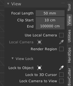
It is in the sidebar->View->View Lock
Just to mention an alternative to camera operations besides Lock Camera to View: I’ve been lately extensively using Walk Navigation to Pan and Move the camera around. If you left clic, you set the changes, and right clic or ESC dismisses them. Orbiting around an object is the only thing I would use Lock Camera to View for. For other camera controls, I use the Camera Properties, and there, I only regret losing the target as I adjust the Shifts, it’s a nightmare.
And yes, all is very spread around and hidden, so I support many of the ideas shared here. I’m just sharing another option, not a workaround.
UGH!
thank you so much. this was driving me nuts. never had to hunt this down for any other 3D app. I thought Blender was supposed to be user friendly.
i don’t understand your trick yet, but I bookmarked it because I have a feeling it’ll be very useful. I’m totally new to Blender, coming from Cinema. thanks!
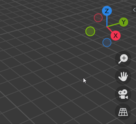
Like this?
No, not like this. This only addresses tiny portion of the issue and will not help anyone who has these buttons hidden, as they are more or less useless for anyone who does not use touch/pen display.
A few posts above there is an explanation why the whole “View” tab of the sidebar needs to be moved to the header.
Meh, I see it as a separate issue. Even if you did exactly what you propose and moved the contents of the View tab to a header popover, I would still want this item exposed more directly here.
Nor does it harm them.
The was a proposal somewhere to add the lock button near the frame when in camera view. Neat and simple!
Edit: found it https://blender.community/c/rightclickselect/3mdbbc/
It does not harm them, but it does not solve the issue. It won’t help people who have those buttons disabled to make UI more accessible and organized.
The problem is that in the typical Blender manner, this tiny change will most likely be considered as this request being fully solved, and no one will ever revisit it again. I’ve seen this pattern repeat way too many times already:
- Someone identifies some issue
- The same person or someone else proposes a solution
- Some developer implements only 25-75% of the solution
- The situation has not much improved, but no other developer revisits if because they’ve seen someone else has already “solved” it
Yes, I have no doubt that you can look at any small improvement and somehow see it as an impediment to a better solution. Feel free to see the world as you wish. But I personally think that “Perfect is the enemy of good” and I’ll just continue to look for ways to improve blender - even if by small steps. Feel free to submit a patch that implements your proposal.
Yes, this mindset pretty much sums up the reason Blender is still behind in terms of usability and user experience despite all the resources and efforts since 2.8 ![]()
“Feel free to submit a patch” is arguably even worse mindset. You are saying that because you very well know that most people are not programmers possessing the skillset necessary to do so. In fact even more so in context of Blender, since most people have dedicated years or even decades of their life mastering their artistic skills. The stereotype of artist usually not being a good programmer and vice versa emerges exactly from that - from the fact that there’s only so much time in one’s life so they have to pick one path.
By going in the direction of this mindset, you are pretty much indirectly implying that someone with programming skills should always have exclusive rights to decide the design of the features that the artists will then have to use in the daily basis. I see it way too often in Blender where someone has decided to implement a feature in certain way mainly because they will not have to suffer the usage of it. If they had to, the feature would most likely turn out to be implemented quite differently.
I like the proposal. This button is definitely needed, and might be a separate view lock tab as well. I would argue on a choice of a lock icon - for a newbie a lock means turning off or freezing some degree of freedom. Like lock a layer in Photoshop, or lock your phone with a password. I would suggest using word snap instead, and magnet icon is already understood as snapping to grid or to some object. I’m not an icon designer, but probably a combination of camera and magnet would do the ultimately understandable icon
![]()
@LudvikKoutny - Interpret my words any way you wish. But all I am saying, and doing, is posting a solution that addresses OP’s complaint, fits with prior plans, and matches RCS requests. No, I am not working on your suggestion, but I could one day or someone else might. As for the insult of saying “feel free to submit a patch”, this is a Development website and I do not keep track of what you are capable of.
Did I claim anywhere that I consider that to be an insult?
All I was saying is that I am under the impression you are most likely saying it not because you honestly expect it would encourage to submit the patch, but because you very well know I am not a developer. It takes quite an intelligent person to become one, so I am pretty sure you have by now noticed most of the people here are users, not developers. Especially given the fact that this forum subsection is literally labeled as “User Feedback”. You are also frequenter on the developer.blender.org, so you probably know who most of the frequent Blender code contributors are.
Just try to see it through my eyes. Imagine you were working for a game development studio for example. I use it as an example because it’s a perfect scenario where both skilled developers and skilled artists need to work together to deliver the final product.
Now imagine there was a need for a let’s say a main menu artwork, with a specific requirement. The artwork needs to convey something specific. A very skilled artist at the would make a great, high quality artwork, but you would feel that it doesn’t meet the requirement of conveying the specific idea required for the game’s main menu to feel right. You’d raise your concern that the artwork doesn’t fulfill the purpose it should have, and the response you’d get would be “Feel free to create an alternative artwork and submit if to the art department for evaluation”.
You’d know how unrealistic the idea of putting your constantly evolving programming skills on hold to be rusting for at least 5-6 years to reach the art experience skill level needed to pull artwork of that quality level just to prove a point would be.
I don’t have any big issue with you presenting the small patch. I agree with you it won’t do much harm. But as I said, I’ve seen this patter way too many times already. Just look at the broken and unusable “Extrude Manifold” for example. BF has now checked a box of Blender having destructive extrude operator, usable or not, and no one has revisited it since it was implemented.
And it will be the same here. The sidebar will remain a kitchen sink for all the different stuff. Yes, lock camera to view will now have a duplicate place somewhere else, but all the other features occupying that obscure view tab will still be hard to find. And that is the issue. What’s being fixed here is just a one specific manifestation of an underlying issue, not the underlying issue itself.
It just continues to reinforce the old entrenched Blender development habit of always trying to fix issues at the highest level possible, and always try to avoid fixing the underlying issues. That in turns leads to the UI and UX complexity growing to crazy levels.