While I like those I think they are very harsh, sharp and overall look unfriendly in a way.
Almost like a logo of some dystopian futuristic industrial mining company.
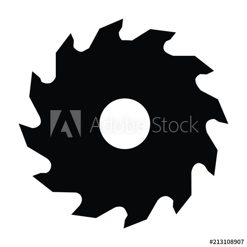
It resembles to me a saw blade:

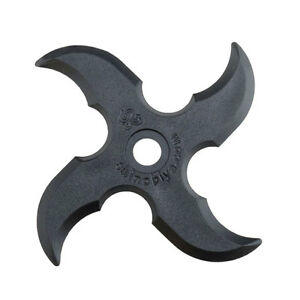
Or a shuriken for that matter:

I think it’s good but would dial it down on the sharpness and make it more friendly looking.
That’s also why the ends here are rounded (like Blender logo) and they are quite long.
