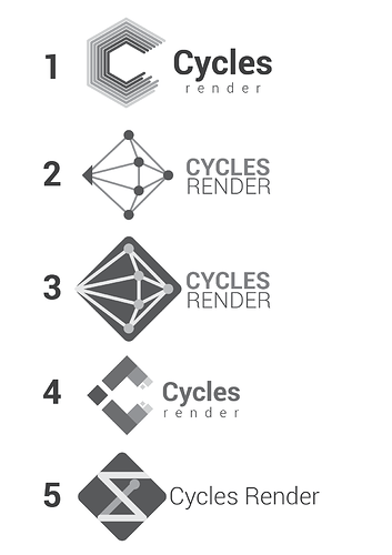
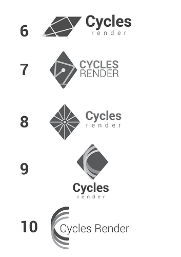
Here’s my most recent attempt, after reading the comments from everyone and the guidelines given by @Brecht I tried to represent the concept of raytracing and bouncing, without repeating the effort made by @WoollyBear, so some of them are quite literal hehe.
The only one I kept from the previous set of sketches is the number 4, because I think it serves to represent not only the rays bouncing but also the render process, with the little squares at the end.
Some notes:
- Almost all of them are using the rhombus as the main shape, this is to separate the logo visually from other render engines logos. They’re already using spheres, cubes or hexagons with different variations.
- This sketches are kept in greyscale, so we can focus on shape first. Color will be added later.
- Since Cycles is also a standalone app, I don’t think the logo should have any resemblance to the Blender logo, we can connect them both with the use of color, not shape.
- The font used here is Roboto (in different styles) from the free Google fonts.
I hope you like them, let me know what you think! ![]()

