Interactive Editor Docking is Now Experimental

I’m hoping to get broad testing of “Interactive Editor Docking”, now available as an experimental feature.

Should This Be Made Non-Experimental?
  • :heart_eyes: Yes, I’ve tested this thoroughly and love It!
  • :rage: No, I’ve tested this thoroughly and hate It!
0 voters

Who Should Test This?

Anyone who currently uses the corner “action zones” to do things like split and join editor areas.

For users who do not (and often can not) use these corner zones effectively this isn’t for you as it doesn’t make this any easier - it only adds new features to them. But this could eventually help you too. Because this allows every action zone to perform all operations, this could eventually allow us to do things like make one (or more) visible, or allow dragging from the headers or other single areas.

Any Special Considerations While Testing?

Try to not get blinded by the “shinier” parts of this, like the ability to tear areas into new windows. You really want to make sure that the mundane things that you do still work in a way that is efficient and make sense.

Do not assume that this could be non-experimental but enabled optionally with a user preference. Nor could parts of this be configurable. That would hamper our future work. So consider this all or nothing.

Of course I will strive to continue to improve this and everything else. But for the purposes of testing assume that what you see is exactly what you get.

How Is This Enabled?

If you have a very new version of Blender 4.3 Alpha, you can enable this by turning on “Developer Extras”…

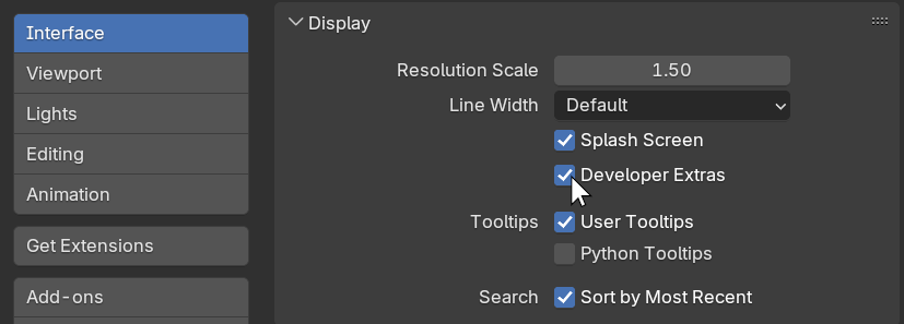
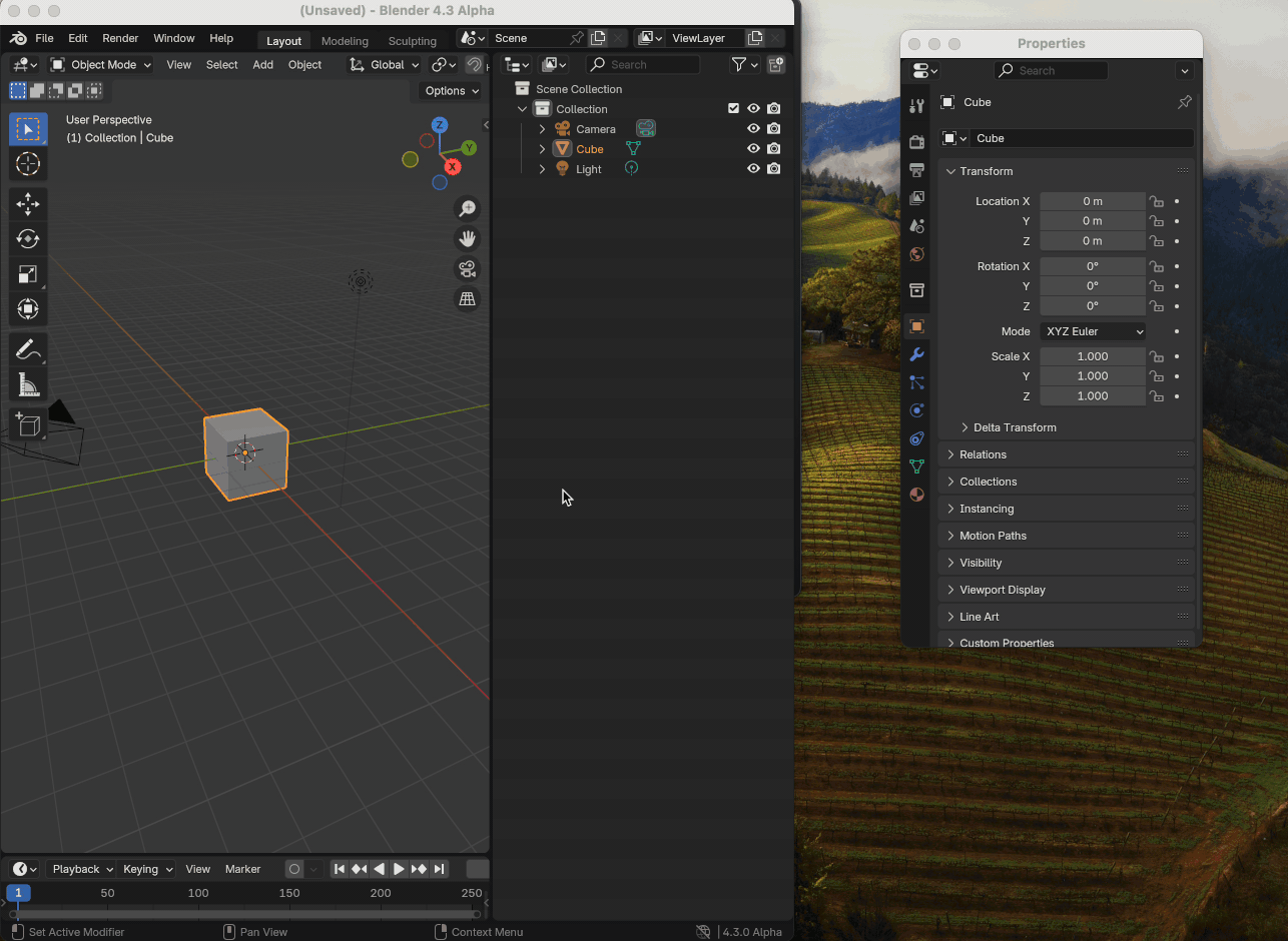
and then enabling “Interactive Editor Docking” in the “Experimental” section:

What Does This Do?

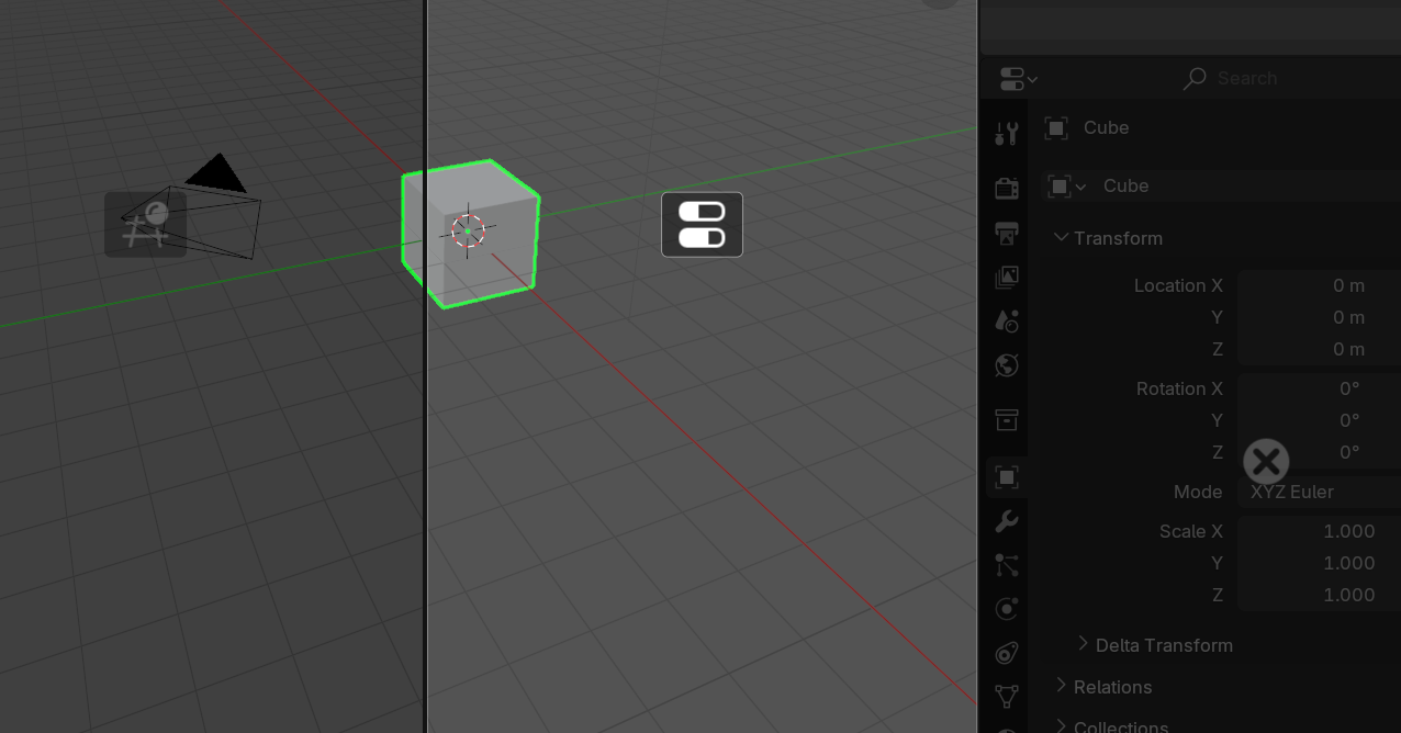
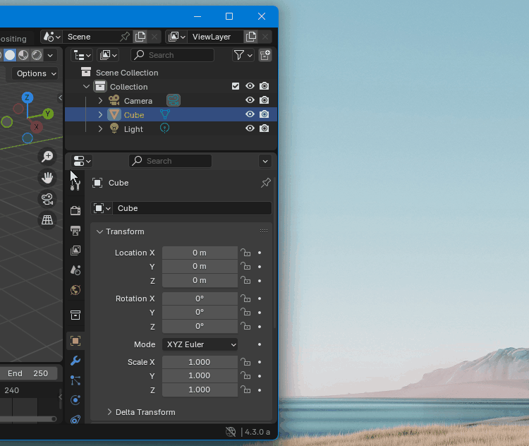
In a nutshell this extends the area join operation to allow the dragging of editors to entirely new locations. To quickly illustrate this, the following shows a “Properties” area being ripped out into a new window, and then dragged back in.

DockResize

Are There Any Downsides?

The distance you can drag to join to neighboring areas is slightly constrained, since dragging further assumes a move. This shouldn’t be very disruptive because the visual feedback should seem immediate and clear.

Currently splitting an area will happen immediately upon dragging within an area. But here the splitting does not occur until you confirm by releasing the mouse button. This change allows all operations to work from all action zones. So you can drag from a left-side zone to the right of an area without a split happening mid-drag. This should not feel very disruptive since you can transition between all these operations non-destructively before confirmation at the end.

Currently when you start a join of one area into another, you can move your mouse and cause the join direction to reverse. This can’t happen here since there are more operations possible than just joining and this allows transitioning between all of them. That feature doesn’t seem very useful anyway though, so I doubt that you will notice that it is gone.

31 Likes

I have tested it thoroughly and I love it! :slight_smile:
For long, I had found the dragging-of-the-corner mechanic of Blender to be finicky, and this solves it. It is so much clearer and easier to organize the editor layout.

I was just wondering about a thing, when using it: how would it be if instead of having to aim for the corner, one could trig it by dragging on the area I highlight in the screenshot below, the header of docks?

It’d feel very close to how an OS native windowing system is currently. I don’t know if it could be worth it trying it as a possibility, but maybe it’d make too big of a click target. I’ve always felt that that area feels draggable but it isn’t. However, it would need testing to see if it works, dunno.

In any case, it is great and it should be the default behavior. Amazing work!

3 Likes

Yes, that would be nice. If we want to go in that direction the changes here move us a step closer. The changes here allow us do any operation from any corner, which helps move us toward having singular zones. Dragging from the header would probably require some thought and (small) changes to the current splitting behavior so that we could still do either a horizontal or vertical split no matter where we start.

If you start from a top corner now the split direction is taken from whether you are dragging more downward or toward the center. So dragging from any arbitrary header position could be problematic if, for example, there is only empty header space on the right but not the left.

So yes, dragging from the header would be more intuitive than our hidden zones now but would have to be a part of future work.

2 Likes

This is beautiful! Feels so much better.

My first impressions were good… The only point i’d make is that we could use a different cursor icon for this action.
One thing I notice, my brain quickly tried to use the Shift or Ctrl keys while dragging the editors, expecting that the operation would copy or swap the editors… Other than that, the adaptation to the Docking was quite easy and intuitive.

What sort of time frame do we have to provide our feedback? For something like this, I’d prefer to enable it and just use Blender like normal for a week or more before coming to a final conclusion and ticking the Yes/No option at the top of the report.

I will obviously provide feedback through out that testing period if something is obviously wrong or bothersome.

I noticed that the UI flickered in some situation.

This flicker comes from a incorrect editor layout being displayed breathly when the cursor is within a small (1 pixel?) wide part of the UI during the drag. Because the split/combine UI, shows one option, shows this “incorrect window position layout” for a single refresh of my monitor as I move my mouse over the troublesome region, then shows the correct result as I continue to move my mouse.

So there are two issues related to each other.

  1. The incorrect editor layout.
  2. The flicker that can occur from the user crossing over this section.

Here is a video demonstrating the “incorrect editor layout” spot:

System Information
Operating system: macOS-14.4.1-arm64-arm-64bit 64 Bits
Graphics card: Metal API Apple M1 Pro 1.2
Blender version: 4.3.0 Alpha, branch: main, commit date: 2024-07-20 11:30, hash: 0e442c209038
Displays tested on: A 2560x1440 27inch monitor. And the built-in display on the 2021 MacBook Pro.

There’s quite a bit of time. In order to get it out of Developer Extras during this release I’d have to get the go ahead before August 28th.

Getting it out of “extras” would likely be an Admin group decision, not just the UI Module. So I’d need quite a good response from users, other devs, and the studio. With corner action zone operations being so ingrained I’d guess that this will have less to do with the relative benefits overall and more to do with changes to current behavior. So how the change to late confirmation of splitting is perceived will probably end up being quite important.

Have not tried this yet, but your description of shift keys makes me think the current “split” stuff can be complelety removed. Holding down some shift key would make this “copy” rather than move, and I think the user can then get all the possible results of a “split”.

Clever drop locations (ie on borders to replace more than one panel) would get rid of the need for “join”.

Currently, it does not seem to be worst. That is intuitive.

I have to minimize or move my main window taking the whole screen, to be able to extract an editor into a new one by dragging.
I would prefer to avoid that, like when I shift click to duplicate editor as a new window.
Is it something that could have a modifier key to keep main window taking the whole screen ?

I am wondering if it could be possible to select several editors at same time, to create in one manipulation, a new window with several editors ; or if a secondary window containing multiple editors could be entirely merged in main window, in one operation.

What do you think this cursor should look like?

I did experiment with unifying it more by having the split be just be a docking operation, but that was too much of a change of behavior. Old habits die hard.

You need to try it. This treats joins just like docking, so blurs the distinction between them nicely. But yes, this could possibly be extended (later) in a number of ways, including treating a drop onto a shared border as a docking that takes both locations after a merge. I would also love to treat the outside edges as a way of docking there that takes the entire window width or height. That is just a bit complicated with our current code. I’m trying to get this in with as little disruption as possible

This doesn’t remove the option of using Shift-Click to duplicate into a new area though, so that remains available if your window is taking up the entire monitor. Or are you hoping for a way to do that without holding shift? I’m not sure how that could be indicated by the user. I could make a new window if you drag to somewhere invalid, like the TopBar perhaps. But not sure that is very intuitive.

I’m not sure that would actually save any time since I wouldn’t know what arrangement to put them in on the new window. Or where to put them when merging back in. So if you have to move them about afterward anyway then you might as well drag them one at a time. Interesting thought though.

Was playing around with this a little bit, I believe I’ve found a bug - after ripping out a panel into its own window, I’m unable to dock it to anything other than the left or the bottom. See attached gif:

2024-07-2014.22.26-ezgif.com-resize

I can file a formal report if you would prefer tracking them on the main issue tracker instead.

Other than that, my main point of feedback is that dragging an already detached area outside of the blender window and releasing creating a duplicate window seems like unintuitive behavior.

I’m not certain what you mean. In the GIF you do end up docking to the bottom, not the right or left.

But it does show you struggling a bit, so perhaps this is a window measuring issue on Mac Retina displays? The dropping areas are diagonal quadrants. So perhaps I am not calculating this correctly when on high dpi on Mac? We do have some issues with Mac region sizes.

dragging an already detached area outside of the blender window and releasing creating a duplicate window seems like unintuitive behavior

Do you mean dragging an area out of the main window, and then dragging from there outside of that new window? If that is what you mean, then yes that should not do that, looks like a bug to me.

I’m not certain what you mean. In the GIF you do end up docking to the bottom, not the right or left.

Apologies, I meant left or bottom. I’m unable to dock it to the top or right. I updated my previous post.

Do you mean dragging an area out of the main window, and then dragging from there outside of that new window? If that is what you mean, then yes that should not do that, looks like a bug to me.

Yes, exactly that. Here’s another gif for clarification.

2024-07-2015.08.24-ezgif.com-resize

The cursor appears to get into a weird state in this particular example as well, I haven’t figured out exactly what causes this yet, but after I close the third window, it believes I’m attempting to dock a window and I have to click again to restore the cursor to a normal state.

Although I can’t recreate that on Windows, that would fit with this being an error on measuring the region size on Mac with Retina. I might need to divide or multiply something by the pixel density. At the very worst I’ll be getting a Mac to test with very soon.

I’ll also look into this issue with tearing out an area that is already torn out and alone. I should be able to find a solution that doesn’t seem so weird.

Overall, this is really great to use. I love being able to just rip out the outliner and move it to the left of the screen! I’d use it!

I have some minor nitpicks about the styling, but it could just be my personal preference.

Dimming the icons of the non-main window seems unnecessary to me and feels a little messy. In the last image in this post, you can see how the outliner icon especially is getting lost. Since there’s already highlighting and darkening to communicate what’s going on, having them all the same style (including outlines or not) would look great.

One weird thing is that both of the below actions are exactly the same yet look totally different, which led to a little uncertainty at first about what it would do (the properties editor is being removed?). Some logic to keep the style consistent when replacing the window next to it would be really nice.


Also, operations like the one below are pretty useless and get in the way of expanding if the user moves the mouse just a little too far up. It’s weird that a slight movement up replaces the above window, more movement up slides it a bit, and then moving the mouse further up goes back to replacing. If they wanted to slide the border, they could just do that faster and more precisely by dragging it. I think snapping in this section should be ignored and replaced with the same action as the above images.

2 Likes

Yes, I have now fixed that in main (might take a day for a daily build) so it closes the source window. It ends up like moving the window, but it feels much better, makes more sense. Thanks!

I’ll try to look at the Mac issues as soon as I can.

You are right, the dimming there didn’t really make sense. I changed it so they are the same brightness, but kept the outline only of the one area in motion. We can give it a try and see if that helps.

For sure. I’ll take a look and keep this in mind, but there might not be much I can do for a lot of this. In simple layouts there will often be more theoretical join and docking targets than the number of possible operations. The most extreme example is if you have only two areas in a window, as there are only nine arrangements you get get to in one step, yet there are 16 split/drag/drop targets.

1 Like

Hi! Tried it now and it easily replaces split and join.

I had the same problem reported above about dragging a panel that was the sole content of an outside window into the main window. I was unable to drop it in some halves of the panels. This is on Linux so I don’t think the problem is Mac only.

Also dragging inside I could not get the panels to split at some locations that I expected. For instance in a typical layout I could not drag the viewport and put it atop the outliner, it always made the viewport the full width of the window. Not sure if this is a problem, you may be avoiding layouts that are not possible or maybe ill-advised?

It would be useful if there was a position that did nothing, most likely by being sufficiently close to the original click. It would preview by highlighting the panel exactly as though it was replacing the panel with itself.

I’m not really seeing any use of the icons in the panels. All I want to see is a bright rectangle showing where the panel I am dragging will occupy if I drop at that point. This may apply even for the split preview, the right/bottom of the split is the “new” one I am dropping and only it should highlight, don’t draw a rectangle in the other half.

More I think about it, I’m pretty convinced the user feedback can be a lot simpler. I want to see a bright rectangle showing the area the panel will occupy after being dropped. There does not need to be any graphics any where else, and the exact same feedback is used if they are splitting or replacing or merging panels. If you cannot draw a rectangle for it, a drag that creates a new window can be shown by changing the mouse cursor to the biggest rectangle you can get.

When splitting a editor, the arrangement of the new editors can feel “backwards” in some situations.

With this setting turned off, if I grab the top right corner of a editor, and drag my cursor left, then the new “duplicate” editor is on the right, while the existing editor is on the left.

With this setting turned on, if I do the same operation, the “exisitng editor” is the largest region, while the duplicate is the smallest region. Which depending on the size of the regions can make the editor arrangement seem backwards.

I pesonally feel this is a issue since it feels unintuitive, but it could also just be that I’m used to the old system.

This thing with the “original goes in the biggest region” doesn’t matter in most situations as the users can’t tell, but it does matter wth the 3D viewport if you’re in rendered view, because the duplicate 3D viewport will turn rendered view off, which makes the difference visible.

Note: I do this operation a lot. I have a rendered viewport and I want to start editing materials. So I split the 3D viewport editor, making the “duplicate” quite large, then switching the duplicate to the node editor. With the “issue” described, I can still do this, but it takes extra steps to keep the editor arrangement I want.

2 Likes