Just wondering what everyone thinks of the following…
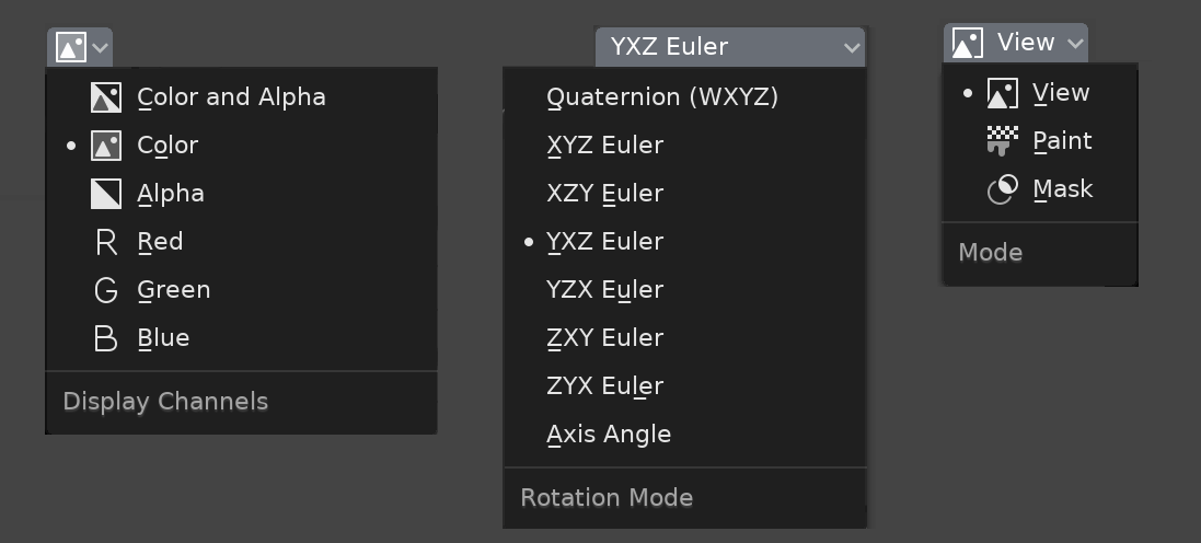
When we now open a menu of enums it does not indicate what the currently-selected item is. I have a patch that makes it do so with a little dot to the left of the current item. It makes it look like this:
A vertical line about the height of the text and a few pixels wide could reduce the overall horizontal width. (This could make the menu UI look a bit more streamlined and would look nice with corresponding color coding, when applicable.)
The drop down menus or the menus’ margins could be reduced to streamline menu UI.
I think we can use a small dot when there are no icons in the menu, and just not use the indicator at all when the icon is present. You can often see slightly different types of similar menus in one program, there is no problem.
Though personally I don’t see a problem here. You can always see the current state at the top, in the button itself, you literally click on its name when you open the menu.
But that (exact) implementation still loses the highlight of currently-selected as you hover into the area.
Yes, but it can be combined with a dot as you suggest, in fact it is independent things.
Could get a bit ambiguous when you hover over a new item but then pull off to the side, as the menu would dismiss but your last selected item would not be chosen.
In the same way as it now (if I understand correctly what you mean). If you click outside the menu or move the cursor far away, the menu closes without changes.
And as I suggest, when the cursor is outside the menu borders, reset the highlight to current (old) item:
It also doesn’t work well for Brecht’s desire to (eventually) allow changing selection using keyboard up/down.
Why? When you just open the menu, the current item is highlighted and pressing the up/down key goes to the previous/next, rather than always starting from the first item as it is now in Blender.