Three slightly different camera icons in a row … there ought to be a better solution.
3 Likes
Maybe a different recording symbol? The second option looks too much like the bounding box center.

@dan2 thanks for the suggestions, I’ll work on it and share my ideas 
@slowk1d Thanks for all the feedback!
- Yes, the icons are not final.
- Thanks for the ideas for alternate icons. We’ll work through all the ideas and see if improvements can be made.
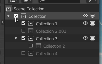
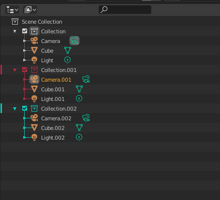
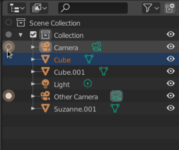
- Any collection (including the Scene Collection) can be made active. This is the collection that new objects and collections would be placed in, so we need a way to set the active collection, even for the Scene Collection.
- The reason for the column is to replace selection of collections, scenes, and cameras to set active. It’s confusing especially if all you want to do is rename a collection to have it be made active on selection. So clicking in empty space wouldn’t change the collection.
- For delete we want to make the most common types of delete fast (objects and collections) with x. For other datatypes, the context menu should suffice since it’s not common to delete scenes. This is mostly to keep the code simple. It’s possible though.
@ManuelGrad I would love to add the autoscroll when dragging. It looks like the code should be easily adaptable to the outliner. For now though, you can scroll a mouse wheel while dragging.
@dimitar you might want to try the latest builds of 2.90, I believe that first issue you mentioned is fixed.
As for the context menu: I want to clean it up this summer, but depending on time that might be limited to making the current features actually work.
@jc4d by active camera we mean the camera that you see the scene through, not the actual state of being in camera view. That second point is a known issue and we are working on a solution. Thanks for the idea!
Thanks for the icon suggestions everyone, I’ll see what can be done I am not completely against the checkmark though.
6 Likes
My top requests would be:
Color coding of collections
Being able to open/preview images from the Blender file list
Being able to merge multiple selections into one object in the outliner
Being able to separate an object by ‘loose parts’
Drag and drop files either to re-order them in the list or to parent without a modifier key.
Thanks!
4 Likes
Custom color coding of collections is my #1 request. As someone who tries to keep my scenes really organized the hardest thing I struggle with on the Outliner is finding the collection I want when I have 15+ of them going.
The second hardest thing is finding what collection the mesh I have selected in the 3D view is in. I am using a custom theme that has less contrast than Blender default (better for my eyes) but it seems like the colors for Outliner icons are tied to a font? Hopefully that makes sense.
8 Likes
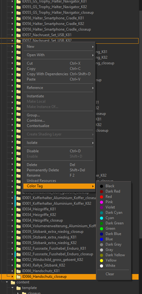
In other 3D programs you can assign color tags to folders/groups etc.
Something similar in the blender outliner would be great!
7 Likes
Arrow navigation is awesome. It’d be great to be able to jump up/down the hierarchy too, otherwise it takes too many keys, forcing to resort to clicking.
I mean - the left arrow could jump to the parent when there is nothing to collapse or the node is already collapsed.
And the right arrow could jump to first child, when the node is already expanded.
I’m not sure - perhaps that’s how it is intended already, as the hotkey says walk:left, but it only collapses/expands without moving the focus.
4 Likes
We have had so many requests (in the past and just recently) for color coded collections. This is a great thing to add, but the design isn’t completely clear at the moment. I will be making a design task for it in the next few days and then ask for feedback.
@Massivetree thanks for the ideas! Some of them (like separate by loose parts) are just a little too specific for the outliner. If we add that feature, why not “merge vertices by distance” for example? As part of this project we are trying to focus the outliner. We do want to improve drag and drop.
@Dheim I’m working on a proposal for highlighting the collection containing the selection.
@kivig thanks for the reminder, I just committed this now! (in my branch) It’s a simple fix though, perhaps it can go in master soon for 2.90. 490d44409770 See the GIF for an example.
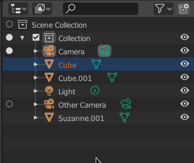
After the discussion about the icons, I had a chat with @billrey today. We decided to try the radio icons for collections, camera, and scene toggling. I’m still using the edit mode icon and the dot for edit mode right now. We want to use these radio buttons because they convey that only one of each type can be active. It’s not perfect, and changing icons is easy, so we could still make some improvements here. One that we don’t like is using the camera, collection, or scene icon. It creates too many repeats of the same icon in the row.
Idea Needed: Currently I’ve been calling this the “Left Column” in the UI and code. While the name isn’t wrong, we could have something more specific. Our best idea is the "Data Activation’ column, does anyone have any better ideas?
4 Likes
@natecraddock well I’d say that merge by distance is more of a edit level thing which the outliner does not deal directly with. However, it does manage objects in your scene and merging and unmerging(by loose parts) objects is a very common action among other applications in an outliner.
Just like parenting and organizing elements in your scene is essential, so is merging and unmerging objects in a given set. Take some CAD files for instance that have been converted and opened in Blender… Organizing and managing that data is something that is best done where you can best see how it is structured and that of course is in the outliner…
Just my opinion.
Steve
That was fast
As for UI, just “Show Active” and/or “Active” could do. All a familiar to Blender user has to get is an association with the concept of active. A new user won’t automatically get the meaning straight away unless it’s a full sentence anyway. The “Data” part leaves a bit too much for imagination for both imho.
Edit: Ok, I’m an idiot. It is there and it didn’t even occur to me to search for it… whole this time 
Couple notes though - filtering Object Content display seems to be available in View Layers only. And bones constraints it seems can’t be filtered.
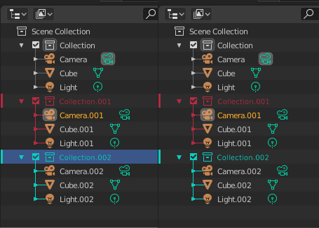
Best design for color coded collection was made by SaintHaven.
19 Likes
What about nested and colored collections?
Nathan,
Thanks for all the work you did on this and what you’re currently doing.
If I was a begging man (and I am!!) I would beg that selections in the 3d viewport show in the outliner by selecting the collection and parent nodes of what item is selected.
Right now if you click in the viewport and your object is in a collection you cannot find out where it is.
I realize it’s probably not super sexy but would be super helpful. I will buy you many drinks of your choice if you can make this happen.
Thank you!
Rob
3 Likes
This is for sure the most elegant solution.
He also made the best mockup for the icon coloring of the properties editor imo.
Would be awesome to see this in Blender like this.
3 Likes
I’d go as far as adding color to the collection name as well Once it’s collapsed having that little icon colored might not be super obvious. Especially since people can go quite crazy with their themes.
1 Like
For better differentiation, when hovering over one data activation radio button, Blender should highlight the data activation radio buttons in its toggle group and/or darken the ones that aren’t.
3 Likes
yep, that should do it
1 Like
Mmm, nice but i can see a visual conflict with the yellowish color of selected camera. if i choose yellowish color for a collection then i have a confusing color match