GSoC 2020: Outliner Discussion and Suggestions

@natecraddock: Hello, you mentioned drag and drop improvements in the outliner.
The problem I have every day with the blender outliner is, that it is not possible to drag and drop one hierarchy into another one because all transformations are lost. You have to select one hierarchy then the other one, move the mouse into the 3D viewport and hit strg+p and select “Object (keep transform)”. That is very cumbersome!
Maybe if I drag and drop in the outliner a popup can appear where I can select if I want to parent with transforms or without! Or it is an option you can set in the outliner options dropdown.
In all other 3D programs I know, you can drag and drop across the hirarchy without loosing the transformations. It would be really great if that would be possible in blender too!
I hope you understand what I mean?!
Cheers

4 Likes

To make clear what I mean I created a simple blend file.
Blender_Outliner_Drag_and_drop_01
If I drag and drop the Cube.001 into the Empty it moves in the viewport because it inherits transforms. So drag and drop is not possible with keep transforms.

3 Likes

Alright, first weekly report in: GSoC 2020: Outliner Weekly Reports
Also, there is now a Windows build of my branch: https://blender.community/c/graphicall/Qmbbbc/

I committed changes to add a new left column for this task: https://developer.blender.org/T68498. It works well right now, and I would love some feedback!

@MichaelHermann though that would be great, I don’t think the outliner would be a good solution because local view is viewport-dependant. So you can have more than one 3D view window open each in local view on different sets of objects. I can’t think of a way to cleanly represent multiple differing local views in the outliner.

@lsscpp @dan2 thanks for the mockups. I prefer either brightening the icon highlight, or the full bar, the half bar highlight has some asymmetry. I really would like to think of something other than another highlight if possible though.

@machieb it’s a bit cumbersome, but you can drag+drop parent in the outliner holding Shift+Alt and it will keep transforms. Making drag+drop more intuitive is on my todo list for the summer.

5 Likes

Only thing I’ve seen that could be an alternative is that auto expand/frame thingy that houdini/solaris is doing in the scene graph view, but that might be something that’s more practical with extremely complex scenes, it wouldn’t be viable at this stage - at least until everything nodes comes along.

I guess adding a theme option to change the icon highlight could be the simpler solution, might throw off people coming from other packages though, at least until they get used to it. Most softwares I’m working with have that dimmed highlight option a’la Maya.

Thanks for the great design task an all your work on these improvements! Really looking forward to this project.

1 Like

Parenting through outliner drag’n’drop should show the same “Parent…” popup we get when parenting objects in the 3DView, so that we can choose between “keep transforms” or not (and hopefully one day we get “keep transforms and apply inverse parent matrix”).

7 Likes

Hello everybody! First off, thanks a lot Nathan for continuing in the outliner improvements! After testing a little bit the new Outliner branch, here are my impressions:

  1. ACTIVE ICON

I think that the active icon is too similar to the enabled in view layer icon for collections, and being them also very close to each other, I think it might create confusion on their purpose. This is connected also to the second point.

  1. ACTIVE CAMERA ICON

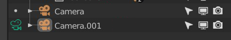
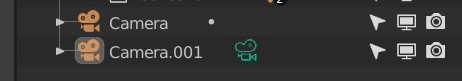
I appreciate a lot having a clearer visualization of the active camera, but for me the active icon of the camera should differ somehow from the active icon of collections and scenes. I understand that it could be for avoiding visual cluttering, but I personally think that cameras are a different concept from collections and scenes, and therefore need a specific icon for the active one. Here are 3 mockups for how it could be:

the first one simply uses the same icon of the camera with a different color: I don’t completely like this solution because it ends up having the same camera icon 3 times in different colors.

1

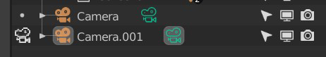
The other two use the data icon of the camera for showing the active one. If, as I expect, these could conflict with the idea of syncing the outliner with the properties, I’d say that accessing the camera properties could happen by simply clicking on the camera’s text space and/or orange icon.

2

3

  1. ACTIVE SCENE COLLECTION

I don’t completely understand the need of having an active icon also for the scene collection: isn’t implicit that is active, being it inside the active scene we are working in? Please tell me what I’m missing.

  1. ACTIVE COLLECTION CLICK

This is aside from the latest column implementation: currently, when we select a collection, making it active, every new object and collection that we create are added to that selected collection. The thing is, if you select a collection and then click outside of it in the outliner, the new object we create will still be added inside that collection, while if we want to add a new collection without it being inside the selected one, we simply need to click anywhere else in the outliner: I think this behavior should work the same with adding objects.

  1. DELETING SCENES

This last entry is made out of a suggestion and what I think is a little bug:

-Currently, for deleting a scene in the outliner we can only right-click on it and select delete. I think it should be possible to delete them by simply clicking X, like with objects and collections.

-BUG: If we delete a scene in the outliner that is not the active one, the scene remains in the outliner, and we have to click or go with the mouse to another editor to actually make it disappear.

3 Likes

That’s true! I have one idea though: Dim only if the mouse is in a 3D viewport window and only dim for the viewport the cursor is in. Whenever the mouse leaves that viewport, the Outliner goes back to normal.

1 Like

In a real life project with hundreds of objects its a pain/impossible to parent objects/collections with drag and drop if the list of objects is too long for the limited vertical space of the outliner.

The modifiers got a really nice update recently with butter smooth pan when dragging outside the boundary, could this be adapted for the outliner as well?

https://developer.blender.org/D7465

4 Likes

Yes please! Selecting in 3d Viewport and then having all parent nodes/collections highlighted would be awesome. Right now it’s impossible to find objects in the outliner if they are organized well.

5 Likes

Thanks so much for helping improve the outliner once again for the Blender community!

I would like to still see layers remembering states when toggled on/off. Brecht overruled this but to me it’s still feels like broken behaviour. Outliner & objects/collections visibility paper cuts

Also, it would be great if there right-click options to easily move or add objects to a different collection as mentioned here: https://blender.community/c/rightclickselect/Mhfbbc/

3 Likes

I tested the latest windows build and the left column is a nice idea, I would like to share my first impressions.

1- Having the check mark while the camera is not Active (View–>Cameras–>Active Camera) is misleading. Ideally would be that the check mark become visible ONLY when the user enable it and then the Camera becomes Active. In this regard, by enabling the check mark call the Active Camera command.

2- When an object is in edit mode using the new left column and clicking on another object both objects are available in edit mode, but if I click on the active object icon both objects are out from Edit mode, I’m not sure if would be better if I click on the second object icon, then that one becomes active and exiting the current active one… hope it makes sense.

1 Like

Here is a small proposal to replace the camera check mark, I’m using blender icons in both examples: VIEW_CAMERA and SHADING_BBOX with the current dot.

What you guys think?

2 Likes

Like the second one!

First design is clearer at a glance.

Three slightly different camera icons in a row … there ought to be a better solution.

3 Likes

Maybe a different recording symbol? The second option looks too much like the bounding box center.
image

@dan2 thanks for the suggestions, I’ll work on it and share my ideas :slight_smile:

@slowk1d Thanks for all the feedback!

  1. Yes, the icons are not final.
  2. Thanks for the ideas for alternate icons. We’ll work through all the ideas and see if improvements can be made.
  3. Any collection (including the Scene Collection) can be made active. This is the collection that new objects and collections would be placed in, so we need a way to set the active collection, even for the Scene Collection.
  4. The reason for the column is to replace selection of collections, scenes, and cameras to set active. It’s confusing especially if all you want to do is rename a collection to have it be made active on selection. So clicking in empty space wouldn’t change the collection.
  5. For delete we want to make the most common types of delete fast (objects and collections) with x. For other datatypes, the context menu should suffice since it’s not common to delete scenes. This is mostly to keep the code simple. It’s possible though.

@ManuelGrad I would love to add the autoscroll when dragging. It looks like the code should be easily adaptable to the outliner. For now though, you can scroll a mouse wheel while dragging.

@dimitar you might want to try the latest builds of 2.90, I believe that first issue you mentioned is fixed.

collections_exclude

As for the context menu: I want to clean it up this summer, but depending on time that might be limited to making the current features actually work.

@jc4d by active camera we mean the camera that you see the scene through, not the actual state of being in camera view. That second point is a known issue and we are working on a solution. Thanks for the idea!

Thanks for the icon suggestions everyone, I’ll see what can be done :slight_smile: I am not completely against the checkmark though.

6 Likes

My top requests would be:
Color coding of collections
Being able to open/preview images from the Blender file list
Being able to merge multiple selections into one object in the outliner
Being able to separate an object by ‘loose parts’
Drag and drop files either to re-order them in the list or to parent without a modifier key.

Thanks!

4 Likes

Custom color coding of collections is my #1 request. As someone who tries to keep my scenes really organized the hardest thing I struggle with on the Outliner is finding the collection I want when I have 15+ of them going.

The second hardest thing is finding what collection the mesh I have selected in the 3D view is in. I am using a custom theme that has less contrast than Blender default (better for my eyes) but it seems like the colors for Outliner icons are tied to a font? Hopefully that makes sense.

8 Likes

In other 3D programs you can assign color tags to folders/groups etc.
Something similar in the blender outliner would be great!

7 Likes