GSoC 2020: Outliner Discussion and Suggestions

Hello. I was told I should ask here about an Outliner feature I suggested on RCS:

https://blender.community/c/rightclickselect/hVfbbc/

In short: Please add the ability to parent bones to other bones with drag & drop in the Outliner.

7 Likes

Hello, I don’t know if there will be time with already all these new features, but it would be nice being able to scale the outliner’s dimensions with CTRL+MMB, like in other editors:

Currently, the only way to scale it is by changing the resolution scale in Preferences, with the downside of scaling the entire interface. It would be helpful in situations with a long list of elements.

8 Likes

I spent 3 days trying to get the color tags to draw in a row. This isn’t supported in menus so I spent a lot of time stepping through the code to get this far. I’ve gotten stuck on the highlights (and a few other issues), and I’m not sure if the route I’ve taken is the best. I’m putting this aside for now since it isn’t a priority. Maybe some day I’ll come back to this. :slight_smile: I’m going to chat with my mentor and other UI team devs to see what I should do here. I do think having the color tags as icons in a row is the best option. I learned lots about the UI Layout and alignment code though!

collection_color_tag_icons

I’ve also been putting together a sort of “overview” of my project. Now that we have reached the halfway point it’s time to start refining the features I’ve written so far. In addition to everything I’ve done, I want to make a detailed plan for after the summer of code.

There have been great suggestions (we are at 450+ replies!) throughout the summer; it’s obvious that the outliner is complex and needs attention. Most of my project this summer involves adding features to the outliner, but we also need to keep the existing behavior consistent. Adding a new feature often causes conflicts with existing behavior, or other parts of my project. Here are the areas I want to clearly define:

  • Selection. Much of this was cleaned up last summer, but there are still a few edge cases that would be great to fix.
  • Context menu: how actions are performed.
    • Is new data created in the active collection or next to the selection?
    • Make actions apply to the entire selection.
  • Drag & drop: Consistent behavior, modifier keys, more clear drop targets, etc.
  • Highlights: How to indicate active, selected, active/selected inside of a closed hierarchy, searched, drop targets, etc.
  • Layout: row icons, popover, restriction toggles, mode tabs.
  • Extra information: linked/instanced state, hierarchies, etc.

Most of these goals aren’t specific features; rather they are behaviors that should be consistent and well thought out.


Thanks again for reminding me of this. I fixed this today and it will be available in the daily build in a few hours.

22 Likes

@natecraddock When deleting a empty with a cube as a child, the empty gets deleted (obviously) but the cube stays in the scene. Why the two Delete operators (Delete and Delete Hierarchy) are not fused into one?

I did try Krita, Photopea and Gimp (plus the commercial ones) and when you delete the parent layer it automatically deletes all the children.

I tried adding assigning Delete key to the shortcut of the Delete Hierarchy but it doesn’t work.

4 Likes

HI Nathan,
I believe it is not directly related to you, but I do not understand the logic in the viewing layer, why if you turn off the camera icon
camera icon
it affects the other layers (Everything else is disconnected) especially that it is also intended for render, turning off the collection also turns off things that sometimes affect the scene, plus sometimes I Want to render one object why you should put it in the collection and turn off the collection, it makes more sense to turn off the camera, for me it is very confusing.

1 Like

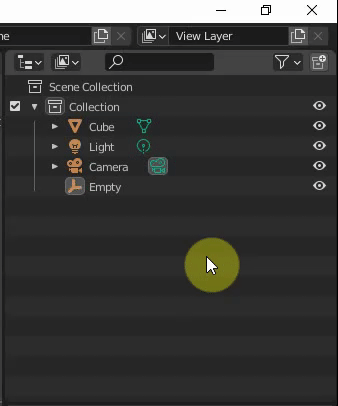
Sorry to bug you, but I found that to move a child object out from the parent I need to drag to child object to the left or right and there is no visual cue on where the object is going to land.

ezgif.com-video-to-gif

2 Likes

before the outliner, I felt this lack on blender, but I had never focused on how deep it was useful and complex, you certainly took blender to a higher level, and you gave an important note to make blender more comfortable and fun to use.

6 Likes

@jc4d: This has been discussed a while ago in this thread, and it’s a real pain in the behind when working with CAD related files or larger hierarchies alike.
I truly hope we can get some parity there in the end :wink:

I lost track of the thread already :sweat_smile:
I messed a little bit with the code (python for now) on how I think that the operator should be:
ezgif.com-video-to-gif(1)

5 Likes

Paste is done inside active collection.
In your screencapture, active collection is Scene collection. So, that logic is respected.
You have to activate collection you want to paste objects in buffer before performing paste.
Which may be useful if you want to paste it in another collection.
But if most frequent use is to duplicate inside same collection, that could be useful to have a duplicate item in right click menu or a shift D shortcut.

A camera is an object. You can add multiple cameras to your scene and choose to use them for different view layers.
View layers are layers for compositing.
You may want to see some collections rendered or absent in those different layers.
But all those collections of objects are content of same scene.

Sorry if I was not clear enough,
By “turn off the camera icon” I meant this
camera icon
i will update the post.

Yes but if there was a “duplicate” option would make more sense if the object gets duplicated underneath the selected object.

well probably we need a “duplicate” button in the menu.

1 Like

It’s amazing to see modifiers drag and drop suppport. And now when this happened, it’s nice way to organize modifiers using outliner. But with that opportunity comes wish to be able to remove selected object modifiers in outliner and this works from menu but only when more than one modifier is selected. For now it’s impossible to remove only one selected modifier instead it deletes whole object. It would be so nice to have ability to delete selected object modifiers from outliner.

5 Likes

As an experiment I changed all the outliner highlights to draw as rounded rectangles like the file browser and UI lists for greater consistency. I like it a lot and I"m curious what others think. It’s a slight thing, but it makes the outliner look a bit more polished.

obraz
left - 2.83; right - outliner branch

its subtle change and i like it, it fits roudness of current UI
and if someone dont like it it could be option to turn it off in theme like other elements does
obraz


obraz
is it me or weld icon is not colored?


I really like design and functionality of collection colors, thanks!

also addon creators would love aligned icon buttons in menu rows, thanks again!


Have you considered/planned dimming checkboxes when they are not visible like visibility rows are?
obraz obraz

8 Likes

This is a subtle but frustrating detail of the current context menu. If any objects or collections are selected, the menu entries are only shown for objects or collections. My goal for this week is to show the menu items that relate to the target of the right click. So if you right click on a modifier (with any other items selected) the modifier options would show allowing delete, duplicate, etc.

A few icons are wrong. The coloring of icons is a bit messy imo and requires the icons to be defined as a a certain type. These are small details though and will be fixed sometime soon.

Dimming the checkboxes is probably an oversight, and it would be nice to do that.

8 Likes

Hi, astonishing work, I have a paper cut. I think the “select similar - collection” operator should work the same as the “select hierarchy” in the outliner (and maybe have the same name), currently “select collection” doesn’t select nested collection.
I know it’s not an entirely outline related suggestion but its kind of collection thing and relevant for consistency, so maybe you can do it.
Even if it’s not relevant, syncing the operator (adding shift -g to the outliner) would be nice.
Still, I am not sure if it’s exactly relevant to you / this SOC.

i was working with some big scenes with a lot of collections and subcollections and noticed it would be very useful if the view> Show/Hide One level would be only for enabled or selected collections instead of the whole outliner.
image

изображение

Nice common solution for color tagging from the patch.
Are color swatches predefined or user-defined with some defaults?

If predefined, I would like to propose to place them in Hue order, avoid Value/Saturation variations and reserve some defined color for cumulative collections which shares the same objects
(like purple, which is used, for example, for cases when texture is missing).

изображение

This will be helpful for possible further viewport shading Collections coloring mode, since cumulative objects may belong to multiple color tagged collections, so they can be detected this way using viewport shading, avoiding color uncertainity.
So regular objects will take collection’s color, and cumulative objects will take that prefefined color in such viewport shading mode.
This reserved color should be out of the palette and predefinder palette should not contain color that are close to that color.

If swatches are user-defined, well, there will be such kind of a problem with cumulative objects and collections, so cumulative collections color should be user-defined as well, separately from the main palette swatches, but as part of the entire palette.

I fixed an annoying issue today with synced selection.

Before and after
parent_select_fixed

An issue with synced selection’s first implementation was that it deselected parent objects. This caused issues with drivers and bones, so the parents were selected in the outliner to ensure the objects were selected in the 3D view.

But this caused many issues with the context menu and drag and drop.

Now the parent objects are still selected, but not in the outliner. This makes the context menu behave more predictably, and fixes a few other small issues.


Bones now can be sorted by name.

One sad thing though - for now I’ve decided to put manual bone sorting aside. The way bones are stored in Blender’s main database doesn’t allow this easily with the current sorting code. I may write an abstraction to translate between the outliner tree to the flat list of bones, but for now I’m focused on other things.

21 Likes

Thank you so much. I’d say manual bone sorting is less important. Name sorting is already effing great. I’ve been suffering from that for years. A mild suffering.

5 Likes