My preference would be being able to do it with one hand only. I’m sure it varies from person to person.
When I switched to Maya from Max about 15 years ago I was shocked how more fiddly it is, how more precision was needed to select or move a vert, etc. I got used to it though, and don’t mind, neither viewport operations nor the outliner reordering. Doing heaps of parenting as well, facial modeling/rigging here, to make ends meet.
That being said, I’d take modifier keys any day over splitting the region horizontally into drop areas with different functions. On the other hand, often it’s just a matter of increasing the area for the inbetween row drop by a pixel or two to make it more convenient for more people.
Obname and meshname are incompatible, so obname can’t be equal to meshname on purpose - this makes handling linked data objects (instances) clear.
I don’t mind if developers want to use data blocks in blender. I am sure some other softwares also use data blocks, the main problems here are that they make clutters in the outliner ( although people have an option to hide them which I didn’t know about) and I found that when I export my models to Unreal for example, the objects get the data block names instead, perhaps this can be solved in the FBX exporter?
That’s because it is hard to make floating windows crossplatform.
Also, Floating windows is bad design solution - usually, if you feel need in something floationg across your screen, it means that your work is not organized properly.
So it is missed on purpose.
I agree it’s messy but I don’ t use in that way. I was thinking more like being able to use the outliner or other panels as popups, which you can quickly access and close them again. In my case I do everything in full screen but rarely I need to access the outliner so it would be convenient for people like me that want to work in fullscreen 3D viewport (which is even less messy) to have that option
@natecraddock Can we have the option to change this color in the preference panel. At the moment it’s very light and almost indistinguishable from the other colors of the interface.
Hello, I don’t know if there will be time with already all these new features, but it would be nice being able to scale the outliner’s dimensions with CTRL+MMB, like in other editors:
pty
Currently, the only way to scale it is by changing the resolution scale in Preferences, with the downside of scaling the entire interface. It would be helpful in situations with a long list of elements.
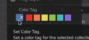
I spent 3 days trying to get the color tags to draw in a row. This isn’t supported in menus so I spent a lot of time stepping through the code to get this far. I’ve gotten stuck on the highlights (and a few other issues), and I’m not sure if the route I’ve taken is the best. I’m putting this aside for now since it isn’t a priority. Maybe some day I’ll come back to this. I’m going to chat with my mentor and other UI team devs to see what I should do here. I do think having the color tags as icons in a row is the best option. I learned lots about the UI Layout and alignment code though!
I’ve also been putting together a sort of “overview” of my project. Now that we have reached the halfway point it’s time to start refining the features I’ve written so far. In addition to everything I’ve done, I want to make a detailed plan for after the summer of code.
There have been great suggestions (we are at 450+ replies!) throughout the summer; it’s obvious that the outliner is complex and needs attention. Most of my project this summer involves adding features to the outliner, but we also need to keep the existing behavior consistent. Adding a new feature often causes conflicts with existing behavior, or other parts of my project. Here are the areas I want to clearly define:
Selection. Much of this was cleaned up last summer, but there are still a few edge cases that would be great to fix.
Context menu: how actions are performed.
Is new data created in the active collection or next to the selection?
Make actions apply to the entire selection.
Drag & drop: Consistent behavior, modifier keys, more clear drop targets, etc.
Highlights: How to indicate active, selected, active/selected inside of a closed hierarchy, searched, drop targets, etc.
@natecraddock When deleting a empty with a cube as a child, the empty gets deleted (obviously) but the cube stays in the scene. Why the two Delete operators (Delete and Delete Hierarchy) are not fused into one?
I did try Krita, Photopea and Gimp (plus the commercial ones) and when you delete the parent layer it automatically deletes all the children.
I tried adding assigning Delete key to the shortcut of the Delete Hierarchy but it doesn’t work.
HI Nathan,
I believe it is not directly related to you, but I do not understand the logic in the viewing layer, why if you turn off the camera icon
it affects the other layers (Everything else is disconnected) especially that it is also intended for render, turning off the collection also turns off things that sometimes affect the scene, plus sometimes I Want to render one object why you should put it in the collection and turn off the collection, it makes more sense to turn off the camera, for me it is very confusing.
Sorry to bug you, but I found that to move a child object out from the parent I need to drag to child object to the left or right and there is no visual cue on where the object is going to land.
before the outliner, I felt this lack on blender, but I had never focused on how deep it was useful and complex, you certainly took blender to a higher level, and you gave an important note to make blender more comfortable and fun to use.
@jc4d: This has been discussed a while ago in this thread, and it’s a real pain in the behind when working with CAD related files or larger hierarchies alike.
I truly hope we can get some parity there in the end
Paste is done inside active collection.
In your screencapture, active collection is Scene collection. So, that logic is respected.
You have to activate collection you want to paste objects in buffer before performing paste.
Which may be useful if you want to paste it in another collection.
But if most frequent use is to duplicate inside same collection, that could be useful to have a duplicate item in right click menu or a shift D shortcut.
A camera is an object. You can add multiple cameras to your scene and choose to use them for different view layers.
View layers are layers for compositing.
You may want to see some collections rendered or absent in those different layers.
But all those collections of objects are content of same scene.
It’s amazing to see modifiers drag and drop suppport. And now when this happened, it’s nice way to organize modifiers using outliner. But with that opportunity comes wish to be able to remove selected object modifiers in outliner and this works from menu but only when more than one modifier is selected. For now it’s impossible to remove only one selected modifier instead it deletes whole object. It would be so nice to have ability to delete selected object modifiers from outliner.
As an experiment I changed all the outliner highlights to draw as rounded rectangles like the file browser and UI lists for greater consistency. I like it a lot and I"m curious what others think. It’s a slight thing, but it makes the outliner look a bit more polished.
left - 2.83; right - outliner branch
its subtle change and i like it, it fits roudness of current UI
and if someone dont like it it could be option to turn it off in theme like other elements does
This is a subtle but frustrating detail of the current context menu. If any objects or collections are selected, the menu entries are only shown for objects or collections. My goal for this week is to show the menu items that relate to the target of the right click. So if you right click on a modifier (with any other items selected) the modifier options would show allowing delete, duplicate, etc.
A few icons are wrong. The coloring of icons is a bit messy imo and requires the icons to be defined as a a certain type. These are small details though and will be fixed sometime soon.
Dimming the checkboxes is probably an oversight, and it would be nice to do that.
Hi, astonishing work, I have a paper cut. I think the “select similar - collection” operator should work the same as the “select hierarchy” in the outliner (and maybe have the same name), currently “select collection” doesn’t select nested collection.
I know it’s not an entirely outline related suggestion but its kind of collection thing and relevant for consistency, so maybe you can do it.
Even if it’s not relevant, syncing the operator (adding shift -g to the outliner) would be nice.
Still, I am not sure if it’s exactly relevant to you / this SOC.
i was working with some big scenes with a lot of collections and subcollections and noticed it would be very useful if the view> Show/Hide One level would be only for enabled or selected collections instead of the whole outliner.