GSoC 2020: Outliner Discussion and Suggestions

Yup, but it’s hard to tell without testing. I definitely think it’s worth trying out as a concept though!

Ctrl+G was reserved for future use

1 Like

Thanks Nate for updating the build! One thing that I noticed trying it out, is that maybe also objects parented to other objects should have a connection line.

6 Likes

Dude - improvements like all of these on the Outliner are so much more important than some of the major new tech implementations, sometimes!

Thank you for all your work on this. You are really helping to make Blender a much more pleasant everyday experience for the users. :orange_heart:

5 Likes

I’m not sure what drove this decision for line removal, but it’s not a good one.
Instead of making the Outliner more readable, the removal of lines for parented objects is a big step backwards.
I do like the colored lines for Collections overviews when opened, but I have to object against the removal of the lines in the rest of the Outliner.

No link icon yet next to the root of linked Collections, or a visible difference between the various instanced/linked duplicates objects in a scene.
The material icon isn’t visible yet on a collapsed object, but all the other properties are there.

I really would like to know if the latter is going to be implemented this summer, so I can stop nagging about it :wink:

Yeah, I also think that parented objects now are very hard to detect.

Regarding your other requests, I think they all are on the To Do list, or anyway have met Nathan’s consensus (I also pushed a lot for the material icon visible with collapsed objects), so for them I think it’s a matter of time.
Don’t know if all of them will be addressed by the end of this GSoC, but as far as I’ve seen Nate is proceeding with a very good pace, let’s keep fingers crossed!

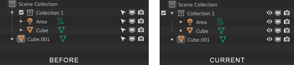
Actually, now that I look back at the 2.83 outliner, I think that the main reason I’m not convinced about the new layout is that is less understandable which objects are in the collection and which not. In the image on the right, it almost feels like Cube.001 is the object in the collection, and Area and Cube are floating objects in between.

5 Likes

Yeah, I agree. I really liked the lines, they sort of visually anchored everything. Now everything is as if it’s floating adrift!

3 Likes

Now I had and took the time:

image

While it’s odd at first, being used to those checkmarks on the left, I quite like them on the right because they immediately show on that restriction columns what is a collection and what is not.
But for this @RonanDucluzeau’s tiny colored squares would look even better

1 Like

Thanks again for the continued feedback everyone :slight_smile:

Remember this is a branch of Blender under active development. Things are broken right now not because of decisions, but becuase things have to be rewritten to add new features.

For example, you cannot activate collections in the outliner in my branch right now. Known issue and it will be fixed, but not priority at the moment.

My goal right now is to get working implementations of all my major tasks early on in the summer. I’m getting close now, with manual object sorting and cleaning up the context menu the only major todos left. In the meantime, the mode column, activation, collection colors, hierarchy, etc. are all in a mostly working state. This is the best route because many of these fixes are connected. I can work a small bit on many things throughout the week, get feedback here and from my mentor, then build on everything again in the next week.

This iterative approach is working well, but it leaves many things with small issues that will be addressed eventually :slight_smile:


Sorting

The outliner branch now has working alphabetical sort for objects and collections in addition to a new sort by object type. Creation order is what currently happens when you uncheck “Sort Alphabetically”.

image

Manual object sorting is today’s goal, here we go!

13 Likes

What happens if one tries to reorder when the view is set to sort by Creation or Type?
There are situations where you may like to see objects sorted by name, others by type, or creation order. You may still want to keep your carefully crafted custom sorting order untouched regardless.

The way I see it, ideally there would be to distinct sorting implementations, one for display purposes only other as operators for custom sorting:

  1. In the Filter Popover there would be sorting options just like you seem to show in your screenshot image
  2. Parallel to that, one could right-click a Collection or a selection of objects in the outliner and tell Blender to sort them by name, date etc, making it “permanent” and part of the custom sort order.
2 Likes

That is a good idea. I’m focused on the temporary display sort right now, but an additional operator could apply a “permanent” sort when in manual sort mode.

4 Likes

Cheers to that!

It would probably be a good idea to disable/forbid manual sorting and drag&drop when displaying in any mode other than Manual to prevent unintentional/unsaved changes.

Other option would be once the user drags or reorders something while in any of Name, Type or Creation Order, automatically switch to Manual and convert those into permanent custom sort. Although I think this option has the potentially of destructive by allowing a user to unintentionally destroying a custom sorting order without awareness.

1 Like

Hi Nate,

I may have sounded a bit too harsh in the comment. I just was stating my thoughts, but could have been more friendly.
Don’t take it as massive criticism, we all want the same thing in the end, and understand it’s all still in flux atm.

cheers!

rob

Already done :slight_smile:

You didn’t, no worries :slight_smile: I just wanted to make my current workflow clear and your comment seemed a good one to illustrate. Sorry to single you out :wink:

1 Like

I love this proposal. Hey, @natecraddock, I was earlier pushing for colored icons, and then preferred the proposal of @RonanDucluzeau which put a small splash of color on the right side just to the left of the toggle(s) and which would let one find a collection’s toggles very quickly and would break up the wall of toggles on the right. This idea is even better. If you color the checkbox icon and have it where Ronan had his splash of color, one still gets the splash of color that makes it easy to find the desired collection toggles quickly and also the visual breaking up of the right-side wall of toggle icons, but one also simplifies the center of the outliner by removing its checkboxes. What do you think? Go, colored checkboxes on the right!

1 Like

Here you go

image

3 Likes

I have two suggestions that would be helpful for my workflow:

1- Keeping objects visibility on the Outliner on hidden collections (by being abble to toggle the down arrow but just leaving everything dim). If I don’t name a collection and hide it I can’t know if it has anything inside or if I created it by mistake. And I can’t know if I threw something there without making everything visible.

2- Cutting off the left spacing which is unnecessarily huge. Heh

Ctrl + C is used everywhere inside or outside of Blender to copy things.

So, I agree that modifier is not needed. I am fine with keeping C as shortcut.
We already have ability to press M to create a collection from selection at same level as existing ones.
So, I think that C should continue to create a nested child collection of active one.

I agree but I prefer those lines not having same aspect as collection lines.
I prefer to keep what we have in official blender.
Lines disconnected of triangle for collections. Lines connected to Object icons for relationship lines.
Relationship_line

Currently, drag&drop is used to move object to another collection.
So, currently, manual type implies to move object outside of a collection and remove it inside to modify order inside a collection.
That is unusable.

We need a drag&drop used to reorder objects, first ; and then, move them inside another collection.

It’s already an improvement, but after a couple of days trying it, I have to say I definitely prefer the original outliner layout, this one to me feels less readable and with no clear relationship lines between objects/collections.

There is no hierarchy relationship between a collection and an object.
Same object can be part of several collections.
The idea is to communicate clearer what happens, when hierarchy of collections does not match hierarchy of objects.
So, the goal of shifted line is to make collections looks more like a container than like an origin.