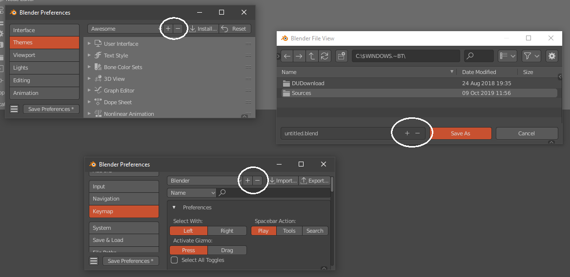
PROBLEM
At the moment the + icon its at the left and the - on the right
SOLUTION
flip position, - (decrease) should be on the left an the + (increase) should be on the right.
PROBLEM
At the moment the + icon its at the left and the - on the right
SOLUTION
flip position, - (decrease) should be on the left an the + (increase) should be on the right.
While not that big of a deal, since we read numbers from left to right increasing, it does feel flipped. In my mind I’m shifting the value over to the right while pushing the button on the left.
Or you could argue that the order is from most-used to less used, since you are far more likely to increase the suffix number than to decrease it.
Might even argue that they are in reading order, as in “plus and minus”, “add and subtract”, “up and down”. In English at least, we don’t normally say these pairs of things in the reversed order.
For me the problem is that any important icon must be the easy to click. To that the plus must be in the outside because made easy to search, identify and click. Inside you need to take care of don’t pulse the minus.
I would argue the same way. But I also agree with that the order has it’s flaws, pushing the buttons to the left of the entryfield could be a way to fulfill both claims. But then the mouse has lengthy ways. So I’d say leave it as it is.
10-20 pixels are not a long way
No I meant when we move it to the left side of the entryfield ( Both buttons ). Then the plus button would be the one that is easier to click and its on the right side of the minus button. And yes I agree 10-20 are not a long way.
The problem with that is that blender will use that -+ symbols at the right in a lot of other controls.
Yes. There should one decision about how it will be done and then everything else should align. It’s a bit gui alignment, not that much work. I just threw it in as possibility that could solve both claims. But as I already said. It’s also ok to leave it as it is.
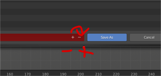
This is not inverted, it was fixed. Plus always comes first.
The bad thing about it is that those buttons are now inside of the text field, which doesn’t happen anywhere else in blender, so it’s inconsistent. Not to mention that the text fields are too big there, again, different from the rest of the software.
Very, very inconsistent.
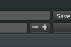
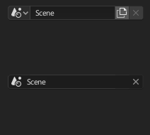
the idea is to made new controls in blender with the plus and minus inside.
Not sure if that’s a good idea. Not to mention that it’s hardcoded, no python customization. 
It is an old petition because some controls are hard to understand also for experts without experience in blender. With this type of thing devs can create better controls that are easy to understand for users
FileBrowser - + are inverted
No, they are not. Plus on the left is the correct way.
Anyways, this incremental system is obsolete, we shouldn’t need to go to the file browser to do incremental saves.
Here’s how the big boys do incremental saving:

Just a simple “File > Save Incremental” and everything else happens automatically, no extra hassle.
This is how it should be done in Blender too.
There is no correct way. I agree that in combination of plus and minus it’s quite often in the order of + - (like on a calculator to negate numbers), but that usecase is different than here. On the other hand in a 1d or 2d graph the positive space is to the right.
And if you would replace the plus and minus with right and left icons you would vote for the opposite order and put the increment button to the right side. It’s in fact arbitrary and so it’s ok as is.
But the c4d menu entry @Regnas demoed is something I’d give two thumbs up for.
christmas gift from @Harleya https://developer.blender.org/D16687 ![]()