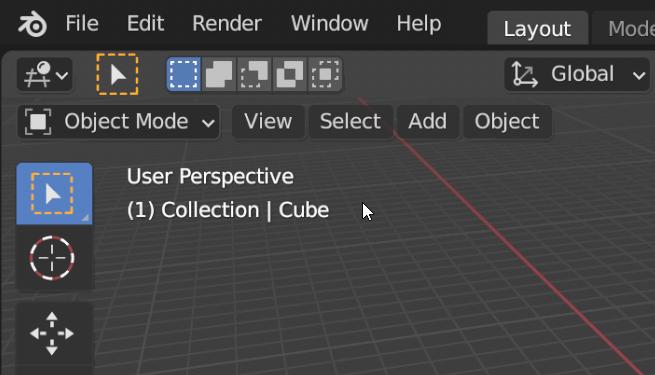
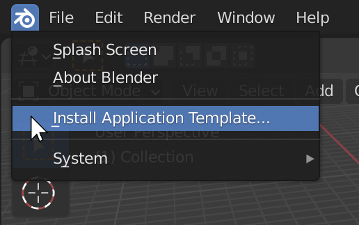
Not too long ago the blender logo at the top-left of the Top Bar was just a decoration. It later got the ability to show the Splash screen. But it now contains a menu of items:
I assert that having a menu there is non-standard and undiscoverable. I have proposed that it should not contain any items that a new or average user should need, and only contain items used by advanced and experienced users.
Pushback on this is usually that it actually is discoverable because the logo has a hover highlight, and that it is similar to the Mac OS “App” menu - although that would be in a different location and be labelled “BLENDER”.
How do you feel about the existing App menu?
Awesome! That is a great place for those menu items
Meh! I don’t care, menu items have to go somewhere
It’s mostly a platform-specific thing. Macs have a menu bar at the top of the screen, separate from the menu that is in the Blender window itself. That bar has an apple logo that shows the “Apple Menu” which includes items like “About this Mac” and “Shut Down”. While Blender is the active application that menu bar also includes an “App Menu” shown as “Blender” with a few things.
So Mac users are used to clicking on a logo to get a menu, and are also used to seeing “About” on both that Apple menu and the App “Blender” menu. As mentioned, both of those things are separate from the menu inside Blender. It is a Windows-specific preference to have “About” and/or “Splash” in the Help menu.
So my primary concern is less about what items are on each menu, but more that the Blender logo being a menu is fairly undiscoverable to a majority of our new users. Show Blender to someone who has not seen it before and they might guess what items might be on each menu, but they would not guess that that the logo is itself a menu. We all find out this by accident though, so I don’t mind too much if we put items on it that are meant for experienced users.
The never-ending non-standard way of doing things in blender is what gives it the reputation it has when it comes to UI/UX.
There’s really no reason to keep things weird. What’s the point? Unless it’s a FOSS rule I’m not aware of.
Nah, many specialized tools - not talking only about graphics - have “none-standard” ui/ux and it’s not a foss thing. It’s also not a bad thing if it works, even if it requires some learning. And with most specialized tools it does.
Blender ui/ux is pretty efficient once you learn it. Of course there are a lot of places that could be improved.
There is no standard ui, there are some guidelines - different for every platform.
If you can put it somewhere both windows and osx users find it instead of having a weird place for it,why would that not be better? This whole blender is weird and that’s good makes no sense to me.
It is discoverable and the items there are fine. Blender may be unique and "not like other software packages, but that is what makes it Blender…why do folks keep wanting Blender to be like others?
why do folks keep wanting Blender to be like others?
Nobody wants Blender to be “like others”, but just to be better. Anything can be improved, including how natural and predictable the menus and items are. This thread is just investigating whether a change is wanted and warranted. Nothing is ever learned unless questions are asked.
 Awesome! That is a great place for those menu items
 Meh! I don’t care, menu items have to go somewhere
 Yuck! That is a strange place to put menu items
 Yikes! I didn’t even know that menu was there