I think you are talking about the Node Title, I mean the Node Contents. ( eg. Check he Geo Texture Nodes ) Most have the Nodes that have the text truncating just needs a little bit of tweaks to have the text fully readable. It not only adds finesse and readability but will probably save millions of clicks and drags !!
I still think it would be worth it. The thing about these kinds of changes is that the later they are done, the more scripts and files they break. So every day of waiting does more damage. There are always only two choices: Do it ASAP or don’t do it at all. And it would be sad if we had the latter. People can always fix their scripts and old files, but bad UX is much harder to fix.
At the same time, I don’t think we should be loading more and more changes on the shoulders of this. The node socket alignment alone is a great improvement, and there’s no need to overload this task with more various small improvements. It’d be probably better to separate those into other tasks which can be discussed separately 
6 Likes
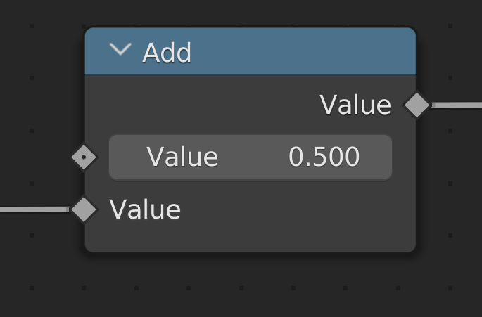
On the subject of merging collapse and hide unused sockets, I find that once I’m at the stage where I’m hiding unused sockets, I no longer actually need / want immediate access to the dropdown options.
What if hiding unused sockets also hid the dropdowns?
This would significantly reduce the size of ex: math operators, reducing the tradeoff between compactness and consistency, both in terms of the shape of nodes and grid alignment.
Edit: Here’s a mockup of an Add node where hiding unused sockets includes inputs that don’t have sockets, such as dropdowns and the clamp option.
Showing unconnected sockets is currently achievable by connecting the socket to something arbitrary (ex: a reroute node), hiding unused sockets, and then removing the connection. I often do this with values that are static but important.
4 Likes
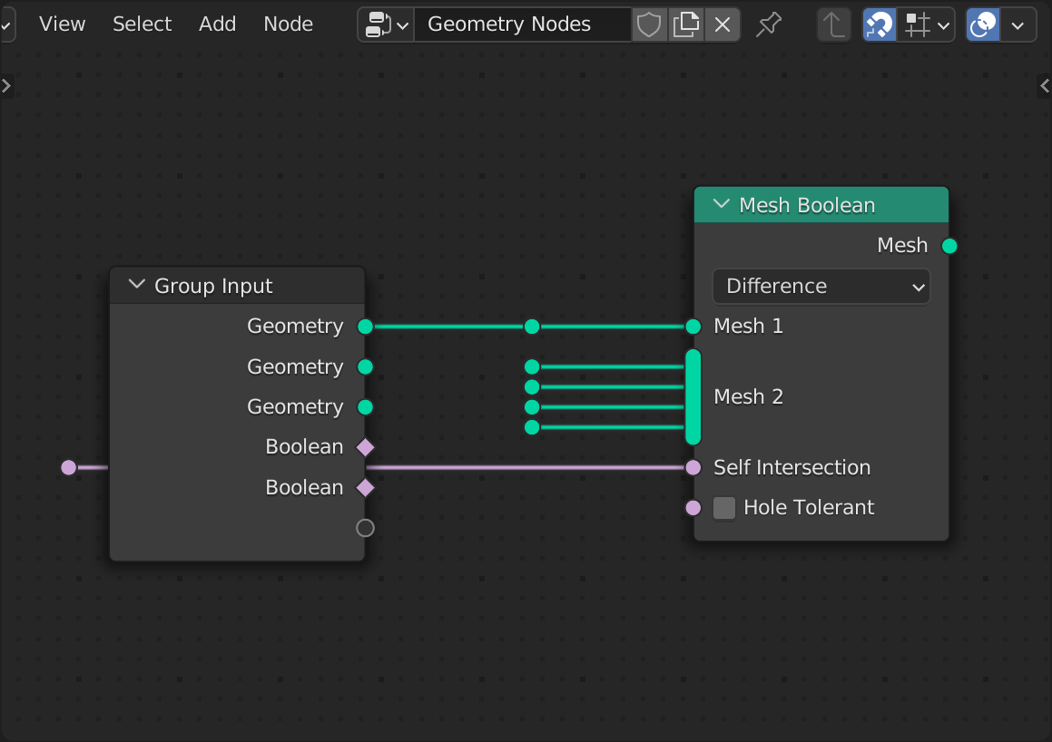
We really need the ability for nodes to dynamically add more sockets as the sockets get used up. The 1 huge socket on the join geometry node just feels lazy to me. All the best proposals to make the ColorRamp node more procedural would benefit greatly from this “add another node socket” behaviour.
1 Like
Fully agree with the dynamic socket list thing… controlling color stops or curve knots this way would open up to many possibilities.
3 Likes
First of all: I obviously don’t intend to cram every suggestion here into D14466. I think the patch now has a well defined scope and I’ll just try to figure out the details to bring it home.
So in line with that here is another thing I came up with while trying out a few solutions:
- Normal sockets are spaced exactly as they are now in the patch.
- Use a snap increment of 0.55f
U.widget_units(exactly half of the default socket spacing) - Increase the gap between links in the multi input socket to also 0.55f
U.widget_units(twice of what it is now)
Video
Screenshot
What I like:
- The multi socket grows with each link you add, like it does now
- Picking links out of the multi input is less finicky
- You can stack reroutes very tightly and being able to align them with the multi socket is pretty cool.
- The denser dot background looks nice, but I only tested it on a high dpi screen
What I’m not sure about:
- While sockets are now always aligned with the grid, as you can see in the screenshot above, depending on the number of connections in the multi input, sockets between nodes can be offset by half the spacing between two sockets.
- In isolation the old link spacing on the multi socket looks more elegant. (see comparison screenshots below)
- The multi socket takes about twice the space.
- Snapping nodes can be finicky depending on the zoom level. This is already an issue, when being zoomed out but making the snap increment smaller obviously can make that an issue earlier.

Also, while I mentioned staying on topic in the OP, I don’t mind the discussion going off on tangents a bit. Design processes are rarely linear after all and there already have been a few great points people can take and flesh out into a design.
I’ll probably add my two cents here and there once I find time.
14 Likes
In my opinion the proposed spacing looks neater or more organized compared to the current one. And not having to try 3 times to grab the correct noodle out of a multi-input would be a very welcome change. 
4 Likes
I think I like the new version better, actually. It’s close at least, so if the functionality ends up being desirable otherwise, the looks shouldn’t be too much of a barrier. You haven’t updated the patch yet so we could try it though, right?
In the meantime: do you think it’s possible to make it so that the output sockets (ones on the right side of the nodes) snap to the grid as well? It’d help control the width of the nodes, since they’re kinda all over the place by default and it’s hard to make them exactly align with others when resizing.
2 Likes
I updated the patch with the changes described above.
Conceptually this should be simple, but I haven’t looked into it, so there might be things standing in the way.
But good point, it would be nice if the width of nodes could also easily be aligned to the grid and other nodes.
3 Likes
One thing that immediately came to my mind is that both sides trying to snap to the grid might produce some erratic behavior. Perhaps limit the right side snapping to the resizing operation, if possible? But of course, I don’t know how it works under the hood so this is all speculation on my part. Thanks for looking into it!
This is a great improvement on its own already.
Could it be possible to have the snap dependent on zoom level ? So that moving nodes with snapping enabled from a certain distance would jump two grid units instead of just one ?
Thanks again for the feedback, everyone. I’m glad the multi input solution seems viable, so far!
After tinkering a bit, I think that restricting the width to increments matching the snap grid size (maybe only when snapping is enabled) would be a good approach, rather than snapping the edges of the node to the grid in an absolute sense.
I like the idea, and it would go very well with the smaller subdivisions of the node grid in the background fading out when zooming out, but it does require some thorough thought.
When transforming multiple nodes each node snaps to the grid individually - you might have seen how in an untidy node tree everything wiggles into place, when moving a bunch of nodes at once with snapping enabled.
That is fine when the distance between node locations is rather large compared to the size of the snapping increment; but when nodes are very close together it can happen that they snap to the same location.
Currently I only sometimes have this happen in practice, when reroutes are arranged very closely.
When being zoomed out would increase the snapping increment, this might happen with regular nodes, which would be really annoying.
So this kind of change would probably also require a change in how transforming and snapping multiple nodes at once is handled.
Rather than snapping each individual node to the absolute grid, it would probably have to resort to moving all nodes in increments matching the snap grid size of the current zoom level.
That way the all nodes positions relative to each other and the node grid would be preserved. Maybe that is better anyway, since it’s more predictable?
Obviously that means selecting a bunch of nodes and moving them a tad to get them all aligned to the grid wouldn’t work anymore, though we could simply have a “Tidy Nodes” operator for that.
I’ll let those thoughts simmer a bit. I’ll try to get a few patches through review before starting any more thing.
your prototype of collapsed nodes is pretty cool and brings consistency in the UI!
With the addition that unconnected sockets are hidden anyway, this could improve the readability quiet a lot
1 Like
Node alignment looks much better. Looking forward
A way to prevent a frame to disturb its nodes would be nice.
If grid-snapped nodes are assembled into a frame, moving the frame can easily offset the grid layout for its subnodes.
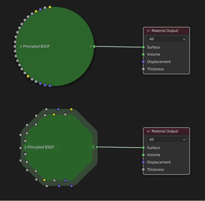
I suggest to try an octagonal shape for collapsed nodes.

Spacing between sockets is higher for same size.
2 oblique sides are clearly marking differences between inputs and outputs.
If node is elongated, spacing between inputs could be increased at will.
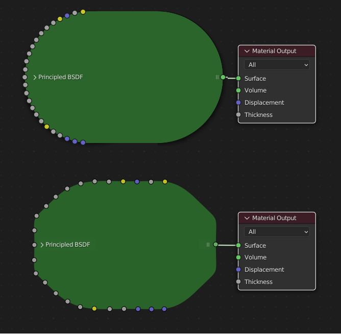
Nodes connected to inputs on horizontal sides could be placed directly above or below the node.
And reroutes nodes are still an option.
In case, amount of inputs = amount of outputs : separation could be made by horizontal sides.
In case, amount of inputs < amount of outputs : separation would be made by opposite oblique sides.
The smaller amount of sockets would determine node height.
I am sorry but all of these variants are even worse ideas than what we currently have. And I did not even think it could get much worse.
I agree that if your goal is to have only horizontal connections that is worse.
But if the goal is just to increase spacing between sockets, I think that is better.
I don’t really see a difference between lone_noel prototype and just hiding node options.
Cleaner case would always be Hide Unused Sockets as you said.
So, I am just making a proposal, in case, we try to keep unused sockets visible for collapsed nodes.
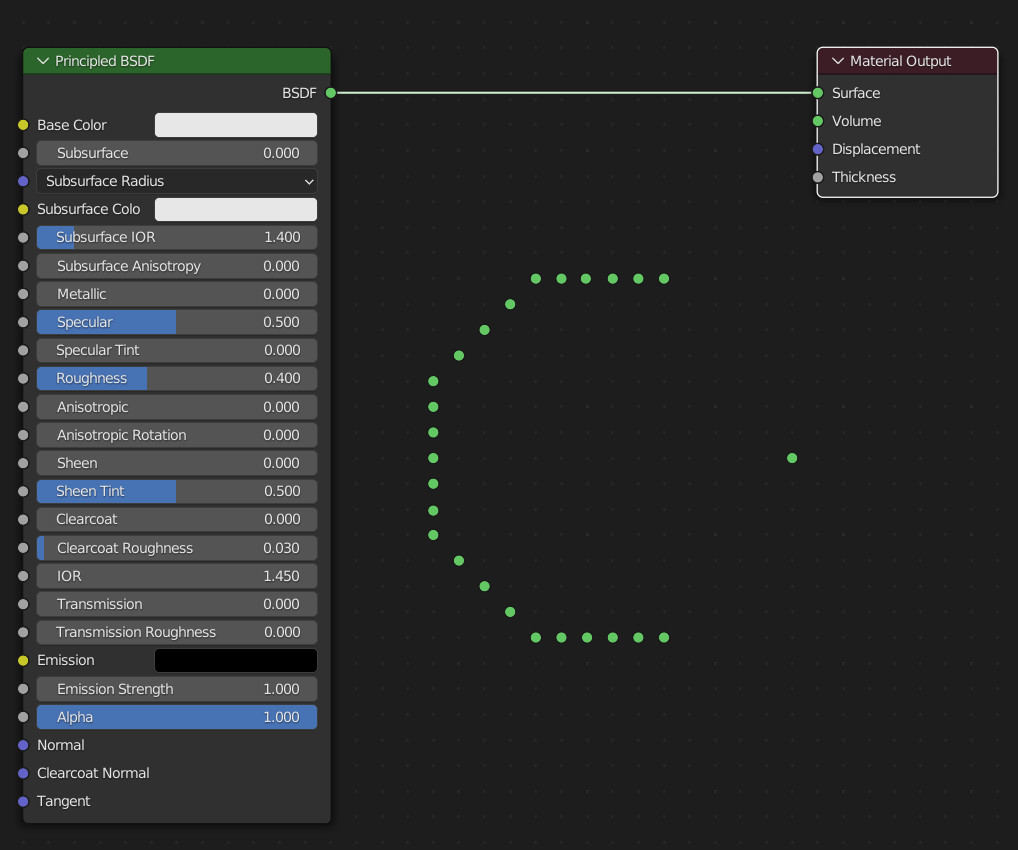
If I combine that with Claus intuition, we can end up with something like that, by using two rows and shifting a socket every 2 sockets.
What is important is the ease of access to the socket, the ease to recognize them by their index, and the reduced size of the node.
The goal is not just socket spacing, the goal is to have:
- Consistent visual language, as few unique shapes and connection directions as possible
- Socket spacing aligned to grid segment spacing vertically, to avoid slanted connections when nodes are snapped
- Socket spacing aligned horizontally, to have visual clarity
And none of these can come at the expense of any other. In your case, you are just chasing half of one requirement (having socket spacing even, while the other half is also to have it match the grid spacing), at a grave expense of the other two.
2 Likes
OK. I missed the point with my mock-ups.
But an octagonal shape could do the job.
You can put on it sockets that are aligned to grid segments.
Its sides are horizontal, vertical or can be slanted at 45 degrees.
It means that if octagon is irregular and slanted sides made to correspond to diagonal of grid units ; they can support sockets placed on dots of grid.
Sorry but is non esthetic design… the wire make a blurry workspace !