Because of our layout system and the multitude of layouts and widgets shown on nodes, the spacing of those widgets as well as the node’s sockets can vary a lot.
As a result aligning nodes and/or their sockets with each other to create tidier and/or better readable node trees can be frustrating and time consuming.
In D14466 I started working on this, and while I’m already happy with the improvements in the patch over what we have right now, the feedback on the patch prompted me to develop this a bit further.
I start by laying out the idea behind D14466, the advantages and disadvantages I found.
After that I’ll present some further things that came to my mind to address some of the things D14466 doesn’t handle, yet.
D14466
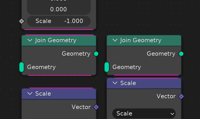
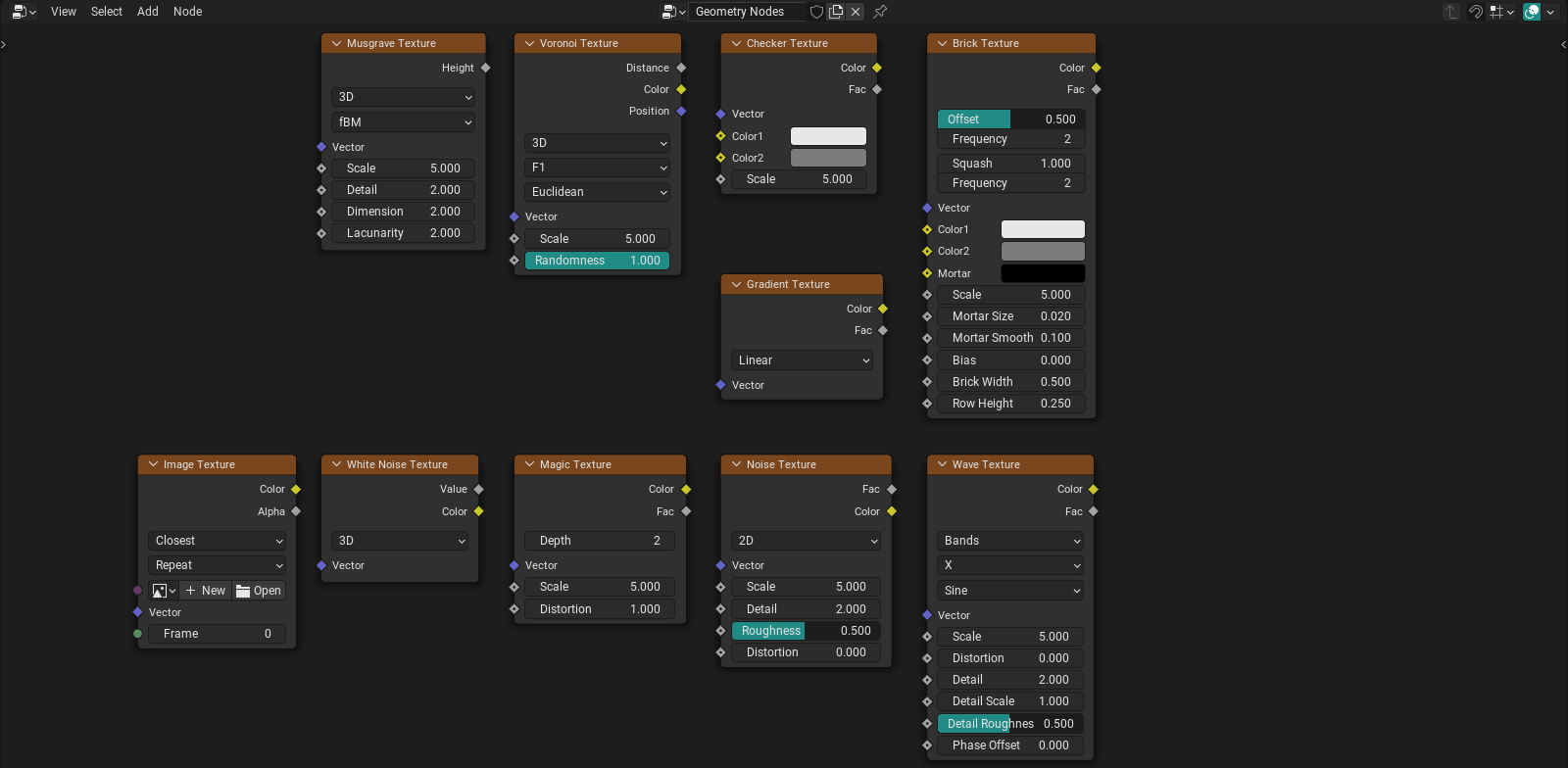
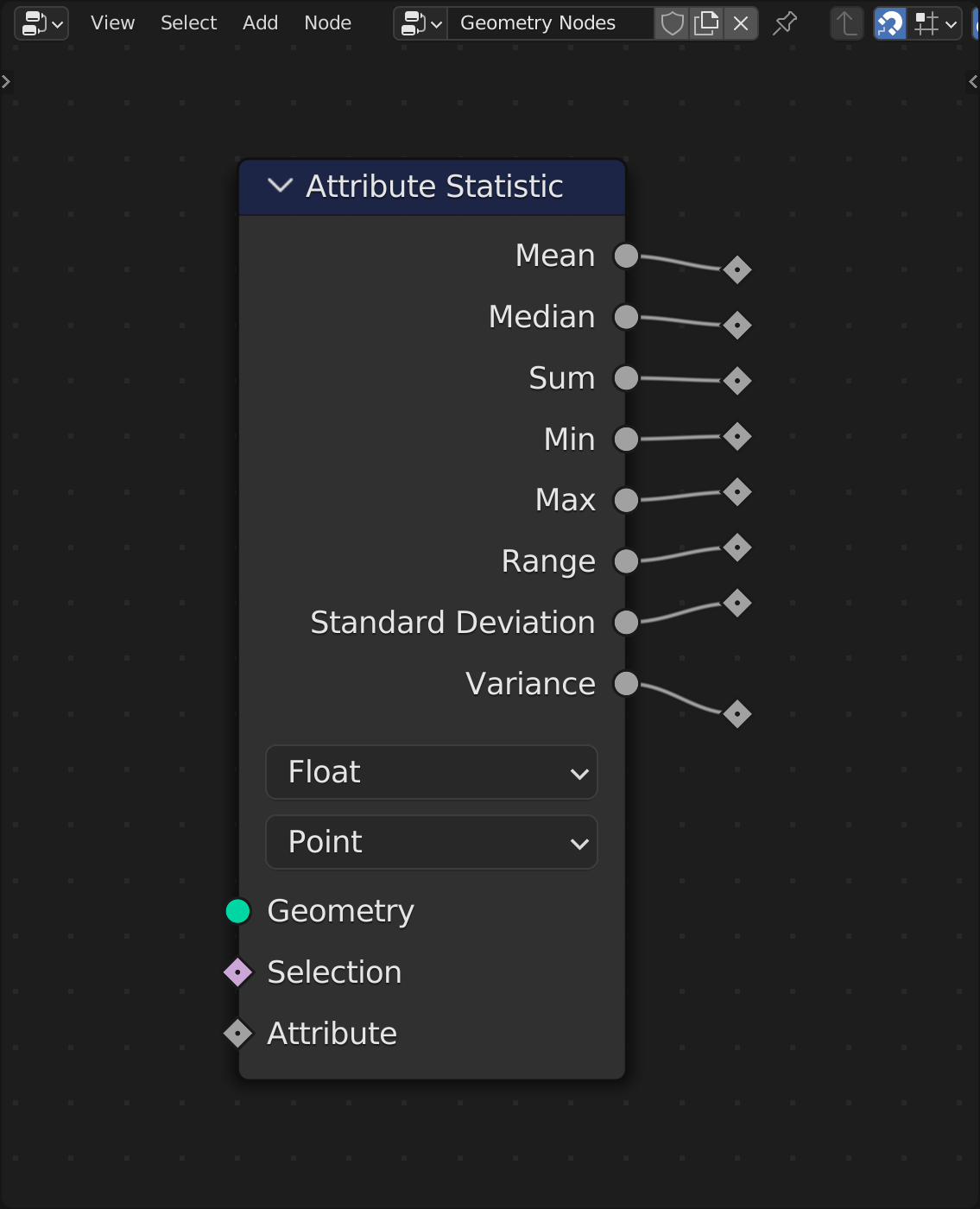
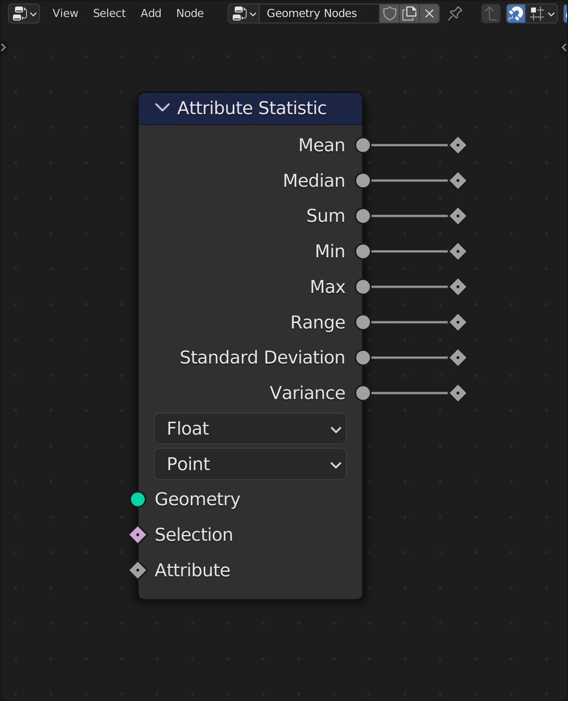
The changes in D14466 include:
- Increasing the node grid spacing to be 1.1 times
U.widget_unitinstead of 1.0 to match the socket spacing - Use a column layout for the node option widgets so they align with the socket spacing of 1.1
U.widget_unit - Offset the sockets of reroute node by half a node grid unit to align with the node sockets
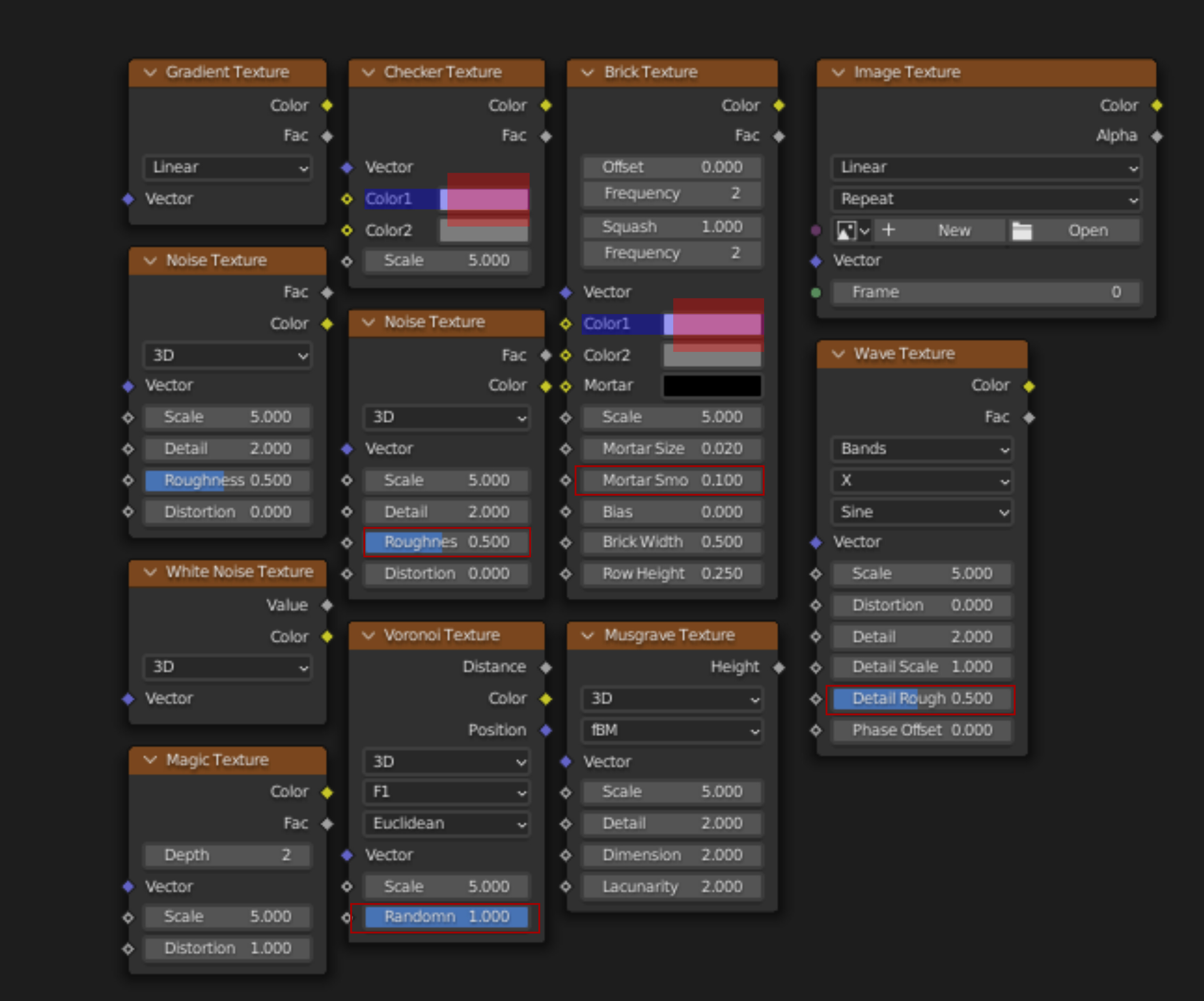
Before:
With D14466:
Things that are not so nice:
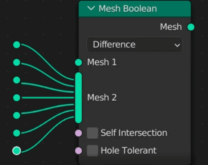
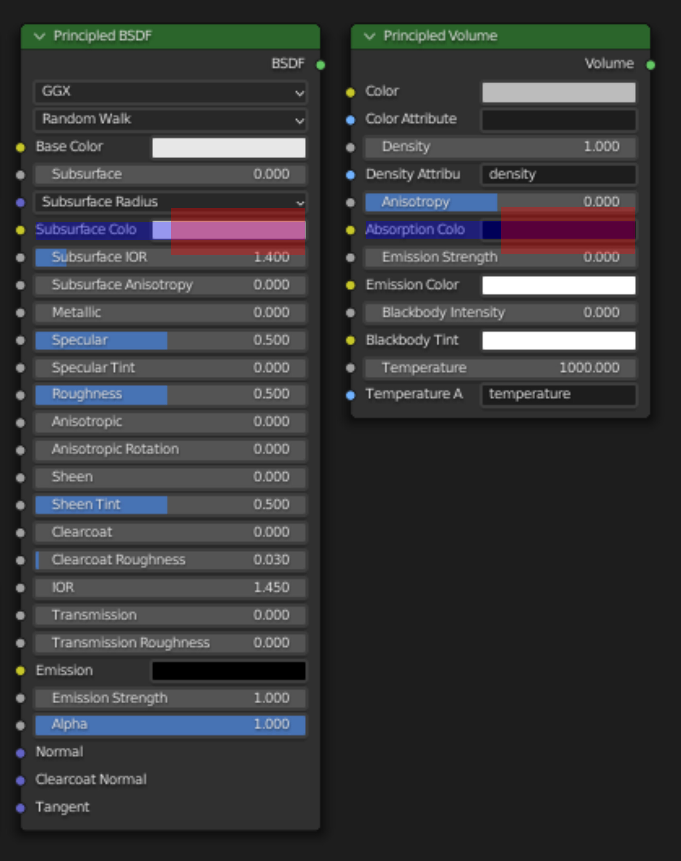
- It doesn’t really handle hidden node sockets other than center aligning them a bit better. Not worse than before, but not much of an improvement either.
- The multi socket has to grow either…
- (a) in large increments of one grid unit to keep the other sockets on the node aligned or
- (b) as it does now, often messing up the alignment of the sockets below it
From the feedback I got on D14466 (a) seems to be preferred but I’m not sure about that, yet.
These points motivated me to think about an alternative way of approaching this. I’m not yet sure how much I like this, which is part of the reason I’d like to get some feedback.
Alternative: More dense snapping grid and grid based hidden nodes
Rather than using 1.1 U.widget_unit as in D14466 we could go one level smaller and make the snap grid exactly half of that.
This would give us all the proper alignment of D14466 but would allow generally tighter layouts and link routing. On top of that with the smaller grid spacing multi sockets could also expand in smaller increments which would look a bit nicer.
The one downside I could see is that 0.55 U.widget_unit might feel a bit small at certain zoom levels making snapping more finicky.
That being said, the big motivation for this would be that this would allow making hidden nodes grid based.
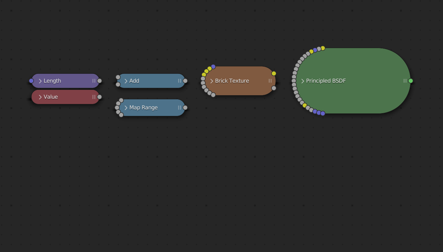
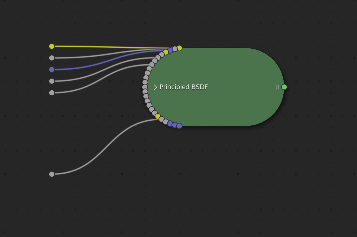
The current design for hidden nodes is very compact, but the circular arrangement of sockets doesn’t lend itself very well to any type of grid based alignment, which is why there isn’t much done to them in D14466.
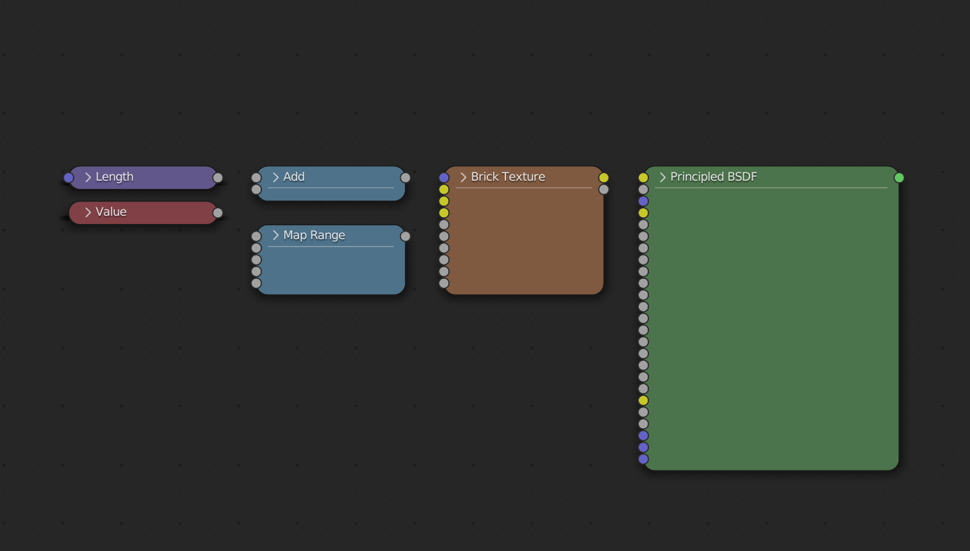
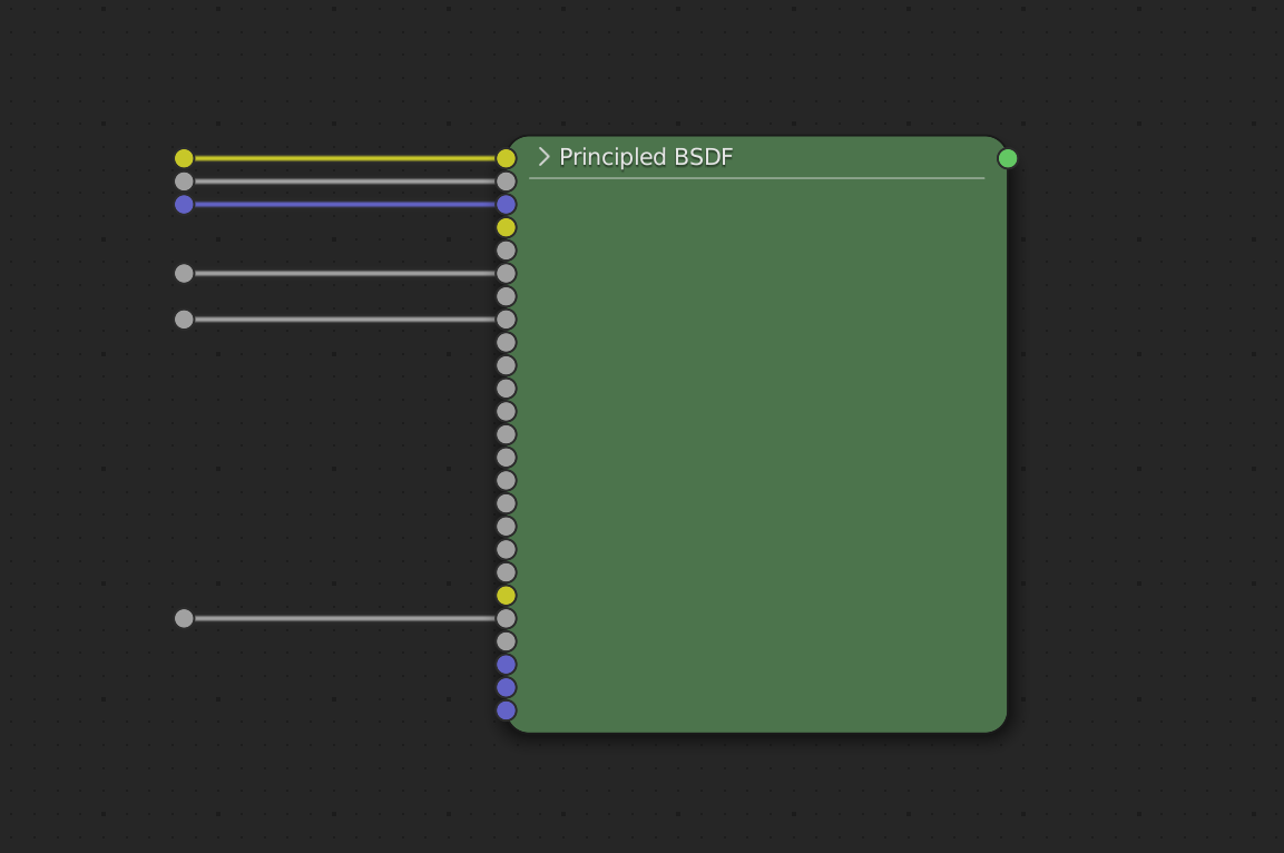
With a grid spacing of 0.55 U.widget_units, it would be possible to very compactly align the sockets vertically along the node. As a result hidden nodes would be more rectangular, which makes them less compact than the current solution but the tighter snap spacing would still allow for overall more compact layouts. Here’s a prototype showing what this could look like. It doesn’t win beauty contests, but I also don’t feel like it’s worse than what we got
Current
Prototype
More Screenshots
Collapsing
Current
Prototype
Socket Alignment
Current
Prototype
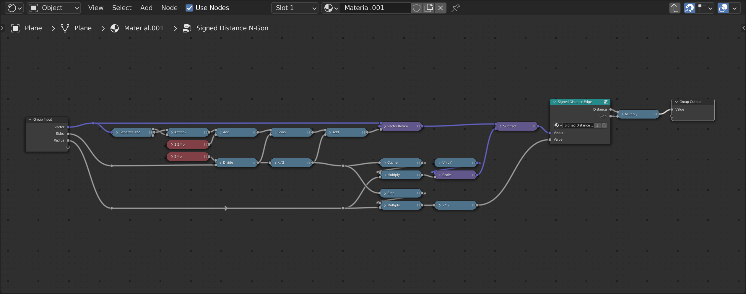
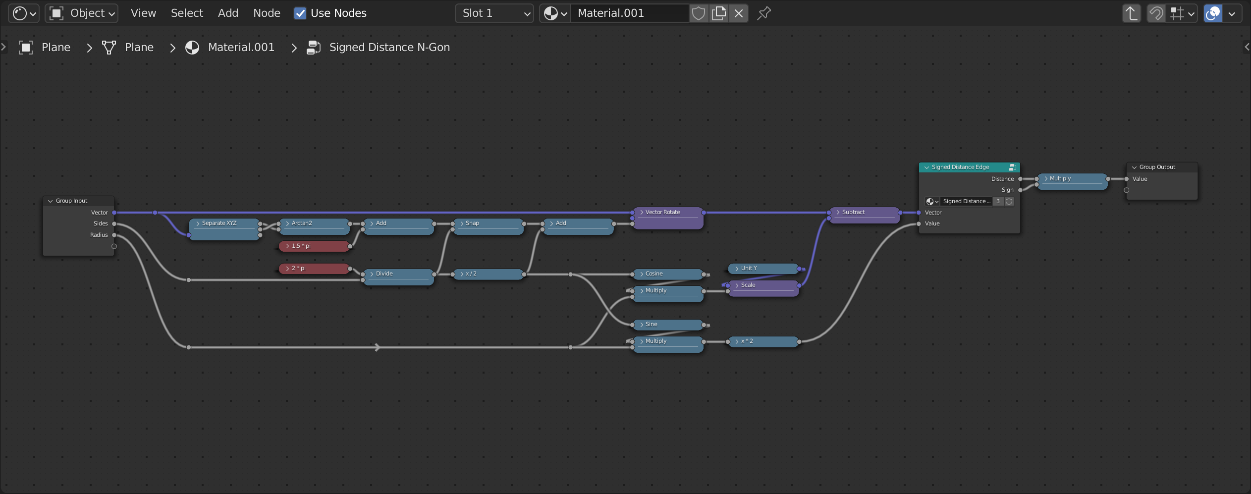
Tidied node tree
Current
Prototype
Questions
I made this topic to move the discussion from the patch itself and get feedback from users and maybe other developers before putting further work into D14466.
Feel free to share your thoughts, but please refrain from feature requests outside the scope of this proposal.
Some questions to get you started:
- Do we want any of this?
- If “yes” is the improvement in D14466 enough or do we want something more wide reaching as proposed in the alternative?
- If you prefer what’s already in D14466, which handling of the multi socket would you prefer?