Feedback wanted on node layout changes to match the node grid

I agree that if your goal is to have only horizontal connections that is worse.

But if the goal is just to increase spacing between sockets, I think that is better.
I don’t really see a difference between lone_noel prototype and just hiding node options.

Cleaner case would always be Hide Unused Sockets as you said.

So, I am just making a proposal, in case, we try to keep unused sockets visible for collapsed nodes.

If I combine that with Claus intuition, we can end up with something like that, by using two rows and shifting a socket every 2 sockets.

What is important is the ease of access to the socket, the ease to recognize them by their index, and the reduced size of the node.

The goal is not just socket spacing, the goal is to have:

  • Consistent visual language, as few unique shapes and connection directions as possible
  • Socket spacing aligned to grid segment spacing vertically, to avoid slanted connections when nodes are snapped
  • Socket spacing aligned horizontally, to have visual clarity

And none of these can come at the expense of any other. In your case, you are just chasing half of one requirement (having socket spacing even, while the other half is also to have it match the grid spacing), at a grave expense of the other two.

2 Likes

OK. I missed the point with my mock-ups.

But an octagonal shape could do the job.

You can put on it sockets that are aligned to grid segments.
Its sides are horizontal, vertical or can be slanted at 45 degrees.
It means that if octagon is irregular and slanted sides made to correspond to diagonal of grid units ; they can support sockets placed on dots of grid.

Sorry but is non esthetic design… the wire make a blurry workspace !

I think principled node is clear example where hidden (H) status is inferior to hidden sockets (Ctrl H) status (or combination of both). Trying to align 20+ input sockets unto grid in some kind of circle is not gonna save much space when compared to vertically stacked inputs.

1 Like

Vertical align is only the best solution than rounded or other things… or you can pass on design like houdini, use horizontal node

Brother you want reduce wire imput and make a good design ?

  1. change rounded minimze to vertical design.
  2. for exemple for some big node like principaled BSDF, put only 5 imputs like base color, roughness, normal maps etc… And for ALL OTHER IMPUT Stock them in hidden menu when you click on the “+” you can add an imputs… to the nodes like this :
1 Like

While not perfect I still think a vertical compact node could be much better than the current pill-shaped one.

8 Likes

I realized that condition about collapsed nodes was using a snapping at half of grid unit and closer sockets.
With that condition respected, a diagonal disposition is less awful.
A condensed Principled node could look like that.

It is a little bit less wide than opened one.
It has advantage to keep label of node, horizontal.
And it allows horizontal connections as much as vertical ones.

Edit : I forgot one Grey socket. So maybe, it is as wide as opened node.

It’s not just about finding a simple mechanical solution to the problem. A simple mechanical solution to an old, dirty piece of furniture in your office which disgusts people is to cover it by a piece of plastic tarp. Problem solved - people can no longer see the old ugly piece of furniture, but there’s now a random piece of plastic tarp thrown over some large object in the middle of the office.

It’s about finding a solution to the problem which is pleasing in both mechanical and aesthetic aspect. And that’s what you are not doing. Node editor(s) in Blender have a specific visual language, and you are constantly trying to introduce new, objectively ugly shapes into it.

Almost everyone can figure out a solution to a problem eventually, but not everyone has a proper taste to do so.

2 Likes

I will not disagree with you about the fact that my rushed mock-ups are ugly.
I let the aesthetic research to other people.

That being said. Blender is not just a piece of art to contemplate.
It is a tool for workers that are encountering ergonomic problems, too.

I am just making suggestions to help solving those problems.
Developers are free to accept them or to reject them.
I am just expecting arguments a little bit more elaborated than :
<< a diagonal, a triangle, a pentagon or an octagon are too far from a design based on rounded squares. >>

I think that addition of a simple basic shape to the design is a problematic that an experienced UI designer can probably handle.
I am just trying to stimulate other people’s imagination, here.

I like Itaro’s solution. But I think that mine could be complementary.
If by default, collapsed node if a vertical line. We could allow an expansion of it to the right as a diagonal shape for people who want vertical connections or no shifting of nodetree while expanding node.

Is there really a point in keeping all sockets separated and distinguishable when the node is collapsed, even though we can’t see their names ? I fear nodes will never be compact if we do this.

The way I see things, the collapsed state is not made for actually editing the connections -since this probably can’t be done without showing the sockets in some way, preventing any substantial gain of space- but to tidy up nodetrees once the work on them is finished. If we still want to edit connections on a collapsed node, there’s always the solution of showing a popup menu with all inputs/outputs, a bit like node wrangler does. (It works, but it’s slow)

6 Likes

I would say that, for a finished, no more edited nodetree : what is important is to keep connections mutable to inspect it.

Collapsed nodes with only one socket as input would be a little bit more problematic to identify connections to the node.
For most connections, wire colors would be mandatory to know in which kind of setting, an input node is connected.
(Actually, just color of socket is sufficient for most of nodes to allow editing.
Principled shader node is an extreme case. Most of nodes have only 2, 3 or 4 input sockets.
I am sure, you can edit connections of a collapsed Mix node without entry names.)
But the most problematic case would be, if same node output is used twice in two different inputs of a collapsed node. In that case, both connections would be undistinguishable.
So, yes, a pop-up menu would be required to mute connections.

This concept might work if there are enough input slots to cover the length of the name string.
There still needs to be a way to handle the case f there are only a few input slots.

@lone_noel, do you intend to come back to this patch at some point? I remember being really happy with it, but now trying to apply it gives out an error (“patch does not apply”)—though I don’t know if it’s because of the patch (not being up to date with master or something) or my fault. It’d be wonderful if we could get this accepted without getting sidetracked with arguments about collapsed/hidden node shapes.

2 Likes

Hey! I updated the patch so it should apply cleanly now.

I’ve been hoping to be able to clean up the node drawing function a bit more as part of this patch but so far I haven’t gotten around to it - I get side tracked quite easily.

I’ll have a bit more freetime in the coming weeks. So hopefully I’ll finally manage to move some of my patches forward.

9 Likes

Loving this. Would be nice to have it implemented in Master.

This is great. What build can I download to acess this?

Can this patch focus on the socket grid alignment snapping ( horizontal / vertical ) and the multisocket expansion please, so it can go trough.

The socket collapsing seems like another design thing that would hold this back.

That being said, I think using the latest mechanism described here for multi-sockets can be used for the collapsed nodes, ie have an autogenerated bar of reroute nodes that connect to the real sockets that shows when collapsed. Ie, just the node collapses, not the sockets. That would also work well together with manually hidden sockets ( which needs an indication on the nodes that stuff is hidden! ) I’l try and make a mockup for this later.

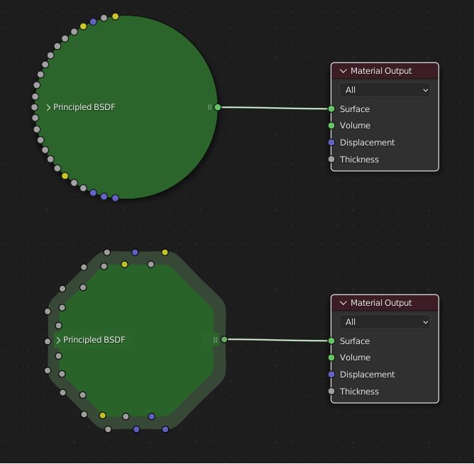
Anyway, back to the focus of the patch: have you tried aligning the sockets on the grid points themselves, not inbetween them ?

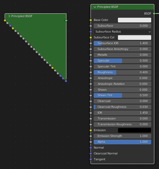
Imho the socket connections are what drives and defines the whole layout. This is the base distance everything is based on, and maybe should have it’s own pref value in styles per editor. node alignment itself should then be a feature of how the node proportion is made in relation to that grid cell distance., ie how large the header is and that. Also keep in mind there is an option to show node exec speed, this too should be relative to node / grid sizing.

the minimal socket distance defines the grid distance, horizontally and vertically, and at all zoom levels it uses the lowest level, so the relative positions of sockets in the whole tree would always be the same relative to each other, and moving nodes would not make them swim trough the grid but always in the same relative alignment. That’s why you also need horizontal socket grid alignment (input and outputs) That would also make it more consistent to copy paste a bunch of nodes around.

So this whole grid alignment seems like a base to further improve the node editing experience. It’s been on my mind for ages to mention this, so glad you took this up !

Also the minimap proposal seems related to this. ( When you have a mini-map, some use cases for node collapsing go away ) +What could also be investigated is if it’s of use to have some kind of magnifier glass box pop over when you edit nodes from a higher zoom level ( maybe with a modifier key )

Speaking of zoom, a few more levels out would be nice.

On a different note, I seem to have a bug too where sometimes i can’t select nodes, the left mouse box select gets offset somehow. Not sure why i mention it here, should add it to bug tracker i guess.

There’s so much that can be done to improve the node editing ux, and indeed a lot of time is spend in it nowadays. Editing frame size is finnickly as hell too for example.

4 Likes