Now it’s not very convenient to work with the visibility of collections. Why not do it! This will work as layers of visibility in 2.79.
3 Likes
in ease of access. I have a laptop and all the side menus are folded. Each time you have to click, open, scroll. A lot of action! I get the feeling that here people do not strive to make the blender as convenient as possible and strive to protect ready-made solutions.
1 Like
@grimakaka Once you’ve selected the tab and opened the panel, it will remain like that. You only have to do that once, the state of the panel is also saved in your project. Then you can toggle the sidebar with N. The sidebar has the benefit that it doesn’t block the view like the large drop down, you can leave it open while working in the 3D view. That’s arguably even faster, since you don’t have to click on the icon first.
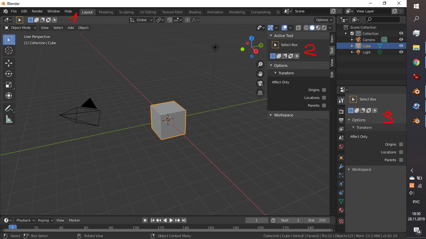
You can pick the one that suits your workflow. The Tool Settings marked with (1) in your screenshot can be hidden by right-clicking and disabling Show Tool Settings. It’s not a requirement to have the tool options appear three times, so one could argue that the redundancy isn’t good for the UI. However if you have the sidebar closed and you’re currently working on some other properties, e.g. the materials of an object, it’s useful to have the Tool Settings in the header.
unfortunately you do not understand what I want to say. you say rhetorical things that are already clear. I came here to help in the development but ran into disputes (((this is sad. I thought the blender community is different.
2 Likes
 this button is not so important but it is there and you do not protest against it
@grimakaka You’re right, I don’t understand how the concept from the first screenshot is supposed to be an improvement over the current implementation. Perhaps you can elaborate why this is better? I merely tried to explain how this is works at the moment.
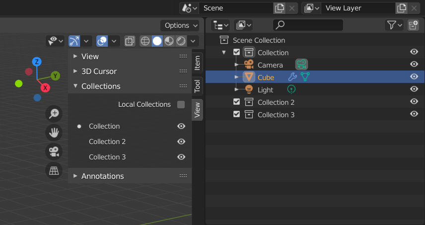
The options listed under Object Types Visibility form a fixed length list. You will never have the need to scroll there, unlike in the case of the collections in your scene.
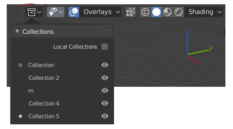
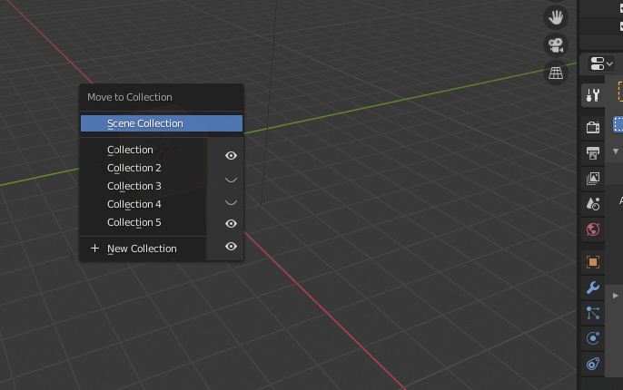
OK. this drop-down menu would provide instant work with the visibility of collections. Like it was in 2.79 with layers of visibility. just one click away. Or, you can do this by pressing M. To expand the functionality of the menu for transferring to another collection with buttons with the ability to make collections visible.
something like this
1 Like
For what it’s worth: I appreciate what you’re doing, and agree that these are improvements!
I also don’t see how the typical blender-user behaviour of ‘explaining how it works’ is helpful here.
The N panel is a mess, and while you can set it to the tab that contains the Collection panel, there’s plenty of other panels that users might regularly need, so they’ll likely switch back and forth a lot.
@grimakaka You should know that your mockup is exactly how it was in earlier betas of 2.80, with the collection being a dropdown-button in the viewport itself. At some point this was changed, and I feel it was a mistake.
I also miss a way to see which Collection(s) an object belongs to (in the viewport), like the old grid of buttons we had! The current viewport display that tells us which Collection is active is useful, but not what I’m asking for here.
2 Likes
I know that it was in early beta 2.8. I took a screenshot from there. I don’t understand why this was removed. I also don’t understand why nobody needs it and why they are trying to prove to me that it’s good now. thanks for the support.
I am confident there are other users like you who frequently use it. When it comes to quick access, you can easily have endless discussions about what is important. Everyone has a different opinion about that, based on their workflows.
They went through many iterations to clean the UI up, to make it less cluttered and more consistent. Even though they are clearly not yet finished, they still managed to do a lot and overall I was very impressed with the progress.
When changes like that take place, literally everyone has a different opinion and plenty of people feel left behind due to larger or smaller decisions. For some decisions they made, they had to revert things. It seems for many users, the collection visibility isn’t as important as for you, that’s why it isn’t as prominent anymore.
I am quite confident that many users can sympathise with you, as they also have their small nifty features they would like to be slightly different.
1 Like
Here is a solution.