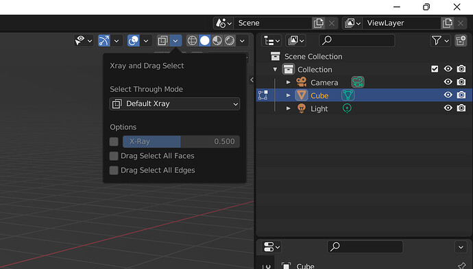
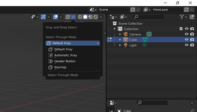
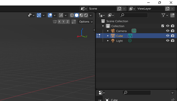
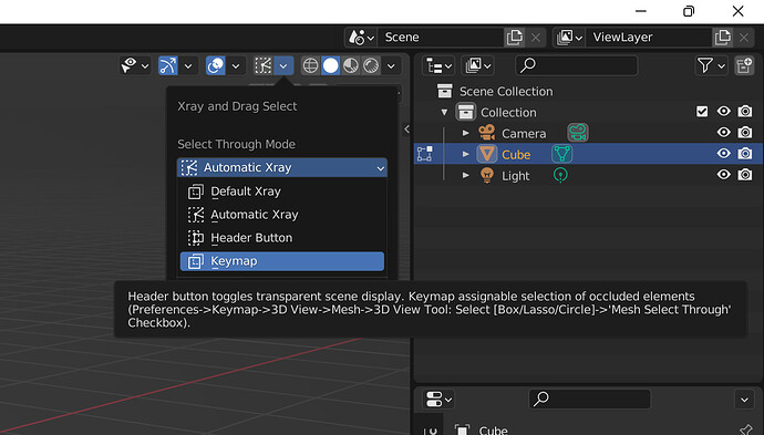
Good job, it looks like I would expect. 
Proposed icons for the Xray mode.

100% scale.
![]()
200% scale.

Good idea! I prefer the first icon with the corner of the cube, because I find the other one a little hard to read. The two dots and the line seem to merge to a blob on 100% scale. But, it does not immediately reflect selecting through.
Could you also try two parallel rectangles of which one is moved up and to the right, with connection lines and some 50% fills (like selecting a face in the back)? Or a fill in your cube perhaps?
What I’m trying to show in video:
-
What select all edges does. Edge select in solid shading makes you fully enclose an edge to select it. Fortunately this was just a simple bool check since the less exclusive edge select is what you get in xray. It only affects solid shading / select near. It’s kinda like select faces by area, but it happens in the opposite mode: select faces by facedot only happens in xray / select through.
-
Show how the icon / operator changes for autmatic xray, select through keymap, and select through button. For now I’m using the placeholder stuff for auto xray and sthru button but I plan on using the two icons @AlexeyAdamitsky made to distinguish those from the normal xray button. Sthru keymap doesn’t need a button to do anything so I am leaving the xray button there.
-
Show the xray shortcut and amount taken from shader options dropdown. I figured it makes sense to put this here, plus you have access to it in the modes that change the header button to something else
Let me know what you think. I know there was never a vote for auto xray and select all edges, but I think they are worth including. At the moment I am using one operator there that changes between xray, toggle select through, and toggle auto xray depending what mode it is in. The problem with this is you can’t dynamically change the tooltip for the header button to reflect what it is going to do.
I think I will just change the operator itself because it makes more sense to have a useful tooltip than share one keyboard shortcut for something that nobody has any real need to switch between. Once you figure out what xray mode you like, I don’t see any reason to switch between them on the fly to the point that sharing a single operator would be worth sacrificing a more descriptive tooltip. I guess when I’m thinking about it that way, there isn’t a whole lot of reason to switch what the icon itself looks like either. Still, I like the idea of the button’s icon showing you the mode it is in, maybe with the exception of select through keymap for the sake of confusion, since it would essentially be an xray button that looks different.
Automatic xray works with box, lasso, and circle, and it doesn’t shut off xray if you are already in that shading mode. I’ll make a build later so you guys can try it, once I get the new icons figured out and if there aren’t any new developments.
I really like the idea of putting most of selection related options (like enclosing edges) into one menu. It’s more clear than hiding or scattering them within existing UI.
A sidenote - you can check screencast keys addon for viewing shortcut keys during recording. Could be useful.
Yeah me too, I like it an awful lot 
Thank you so much for making these improvements!
E: Replied to the wrong person earlier.
Thanks for the feedback. I’ll keep that in mind.
Currently though we’ll go ahead with one of the icons and see if the core devs ask for any changes to the icons or completely new icon designs if the patch is accepted.
Regarding “select all edges/faces” options, there is already a patch for such feature that works based on directional selection: ⚙ D10525 UI: Directional Box Selection Although I’m not sure what is the problem that is blocking the review process.
So adding such feature to x-ray options would be redundant.
@Slowburn from the looks of it, that patch is different, because it is only for directional selection (one direction is contained the other is when touched by the selection box). That is different from having either all contained or all touched. I would regard that patch as an extention of the options in this one.
Thanks for the link I think I’ve seen a few new things in there already that might be useful for something else. I prefer being able to toggle a property with a keyboard shortcut than having to swipe left or right with my selection box, so I will keep mine as is.
I will definitely be presenting this as a work in progress, with the idea that if they are interested in it as a part of blender they will let me know what to keep and what to get rid of. I do not expect for the patch to be ready to go on the first submission unless they really want all of it.
Right now I am going through and cleaning things up. I need to move everything out of userprefs and into either rna_space or rna_scene, whichever has the xray stuff is probably where it will wind up. Also need to send the operators I have in python into C similar to the way toggle_xray works. Then once the technical stuff is done I’ll see about making the button and popover more presentable, similar as I can manage to the other ones that are already there. Then probably have a preview build, possibly that can change the way it works so you guys can see, and then a vote for which style if necessary.
Any ideas and contributions are welcome. This has been pretty fun actually, I have a nicer version of what I was going to use for my own build, and an interesting but not overly difficult puzzle to solve.
What is blocking that right/left drag select from being reviewed, I don’t know, but I think it’s a matter of triage. There’s tons of stuff in there waiting for something to happen. Unless its fixing something that already exists, or its an uncontroversial layup that’s cheap, discoverable, and easy to maintain, it probably gets low priority. I don’t know what that would mean to me, like what fulfills that criteria, nevermind a team of people that actually know what they’re doing and need to agree on some or all of it to get it approved.
[BUILD]Blender 31beta Lite Select Through Preview
[DIFF]Blender 31 Sthru Diff
Preview of latest select through, its a lite build of the beta for 31 so not for production or anything like that. The diff also has the icon svg, not sure if its needed.
4 select through modes:
- Default Xray - normal blender
- Automatic Xray - works like this addon, it turns xray on during box, lasso, & circle
- Header Button - works like kio’s patch but its a header button instead of a tool setting checkbox
- Keymap - like kio’s patch but its assignable in the keymap. You’ll need to do this yourself, read the ridiculously long tooltip I gave for that mode
Off the top of my head, the only other thing (besides making it a dropdown to change modes) is I moved the xray checkbox out of shading and into this xray/select through dropdown. I don’t think that will fly, but it’s one of those things that I think could work from a “Where’s the xray settings? Oh, its in the dropdown next to the xray button.” standpoint. It depends though, maybe it’s better to leave that in shading with the rest. I like the results so far, but the button itself doesn’t make a whole lot of sense. Its a bunch of stuff that is tool settings, but it’s up there with shading and overlay stuff in the header. I’m thankful that I don’t care too much about the look and feel, because its the kinda thing I could go back and forth forever without getting a whole lot done.
Some pictures, I put the icons that @AlexeyAdamitsky made in there, subject to change of course but I like them.
Check out the build and let me know what you think about the layout, tooltips, all that. I’ll see what you guys want to change, and then send it off for review. The patch has so many different things it does, going to be interesting figuring out how to separate the different elements and describe what each of them do.
Hello.
Made a quick test and found strange behavior with Circle selection. After selection it automatically switches between xray mode off/on in all Select Through modes (see the video).
Also I noticed some mess with “Drag Select All …” in all modes:
LOOK AT ME PLS
-
Drag Select All Edges
with “Default Xray” mode if shading active it behave as checkbox enabled (the same behavior with other modes):
-
Drag Select All Faces
in any mode behave like it always enabled
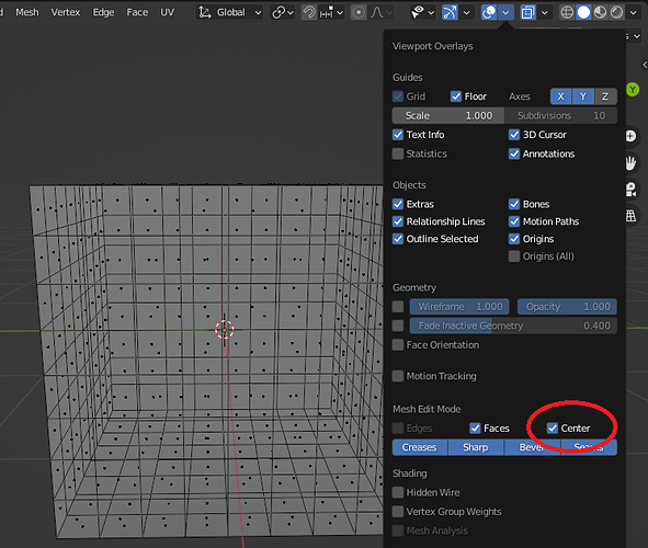
I think it should not depend on facedot on or off. Because you removed facedots from xray shading, and only way to see them is turn always on (show face “Center”) even if xray shading off.
In my opinion, it should behave like:
** if “Drag Select All Faces” is disabled - you select only faces that 100% in selection area
** if “Drag Select All Faces” is enabled - you select faces that 100% in selection area + faces that cross selection borders
Permanently removing facedots from xray shading is a bad idea.
Better to add a checkbox “Hide facedots”.
Thanks a lot, I had encountered the circle select thing turning xray on/off when it isnt supposed to, before moving the select through mode switcher from python and buttons into C and a dropdown. I forgot something there, should be pretty quick fix. It has to do with auto xray being on, and then switching modes, when I changed all the variables etc I think I didn’t make sure it checks for both things.
Drag select all edges is one of those things where it is only applicable in one shading mode. This is because Blender acts that way, at least as far as I’ve experienced. Basically, if you are in solid shading, it makes you fully encompass edges to select them. But if you are in xray, it will always select any edges you touch with the selection box. So if you are selecting through, or in xray, there is no option to only select fully encompassed edges. I wish I could figure this out, but for now it is one of those things that isn’t fully consistent. Best I can manage for now is to just word the tooltip to say what it does, it’s longer than it should be by saying “in solid shading” at the end of it because that’s the only place it is having any affect. This is a bit misleading though depending whether the user is in select through mode or not, or even auto xray, because despite being in, or at least starting in solid shading with auto xray, the feature being off will appear as if it is on. But this is just how blender is until somebody figures out how to do a more exclusive edge select in xray / select through.
Same thing goes for select all faces, one mode only where it does anything different. There’s no select by facedot unless you are in xray. I can give the option to select through by facedot, but its pretty weird. Edit: I just checked and this is also something I left in there. You can select through by facedot in solid shading, I don’t think this is something that people want so I’ll remove unless somebody says otherwise.
The facedots thing I also agree with, and made the option to have split facedot controls for this very reason. I can have the best of both worlds, where I can have facedots in xray most of the time, while also having the ability to turn them off when I want, without the need to constantly turn them on and off when switching between xray and solid as you have noticed. In my personal build I have this feature, but the voters, few of them as there were, didn’t vote for that so it is absent. Perhaps a situation where I ignore the votes? I dunno.
Your suggestion for the face select, fully encompassing them, is pretty interesting. I think I could manage that by selecting faces by edge, but I don’t know. A much simpler solution for me is to just put the split facedot controls back in, optional or not I’m not sure.
The auto xray thing you found with the circle select though, can’t believe I let that slip through, thats a big one. Thanks again.
I also agree with you and @APEC on the facedots, a persistent on/off toggle for X-ray would be great. Otherwise the usual people will complain about the missing facedots… Can’t have that ruin the patch, can we? ![]()
I could misunderstand you, but by default blender behave like this:
Box/Lasso selection and shading mode xray or solid, in Edge edit mode - it select only edges that 100% in selection. If you need to + selection borders you need to select same area again with holding shift.
I thought that “Drag Select All Edges” will behave like default+shift hold on same selection
I will sum up my thoughts. To not mislead new users and please advanced users,
my vision is simple, regardless of shading (xray or solid):
- if “Drag Select All …” is disabled - you select only that 100% in selection area
- if “Drag Select All …” is enabled - you select that 100% in selection area + that is cross selection borders
Plus new checkbox “Hide xray facedots”.
And cherry on the cake, my most cherished desire:
“Ignore backfaces” when “Backface Culling” is on.
Whoa you’re right, and you didn’t misunderstand me. I gotta go look at that script again when I wake up. From what I remember there’s 2 modes for edge select, as opposed to 3 for faces, and for some reason I was sure that in xray it only does the select all edges thing. I wonder why 
At this point I’m going to have a really thourough look at normal blender to be sure about face select as well. I did try a few times over the last 1 or 2 years messing with this to get face select more consistent, but who knows maybe it actually is like edges and for whatever reason it went over my head without realizing.
And cherry on the cake, my most cherished desire:
“Ignore backfaces” when “Backface Culling” is on.
Explain what this means a bit, video/pictures would be great, and I’ll try to figure it out. I kinda remember something from a long time ago about this.
I got the circle select / auto xray working correctly. Also have edge select, fully inside works in xray / select through now. What an eye opener. This whole time I’m thinking edges were just weird, kinda like the facedot select where it only works in xray and not solid shading. I was assuming it was like facedot select, where its an either/or thing, but edges work in 2 passes. First pass does fully inside, then the second pass does whatever else regardless of the 1st pass being done.
The original select through works by always doing the select all edges thing. It even has a comment about it always doing an intersect and not fully inside. I’ve read that comment a dozen times without thinking about what it actually meant. I’d see the comment and think to myself, ok great just do your thing and select stuff, thanks.
I’ve made sure that facedots are the way I was assuming and it does seem like they are unused for drag selecting in solid, and forced to be used in xray. Not the biggest deal, but I’d definitly rather be wrong and have a good result like the edges fully inside thing.
there is a big thread on bugtrecker but I will make visual presentation here also:
Summary
simple one mesh and need to select only sphere edges/faces (verts would be great too)
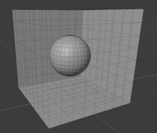
I like this video mockup from Chris Kohl
https://dev-files.blender.org/file/data/yrmpjou5auybrqkdb6tq/PHID-FILE-4ghqz2c5lxne3nput4b5/Example_Backface_Selection.mp4
But don’t waste your time on it.
Edit: I got select faces fully inside working, you can call the same edges fully inside function and then do a
EDBM_selectmode_convert(vc->em, SCE_SELECT_EDGE, SCE_SELECT_FACE);

EDBM_select_less(vc->em, false);
I’ll see how costly it is tomorrow and look into backbuffer sometime after
Its interesting enough, I really doubt I’ll get anywhere but it could be fun to spend a couple hours looking around. I almost always find something useful or neat whether I get the intended goal accomplished or not.
Seems like step one is, ignore faces with normals that aren’t being drawn because they’re facing away from the camera. The viewport knows how to do this and not draw them, so there may be some way that’s easy enough for me to figure out to use that for selection as well. That would at least give a sortof halfway there version. How to get all of the inner sphere, including parts that aren’t seen? Maybe one of those, select all contiguous edges or whatever things. How to not get any of the outer cube, meaning the camera facing normals on the far side, without also deselcting anything on the inner sphere? No idea.
I had to look at that video a couple times to see if I could figure what he was doing in the second half, and I eventually tracked down that post in that thread:
I cut the cube in half and then halfway through the video I turned on wireframe viewport display on the front half to make it look like it was in edit mode, then deselected the front half so only the back half was actually in edit mode.
I was thinking wow, what is he doing that I don’t understand ![]()

