Decoupling x-ray and limit selection to visible

This happens because of retraining - when brain rewrites motorics to spinal cord.
When motor skills are finished this is made automatically and take no efforts.

Blender selection system benefits on irregular meshes, where you have to perform even more complex steps, and where select through concept fails.
This means that it supports a wider range of workflows, so you learn a single approach that fits everything, avoiding such kind of retraining.

Hello !
Personally, I cannot properly use blender without this feature.
Fortunately this addon is perfect for my needs

As the addition of such a function natively in blender does not force you to use it, I am quite surprised that this topic still gives rise to such debates.

5 Likes

I am confused. How does the addon allow you to select faces by intersecting their area rather than by facedots? I thought thatā€™s something which can be implemented only at C++ level.

The facedots are still displayed but the selection can be done anywhere on the face. Itā€™s an option and it can be changed in the addon preferences. The addon is free so you should try.
I really love the auto switch to xray. I think itā€™s a better option than the traditional way of blindly selecting through the object.

1 Like

I tried it quite a while ago, but it didnā€™t work. At least nowhere near as good as the patch. So I just have to make myself a version of Blender with the patch every time a new one is out. I also canā€™t use vanilla Blender anymore.

Too bad it didnā€™t work for you.
Even if it works for me, I would appreciate a native solution.
I hope the developers wonā€™t let us down for too long.

Yes, it is not a problem to get used to any kind of realizations with heavy limitations like that to perform limited range of a workflows.
This method even disallow to aim properly - you see your mesh structure only when you started selection - so it also fails at irregular topology.

Let addonā€™s author join all the geometry from his demo video to a single mesh and this will end up such a selection approach.

still after 3 years no solution,
there is already topic I explain it :

another topic :

each time when I ask this to developer they simply say use xray mode.
the topic until now active which it show how this simple option is a big thing for 3D Artist.

3 Likes

https://developer.blender.org/D6322
oh so its already ā€œAbandonedā€

its kind sad but appreciate all hard work.

Kio (whose usename kinda looks like yours so you got my hopes up a bit) made a patch that is the basis for myself and a few others to have select through functionality. If not for his work I would probably be using an appreciated, though not as good, addon to detour around hitting the xray button.

He very graciously made that patch, and at some point it was set to abandonded by him or perhaps automatically from inactivity or something. None of my business why, but Iā€™d like to think heā€™s busy doing something he enjoys.

Besides this, you have all the work the developers have done. Whether you agree with every single decision theyā€™ve made, it deserves a little better than that. I hate to play internet janitor, but sometimes the collective ingratitude regarding blender is too much.

2 Likes

No donā€™t mix me with kio I didnā€™t know the whole story between you and kio.
I just visit this after one year though.
and saw it was Abandoned.
its kind sad to see abandoned, whoever help develop this I appreciate it, but to be not part of blender for whole 3 years, can summary ā€œfor meā€ that cant be implemented in blender at all.
its still not the end of the world but still kind important.

1 Like

The patch was abandoned because all ever came out of it was a huge discussion, and no clear way forward with it. If I recall correctly one of the main arguments was like ā€˜in blender you always see what youre selectingā€™.

There were a few other thingsā€¦ but the topic just became a huge mess, and I felt it would never converge to a decision.

I still think blender should add this option, just as a simple bool flag on the active tool would work nicelyā€¦

7 Likes

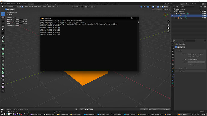
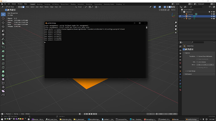
Oh wait, nevermind, I just realized looking at the screenshot I made that it was in vertex mode. Of course itā€™s going to be the same speed. Sorry I didnā€™t notice, itā€™s kinda hard to tell the difference once the mesh is that dense, got my hopes up. Still needs to be rewritten for Select Face by Area to be fast, what a dumb mistake, I was wondering what magic wand the devs had waved for BKE_mesh_wrapper_ensure_mdata(me); to be cost free. Iā€™d try to ninja edit but itā€™s already too late :clown_face:

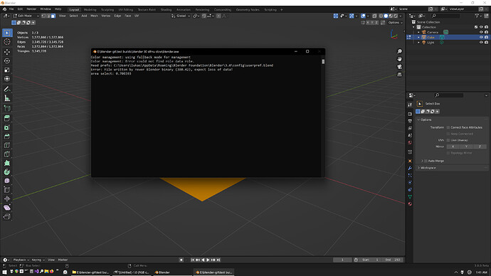
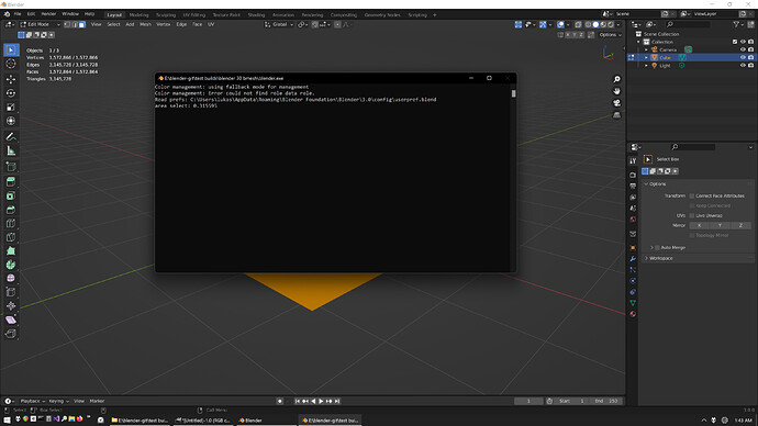
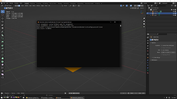
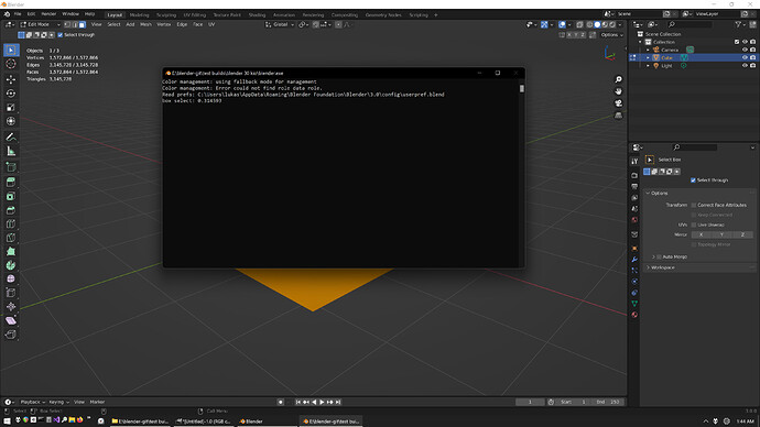
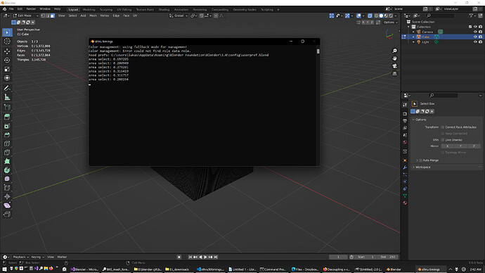
Anyways, hereā€™s the actual results, the one that matters is the first one, it is slower by quite a bit in Area mode (0.7 seconds vs 0.3) because it has to copy the entire mesh. I think additional selections are the same because itā€™s in memory or something.


Iā€™ve also changed the way my additions to the patch deal with drawing the header button. The last build I did was pretty hacky and more inefficient that it appeared, but harmless enough to not really notice. So much so that I had never bothered testing how much it was costing. Long story short, I made everything user prefs rather than tool settings to fix this. If you are using Kioā€™s build you donā€™t need to worry about any of this because it doesnā€™t have a header button to draw.

More info:

Blender doesnā€™t like checking a toolsetting bool every frame, so it acted a bit funny as far as not redrawing the viewport header when changing a tool setting or switching tools. But my select through viewport button needed to check these things so it would know whether to display the button or not, and if it was there, to draw it as either depressed/highlighted or not, again, depending what tool and tool settings were active. Because I was checking a tool setting bool, the state of the viewport header would be behind the times as far as tool(settings), and essentially show the user the opposite of what was going on:

If select through was on and then turned off by keyboard shortcut, the button would still be lit up, because it hadnā€™t redrawn itself yet. But once a selection was made or the mouse cursor left/entered the viewport, it would finally redraw itself properly. Useless.

So what I had done is change wm_draw to redraw the header every frame if the button was enabled. Basically, I made an assumption that checking one kind of bool is the same as checking any other, and since everything was using ToolSettings bools already, that what I was doing. The only way I could get the viewport header to redraw itself every frame without complete screwing up the view tabs and file menu by essentially hyper-drawing them into an invisible state, was to tell wm_draw to only redraw header areas that were also designated as overlapped, because only the viewport header was both a header area and overlapping something else.

But 3.0 changed the viewport header to not be overlapped anymore and it broke my precious hacky implementation of a ā€œsmartā€ button. This was for the best though because it forced me to have a closer look at everything, and once I got it all working again, I looked at the cpu usage for the debug build inside Visual Studio, and saw that when the header button was enabled, it was using between 3-7% of cpu. Iā€™m assuming this scales based on whatever cpu is being used, and for a 5800x to be using nearly 10% is definitely not insignificant, especially for a stupid little header button to light up or not for some select through visual feedback.

This is because tool setting bools are costly to check compared to user pref bools, probably for good reason but I have no idea. Solution was fortunately easy enough, just switch from tool settings to user prefs, and everything is back at 0% as far as Visual Studio is concerned, which is good enough for me. I could have kept some of the stuff like Face Select by Area in Xray as a tool setting because it has nothig to do with the button state, but Iā€™m going to keep everything in one area unless someone really needs to assign these two or three things to keymap.

Forgot I was in Vertex Mode and made this post:
Ok so seems like good news as far as not needing a partial rewrite for speed/efficiency. From what Iā€™m seeing select through is the same speed as vanilla xray like it was pre 2.83 or whatever version that was where select through face by area (as opposed to by facedot) got slower from needing BKE_mesh_wrapper_ensure_mdata(me);

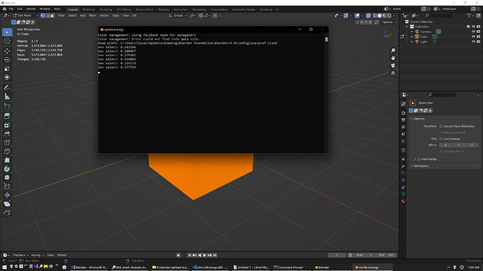
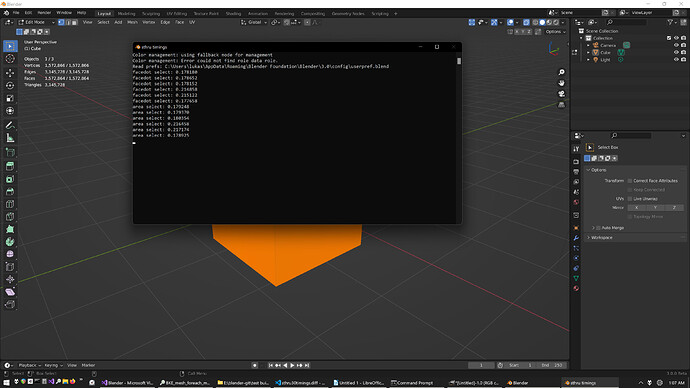
Hereā€™s a quick Lite build test I did. The vanilla build is the same besides adding a time printer to view3d_select.c


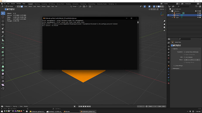
This is a 5800x cpu selecting a cube thatā€™s been subdivided to 1.5 million faces in a Blender 3.0 beta Lite build. Low poly mesh act the same as vanilla as well. The first 3 and the last selection were made without having anything seleced. The 4th and 5th selection were made without deselecting the 1.5 million faces, so it adds that extra bit of time required to deselect.

If you want to see whatā€™s up grab these diffs, build them both (I just did Lite because itā€™s much faster) and compare, if it ainā€™t what it seems and you got different results between the builds, let me know:

[Diff] 3.0 beta VANILLA timings
[Diff] 3.0 beta STHRU timings
5 Likes

really great work, I wish I can try it but I didnā€™t find a way to how to build it.
all I hope the dev start to implement it to blender or at least become as addon.

[BUILD] Blender 30 Select Through
[DIFF] Blender 30 Select Through

Select through by face area is faster.

Viewport header button is efficient now.

Optional Keymap control.

Got rid of Select Near Xray for consistency.

Renamed ā€œSelect by Face Area in Xrayā€ for clarity.

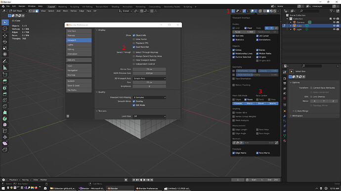
  1. Viewport Header Button, right click and assign it to a shortcut, lights up when itā€™s on
  2. Dual Face Dot - separates facedot display for xray and solid
    Select Through Keymap - can use keymap instead of the header button shortcut
    Always Select Face by Area - face select by area when facedots are on
    Hide Viewport Button - Hides the button in the viewport header
    Independent Control - Box, Lasso, & Circle retain their own Select Through state
  3. What Dual Face Dot looks like

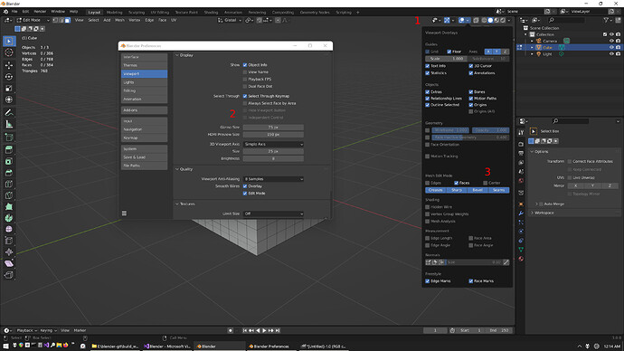
  1. Header button goes away when Keymap is on
  2. Non-applicable settings will grey out when Keymap is on
  3. Vanilla facedot

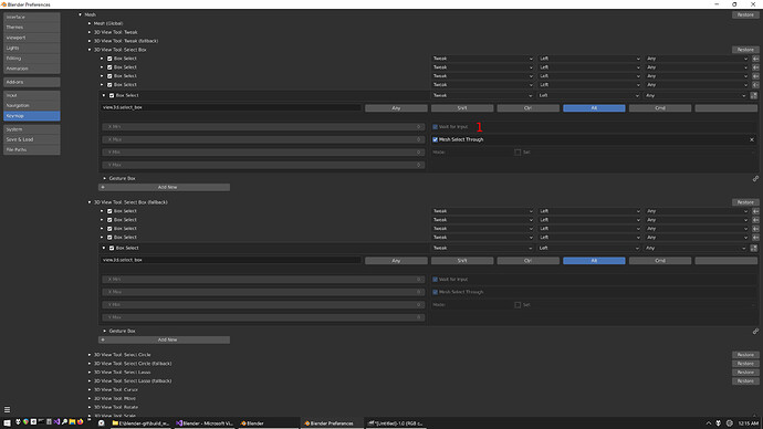
  1. Click the checkbox next to ā€œMesh Select Throughā€ in applicable keymap items if you want to try keymap control.

More detail:
Somebody asked about keymap a while back, and since I had already done that a long time ago, I put it in as an option. I thought I wanted it, but the more I used it, the more I felt like I would rather toggle select through on an off with a single keyboard button rather than doing alt-drag or similar every single selection. This was also before I figured out Independent control, I thought keymap would be a straightforward way to get that. On one side you have ergonomics and alt-drag for something else, and on the other you have an additional keyboard shortcut. I understand why somebody would want keymap control, or to at least see if youā€™d rather use it, so there you go.

To notice the speed difference between vanilla xray select and select through by face area would be quite a feat. At least according to what the numbers are telling me. I wasnā€™t content with that half of a second it used to take for high poly (1.5 million face) meshes, but I was willing to deal with it for better workflow. Now itā€™s virtually identical. You are looking at an extra quarter tenth (0.025 seconds) for select through by face area to deal with that same high poly mesh vs vanilla xray.

For the sake of consistency, I got rid of Select Near Xray. Not like it is very useful anyways, far as I can tell. Until somebody figures out select near by facedot, I cannot offer full constency of drag selections in regard to facedot vs face area behaviour. Right now I think the best compromise is to have selection be dynamic by default with the option to always use face area. Blender has this inconsistency where, despite having facedots on, it wont use them for drag select unless you are in xray shading. I donā€™t like the idea of select through by facedot when in solid shading, but at least it makes sense from both a visual and consistency standpoint. Select near by facedot isnā€™t that useful either, but at least it is somewhat intuitive compared to selecting through by them. Since I canā€™t do select near by facedot, thereā€™s just more inconsistency introduced by having a select near by xray option. Its unfortunate I canā€™t figure it out. As unimportant as it is, especially when vanilla Blender has these little inconsistencies, I would like to get that working in the future. Just typing this out makes me sleepy, really splitting hairs here.

E V E N M O R E D E T A I L :

Alright so I finished rewriting this to be faster. I thought I needed to have a really good understanding of whats going on in order to rewrite this thing, but Iā€™m living proof that you definitely do not. If I knew it was essentially just renaming a few things I wouldā€™ve spent the extra couple of days playing around with it last year.

Either way itā€™s pretty good now. Its basically the same speed as vanilla blender. For me, an xray selection of 1.5 million face cube in vanilla blender takes ~0.275 seconds. With the slower version that uses Mesh data, select through by face area takes ~0.7 seconds.

The rewritten version that uses Bmesh data, whether it is the simple and efficient Kio version, or the latest monstrosity I have created that has all the previous features + optional keymap control, they all take ~0.3 seconds.

So now instead of an additional half a second, its more like a quarter of a tenth of a second. Well worth it, Iā€™m not qualifying at Monza or anything like that :wink:

These times are based on a Lite build of Blender 3.0 release with a 5800x on Windows 11 rolling with ExplorerPatcher while gimp and foobar2000 are open, just to get ridiculously technical.

Want to take her for a spin? Try these out and see for yourself. Vanilla and slow versions are in my previous post. Iā€™ll update with a full build of my latest additions and a quick description.

[Diff] Blender 30 sThruBmeshKeymapTimings
[Diff] Blender 30 kioBmeshTimings


4 Likes

Hereā€™s vanilla 3.0.0 with Kioā€™s original patch for everyone who just wants select through without any UI clutter nonsense: Blender_3.0_SelectThrough.zip - Google Drive

1 Like

Really nice work optimizing the performance. Canā€™t really feel any slowdown now, even with heavy objects.
Only issue I see now is that ā€˜Always Select Face by Areaā€™ option is in the preferences. This is a setting you might want to toggle more often, depending on the topology of the mesh youā€™re working with, so having it in the preferences is a bit inconvenient. Tool Settings in the Properties panel would be a better location.

Do you plan to submit this as a patch eventually? Finally getting a native support for select through in master would be a big improvement.

I can try to explain the issue.
Technically, the problem is in combinatorics.
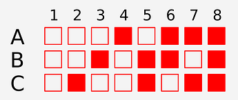
The amount of options has a property of a combinations, which can be calculated by 2^n formula.
For example, if your system has any 3 options that influence the system behaviour, the resulting amount of combinations is 2^3 = 8

Visually:

As a result such a system has 8 different behaviour states.
The more options you have to control some system, the more possible states it has.

If your system has 4 options, it has 16 possible states to keep in mind, control, compare, and reverse engineer (to understand which desirable state you can reach with which exact combination), resulting in a low handleability.

If some system options are also scattered across the interface, such a system has an extremely high entry threshold because of a low discoverability.

Users naturally feels that, but it is usually hard to express in words to provide proper feedback.
Hope this clears up a bit.

You got it, Iā€™ll wait a week for any other requests or problems and throw it into another build. As far as submitting for official review, sure why not, but I donā€™t think itā€™s necessary. I said before that if the developers want select through they arenā€™t waiting around for anybody to do it for them. They have their own plans, or no plans, for select through. But I donā€™t know how they do things so my assumptions could be way off.

Either way, Iā€™m fine with doing what Iā€™m doing. Providing you guys with a build and diff 3 or 4 times a year is trivial. Least I can do when the developers have done so much, and people like Kio have done what they do.

@1D_Inc I know what you are saying, but what I am saying, is that we are talking about a guy who has a really miserable personality. Heā€™s shown heā€™s incapable of posting something without complaining, arguing, or in this case taking shots at me for having the audacity to give people some more options. Not for nothing, but Iā€™ve done it in a way where the button can be hidden. The only thing you would ever see is in the user prefs.

Even considering that, I try to be accomidating and provide him with a faster version of just Kioā€™s original patch (itā€™s a diff in that post) because I knew heā€™d want that. He still canā€™t help himself from taking a shot at me :laughing:. I then try to have a little fun with him by pointing out heā€™s the same old curmudgeon in spite of having very little to complain about. Heā€™s at a point where he canā€™t even handle that, flagging the post like itā€™s some big deal. Honestly, what else can you do with the guy but have a little fun at his expense, while staying within the rules? He got his own thread locked with the incessent whining and bickering with people who dare to use Blender slightly different than he does. Credit where credit is due though, he did manage to compile without coming here crying about it this time, and threatening to ā€œquit doing Blender for a livingā€.

Anyways, regarding what you are trying to say, I hear you. There are more options than absoultely necessary. Iā€™ll figure out who on the team to ask before submitting this thing, and see what they want, or if they are even interested in looking at it again.

As far as I know, itā€™s pretty straightforward. From the user side itā€™s trainingwheels friendly. A button in the header that shows you when you are selecting through, you can click it and/or assign to a keyboard shortcut. If user wants to have it behave differently than that, they have some options in user prefs that are explained ok enough, but could always use some tweaking, removal, or addition.

If you mean from the standpoint of debugging or whatever reverse engineering would mean, I donā€™t have a clue. Basically, it checks some bools using if statements, very simple but for all I know itā€™s a problem. Have a look at the diffs, particularly view3d_select if you want to see the differences between different versions, and let me know.

3 Likes

Thanks for understanding.
Under reverse engineering I mean ā€œan attempt to guess what your system options combination is from system behaviour you haveā€.
In UX design this system responsiveness parameter allow to check how fast you can realize what an option you need to change to switch system behaviour from current to desired.
Less options - better responsiveness.

Similar to determining which gear your car is currently in by determining how it responds to pressing the gas pedal.

2 Likes