Hi,
it appears there still hasn’t been any significant progress in improving usability of Cycles’ render settings UI in 2.8, but there have been some regressions. Namely:
1, It appears that the rollout vertical arrangement is quite random:
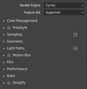
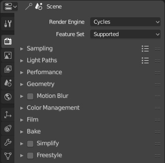
It should instead be sorted and prioritized by usage, something like this:
2, Since there are now not only rollouts, but also sub rollouts, it amplifies the issue of poor category naming and poor categorization, making certain settings even harder to find, such as:
A,
Clamp Direct and Clamp Indirect settings are present in the sampling rollout. These settings do not modify amount or distribution of samples. They modify light path accurracy, and therefore belong in the Light Paths category. Specifically, they should be put in Caustic sub-rollout of Light Paths, like this:
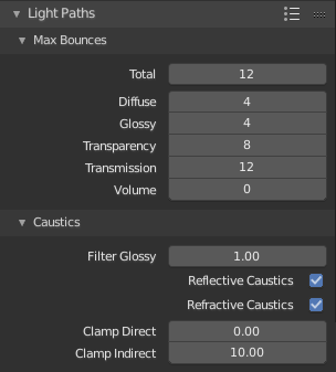
B,
Volume stepping and hair settings are still present in the rollout labeled as “Geometry”, which implies containment of settings like raytracing acceleration structure, definitely not volumes. This should be renamed to something more appropriate.
3, Device selection should go back from being buried in the performance rollout to the header space, under feature set and render engine selection. Arguably, it’s way more important setting than feature set selection. Missing this setting due to being hidden may give newbies hard time, not realizing they are not utilizing their hardware to its full potential, as well as seasoned users, who may forget to switch the setting because it’s hidden out of sight.