sure, this may come off as newbie, but just giving a first impressions take…
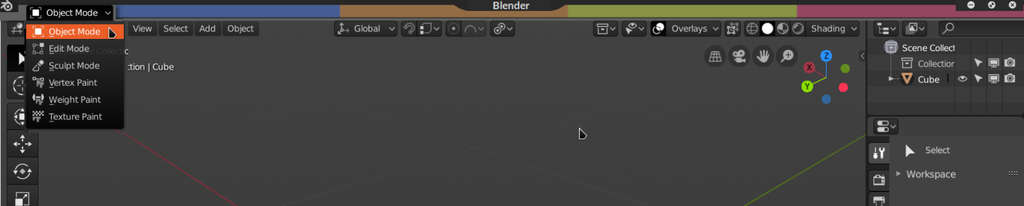
when i started out i thought workspaces meant and were > modes.
i thought the workspaces were more like programs.
after all blender is almost like a suite and covers a pretty wide spectrum of fields from video editing to modelling.
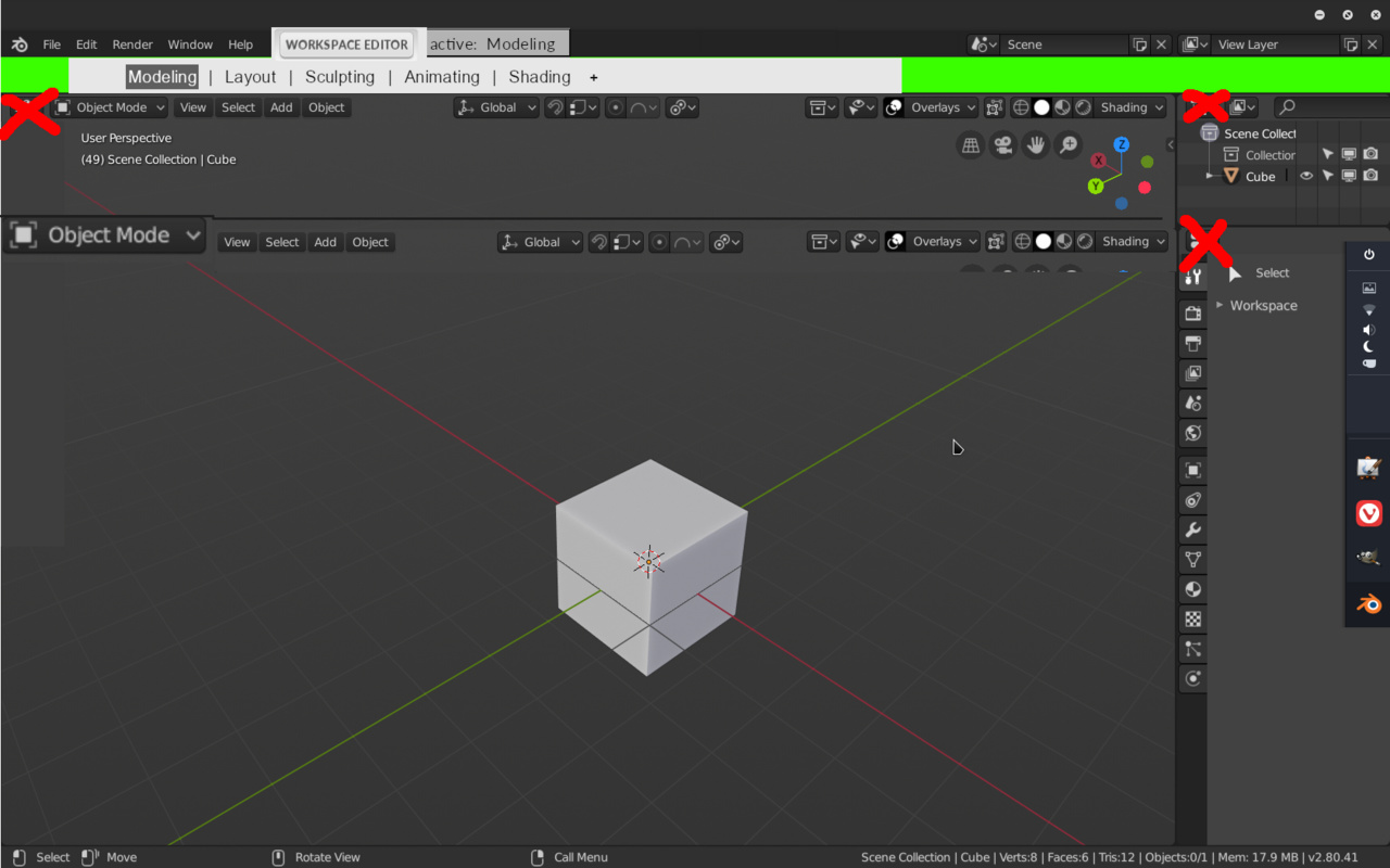
I made this suggestion to save on window space, but I also think it adds clarity by displaying modes more prominently.
We actually had the mode menu there in the top left in earlier versions of 2.8. I actually quite liked it there too, because the mode really applies to all viewports and multiple editors, so it makes sense to be on a higher hierarchical level in the UI.
It was moved back into the 3d view because the vert/edge/face select buttons are there, and because some users would like to be able to hide the top bar completely.
Blender’s UI has a built-in struggle between on the one hand being one coherent app vs being a collection of separate independent ‘editors’.
Lots of things that are currently inside the viewport - the menus, the transform controls, the toolbar, aren’t really viewport controls. But Blender has always been designed this way, where tools and actions only apply if you are inside the correct viewport/editor.
I think we could do things to make it more coherent. For example, the Outliner could cooperate with the Properties a lot more. Selecting data types in the Outliner should set the correct context in the Properties. Things like that.
edit:
I think the tough part is making it so it works for every mode.
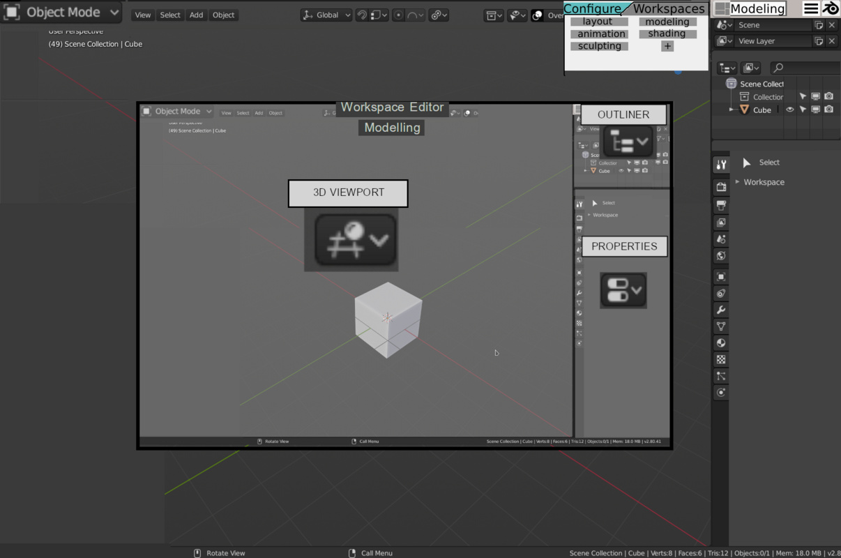
I think this is another way to make object mode etc more prominent and workspaces more clear.
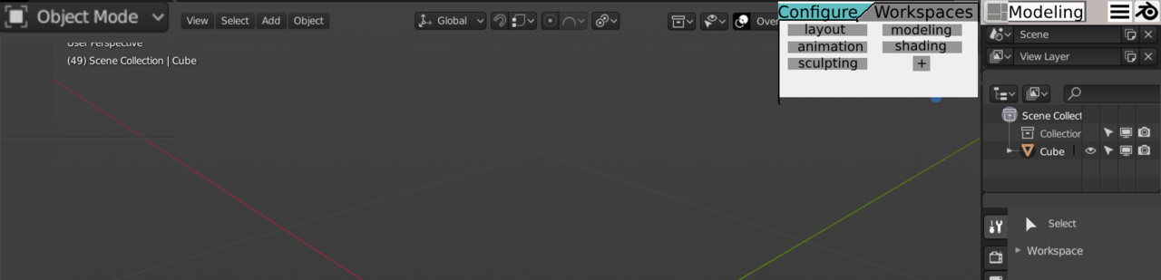
I also like this because by clicking workspace editor you could get a slightly more powerful way to customize the workspace.
if you hover over it will show the other workspaces to choose from.
this allows us to remove all the window change icons. if you were every curious what window you were looking at just open up the workspace editor to see.
removing the panel change icons and doing all from a configure workspaces splash screen-like way would
make more room and would make this proposed layout possible.
the workspace select + configure box appears when hovering over the WS icon + active WS text o the right of that is a collapsed main menu and then the splash screen icon.
hover tooltips could make this obvious.
IMO blender UI is already compact (especially in comparison with some popular 3d tools) and, when the new 2.8 topbar is hidden and the program in the full screen mode, it only takes two lines to fit workspace header and editor header under.
Fitting UI into any paradigm does make sense if it does solve at least one problem, e.g.:
Making it more similar to industrial standards and common UI practices;
Making it more consistent to program’s logic;
Expanding ui for fitting new features, e.g. new buttons, menus, editors and so on;
Significant improvement of UX and accessability.
If it does not resolve any practical problem, it is pretty much just forcing userbase to learn a new layout of existing functionality.
Current workspaces switcher in a form of “browser tabs” is very understandable and intuitive. Again it is also compact enough to not bother about its size for now.
Even if multiple editors share same tools, should they be moved to the “global” toolbar? For example, snapping settings. Users may want to keep them separate for different editors.
Also blender as collection of multiple tools is very good idea and it should keep isolation of editors, especially if it helps to create controllable environment without fear to break or change something outside. There is a great proof of concept for such approach - unreal engine. Its subeditors are comfort to work with just because of that.
The current compactness i can live with not a biggy even though atm i spend very little time using the top-most bar if at all.
The clarity however does bother me.
edit/object mode should not be situated in the viewport as each mode affects the whole of blender’s other panels.
the workspaces look more like mode switchers where they are located yet no way to know exactly that they are workspaces until you click plus button.
The solution for blender is to be upfront with new users about how it is a little quirky and point out where off the bat so new users can get that out of the way quickly and not need to refer to the manual. I tried to understand the outliner by trial and error given my experience with other software and it was a bit much of a brain stump for me, in hindsight it’s obvious, I would have really appreciated a notice to cover a few things to be clear on blender’s peculiar design.
this could be seen as a good thing or not to attract new people. on one hand they might think oh its a quirky software. on the otherhand get past that and it’s also super powerful.
I’d also be upfront about blender’s default key bindings and how meh they are out of the box, point to the many resources people have to change their bindings to suit their needs. like a more official endorsement of addons such as: Machin3tools + wazou and others a proper setup makes a world of a difference.
and so you could kind of hide things without worrying about not having people know where to look.
In the name of clarity first. though a compact mode would still be welcomed.
you could also access workspace editor this way:
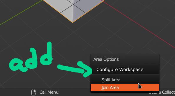
this is what I had in mind for an editor:
I don’t imagine people change workspaces around too often and don’t see how it would be troublesome to just edit from this center pop up area.
another thing that might be nice is to scale resolution such that the topmost bar can be scaled independently.
I must say this does not make any sense to me. Edit,Object, Sculpt, Paint and other modes are not modes of the entire program. They are supposed to be in the 3D Viewport because they only change things that happen in it. They have no effects on most other Editors for the most part and even some of the effects like Edit Mode on UV Editor should and probably will be changed, because since it is now split from Image Editor, it makes no sense to have nothing in it when outside Edit Mode. Consider things like: What if you use Blender for compositing? How about video editing? What if I want to concentrate on Shader nodes and only have a small 3D Viewport at the bottom of the screen? If I choose to do so with a mouse, should I then have to drag the mouse out of the 3D Viewport through possibly a few other editors to reach the modes I want to change in it in some global bar? Blender should not be limited to one use. It already has a few and may evolve even more uses in the future. Going in this kind of limiting ‘single program for one purpose’ design direction would make no sense to me at all and would go against the core spirit and values of the diverse and multipurpose program the way I see it.
The only thing bothering me is the outliner panel really. the way it is designed is not unlike how the RMclick strayed from the industry standard, what one is accustomed to find from an outliner in other programs.
it doesn’t help that layers kind of add to the confusion in terms of naming conventions.
the properties panel when trying to apply modifiers will let you know it cannot be done from edit mode.
this is cool.
but there are no pre-creation warnings for someone who is trying to make a separate object from editmode using what you would think was the same outliner. because the program cannot read your mind of course.
you simply cannot create a seperate shape from edit mode. well you can press P from viewport yes, and you can search stackexchange or read the manual.
and ya I get that pressing shift a in viewport shows different selections based on the mode and that that should be a clue. It was just one of those things that I found confusing prior to learning and felt stupid about it after.
ya its a learning thing. yes i might be the minority that stumbled here, however it remains to be said
it is still not a standard I see in other programs and it could be made clearer.
I have not use blender much but perhaps there are other quirks to blender, or at least it seemed to be the case prior to 2.8 and these quirks were the main reason for the bforartists fork.
anyways if there enough such quirks I think blender could have a variant of the software that is more beginner friendly, with bigger hints… maybe bforartists is the place to go to for this. but it would help if it got more exposure.
on another note:
I’m not about trying to disrupt other workspaces, if my design does so it’s just me brainstorming outloud, seeing what sticks,