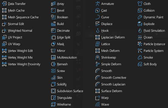
I want to propose a colored icons versions of the interface, now that some people have worked in a patch for icons themes that wait for approval. This is a version of the icons that I have made
I really like your usages of a single color highlights for groups of icons, the blue in the first capture and orange in the third. Could that work for the Properties icons as well? Although that just gets me thinking again about having two layers per icon, which is off topic.
Sorry I just mean that I love your use of two-tone (white and blue) color here:
and here with orange and white:
Then I wondered how that would work for the Properties Icons, ie primarily white with a single shared highlight color.
And that got me thinking how I would have liked to have seen @jendrzych’s icons split into two layers so we could have done one layer in the current text color and a second layer on top in a highlight color, as you are showing here. But that suggestion never got me far. LOL. And I don’t want to derail your thread showing off your nice versions.
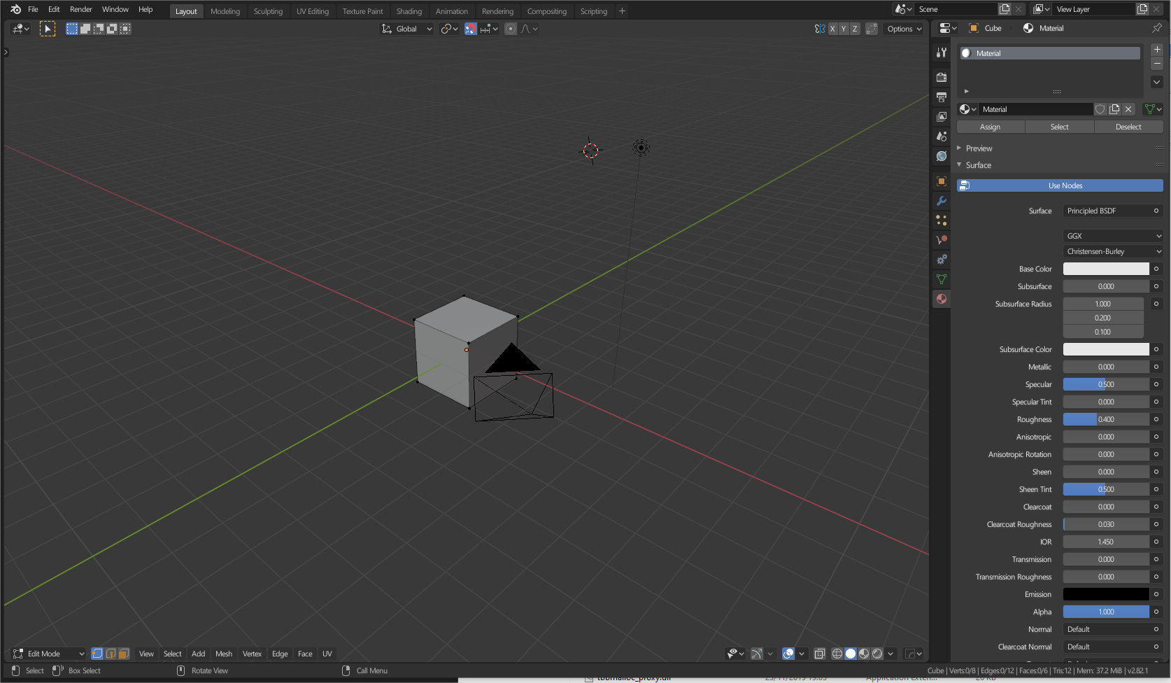
That was my first idea when I do the icons in my computer, but the problem was that when I see the editor properties I mixed the different icons. So I think that it didn’t work well
Yes , there is a lot more hint at what they do if an accent color is thrown in the mix. Plus they look sexy as well. I still dont like the full color Wrench icon for Modifiers tab. It doesnt feel consistent with the others designs and neither looks particularly great. Either add a minor extra element with white or change the shape of it.
AND for the thousandth time pls GIVE US THE OPTION TO KEEP THE PROPERTIES TABS ICONS MONOCHROME WITHOUT AFFECTING THE COLORING IN THE OUTLINER. I think adding separate colors to tabs icons there its a bit redundant and not really necessary and doesnt fit with the rest of blender UI. Multicoloring should be reserved for hidden or non permanent parts of the UI like drop down panels or menus or for the Outliner to distinguish the content there. Having the color monochrome or even better sharing the design shown here with accented colours gives the tabs bar its own identity as part of the same UI element.