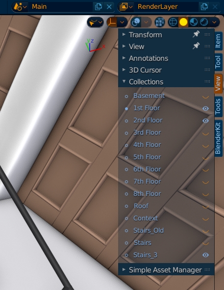
Hi, I got used to that little collections icon at the top of 3D View, is that gone for good? What was the design decision behind this?
I think the previous solution is superior as it doesn’t take a lot of space and is more directly accesible (without the need to turn on the Sidebar). I only miss the clickable and renderable icons there, that should be added.
Previously:
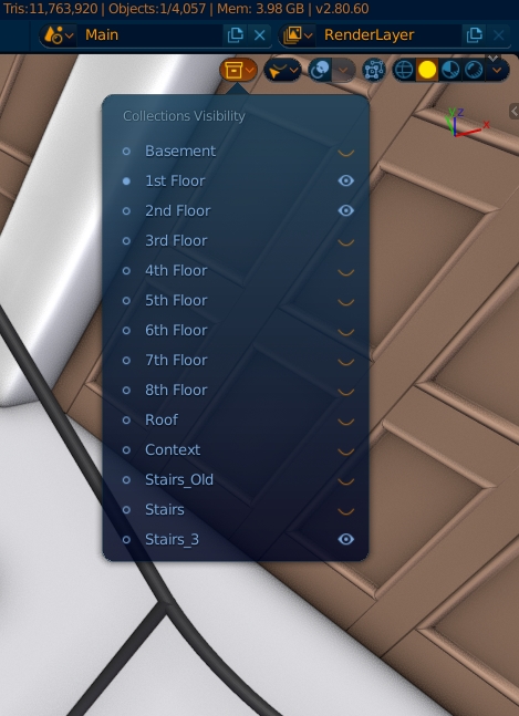
Now: