Who’s with me?
I’m working on both 5k and 900p screen, but always struggling with screen estate.
Some parts of the blender interface are way too wasteful.
I saw that (up until now) blender2.8 made it even worse by assigning 50% of the column width for the label and 50% for the value throughout the interface.
At first I thought to ask for a change to 30-70% but I’d suspect there would be lots of people against it and stuff, so maybe THIS idea is the better one… It’s only a start but like you can see, it isn’t that difficult to do… Bring on the PREFERENCES… just make everything remotely adjustable: ADJUSTABLE via preferences, dynamically!
tweak galore!
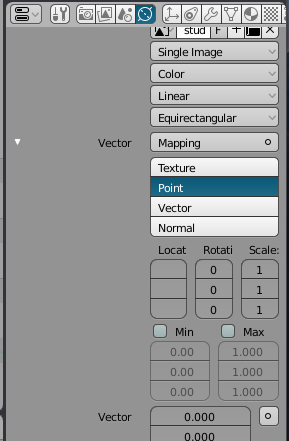
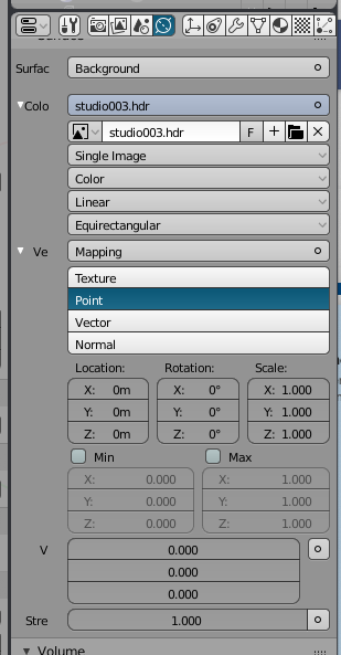
Here’s a small screencap of what I’ve done so far… look at the better use of screen estate with less label, more value
Before:
but I don’t think cutting off the labels is a good solution.
This obviously was shown as an extreme… the point is that it’s user selectable… more/less label space at will.
Maybe you’ve not looked at the little screen cap… it’s up to the user to decide what’s more important with my proposal, a label or the value and how much of each.
The labels are written in a way to make them fit in a typical width properties editor, and the layout of buttons on the right side is as well. Changing either significantly from the default will inevitably lead to cutting off text, so it’s strange to present the user with an option to do that.
It makes more sense to me to make the label side fixed width since the contents is fixed, while the right side could have variable width to show more as the user makes the editor wider.