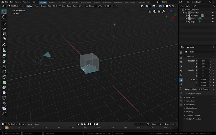
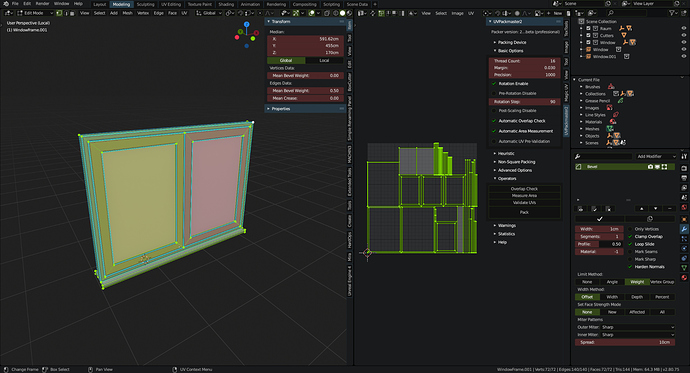
Nice - I wonder if you then should also make the icons black?
I considered making all of the icons Black, but I still wanted to have some differentiation for people working within the theme (or for color printing), so I leaned toward trying to keep the theme within the same hue ranges as the default theme and only focus on value adjustments.
I’d really like the ability to easily invert the toolbar icons, but as we’d discussed on blender.chat, that’s not easily done at the moment.
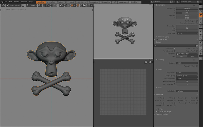
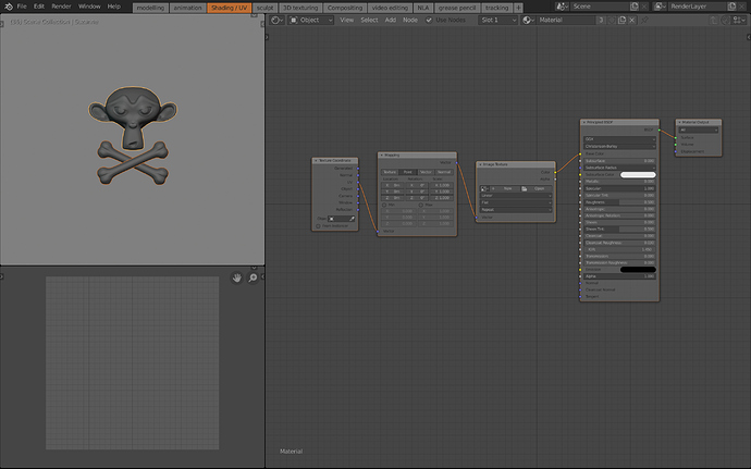
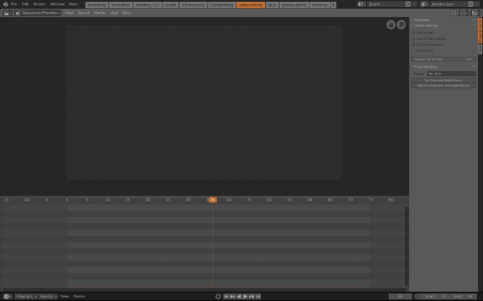
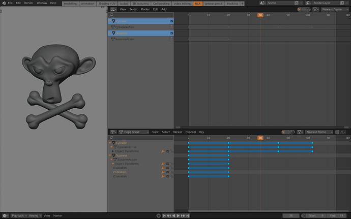
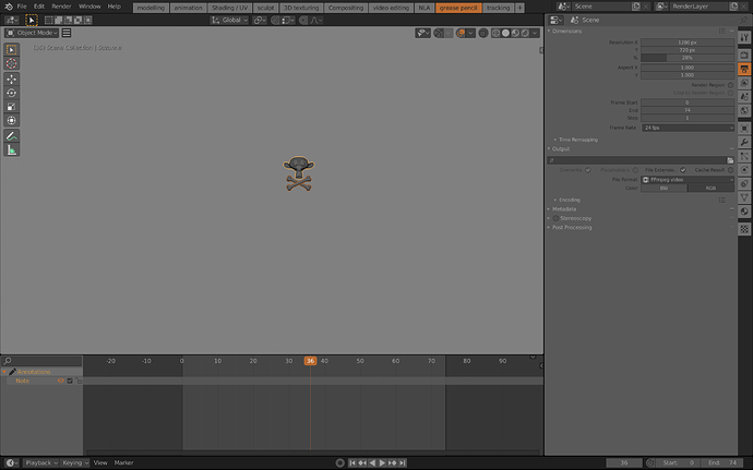
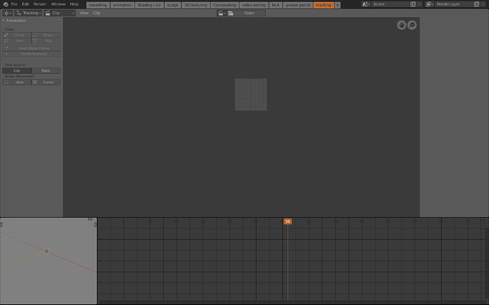
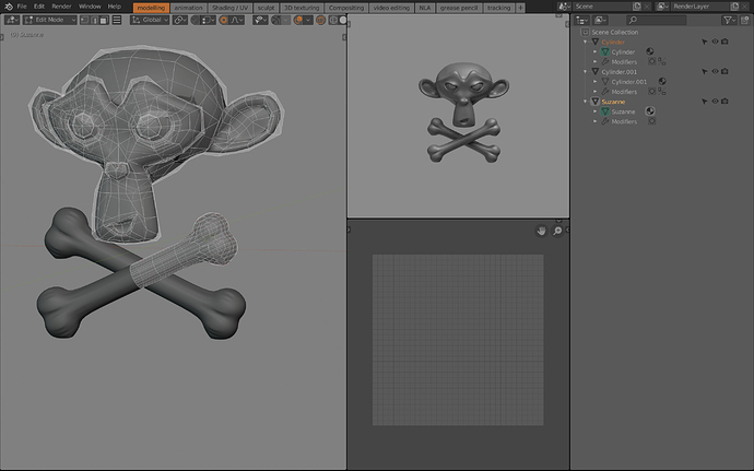
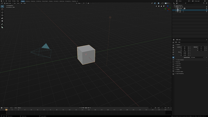
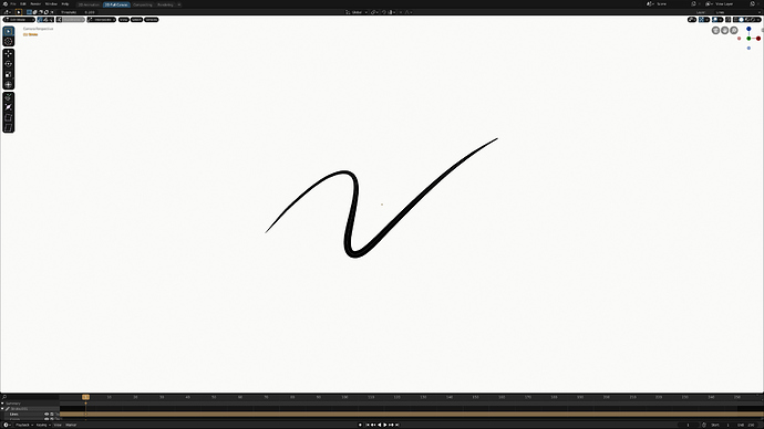
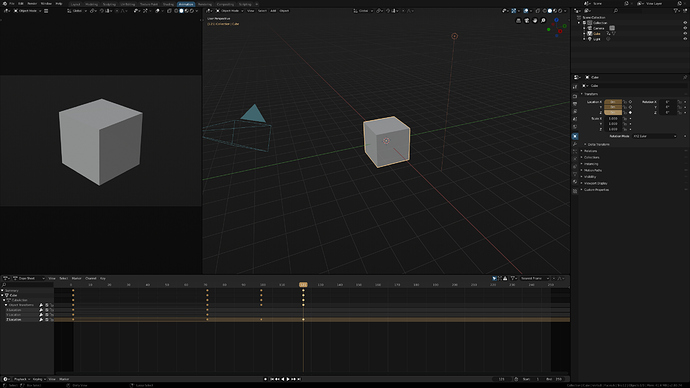
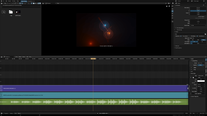
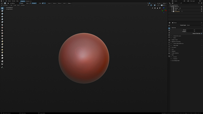
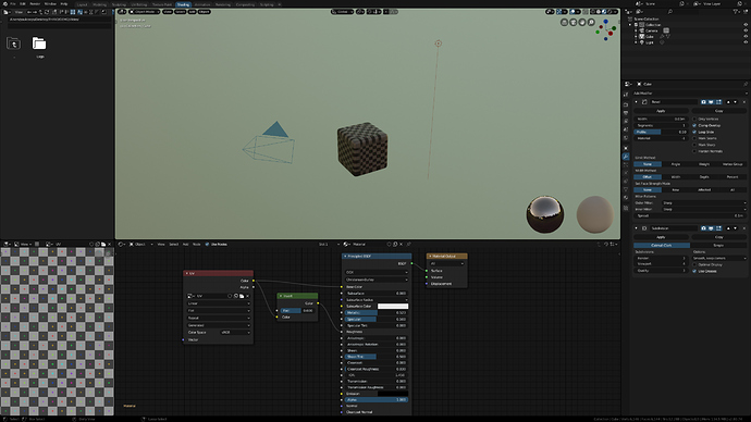
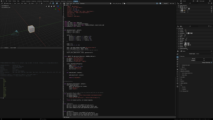
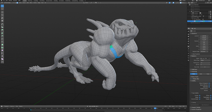
Hy there! If you consider blender default themes are too much darker or brighter, this is your theme. This one is the result of had being working several months in UI themes. At the same time blender 2.8 was redefiying its interface, I was recopiling some experience making UI Themes. The point is create a really well balanced theme. UI needs to be neutral and secondary to the viewport. So the key had being stablish a jerarqy of highlighting extremly accurated that helps user to focus better inside all UI information. Feedback welcome ![]()
(upload://7qr14gADjS26HbtCsH8JIMVByAS.jpeg)
Ozymandias 0,2
(I will update this theme as I find new interesting color harmonies or errors.)
edit: fixed same little erros and made the various space windows more consistent colors
ozymandias.xml (42,2 KB)
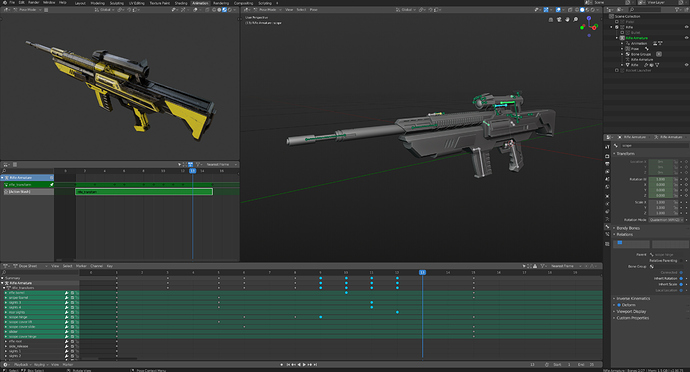
Blender Pro Beta 2 – 10 July 2019
Check out the Updated Blender Pro Theme. And please let me know the areas where you would like to see improvements.
blender_pro.xml (40.8 KB) Updated 10 July 2019
Thank you very much for pointing that out. And you are absolutely right. I’ve changed the vertex color to a mid gray for improved visibility. I’ll update the theme right away.
A new version of the Blender Pro theme can be found here: Call for Content: Themes
Where are the chosen themes in 2.8? 
This thread was for nothing? 
I guess the assset manager will take care of it when it arrives(?)
I like your dark theme except the rounded corners of buttons.
How to reset them back to the default blender 2.8 style?
Thank you for your feedback. I’ve tighten up some of the round corners except for the option button ![]() And it looks better. Check it out: blender_pro.xml (40.7 KB)
And it looks better. Check it out: blender_pro.xml (40.7 KB)
I will update the theme post and screenshots later.
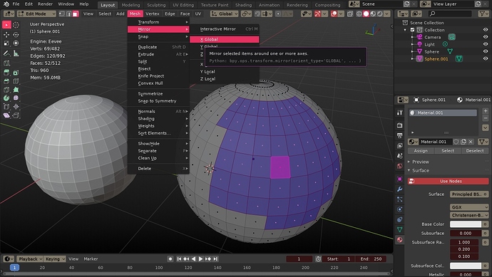
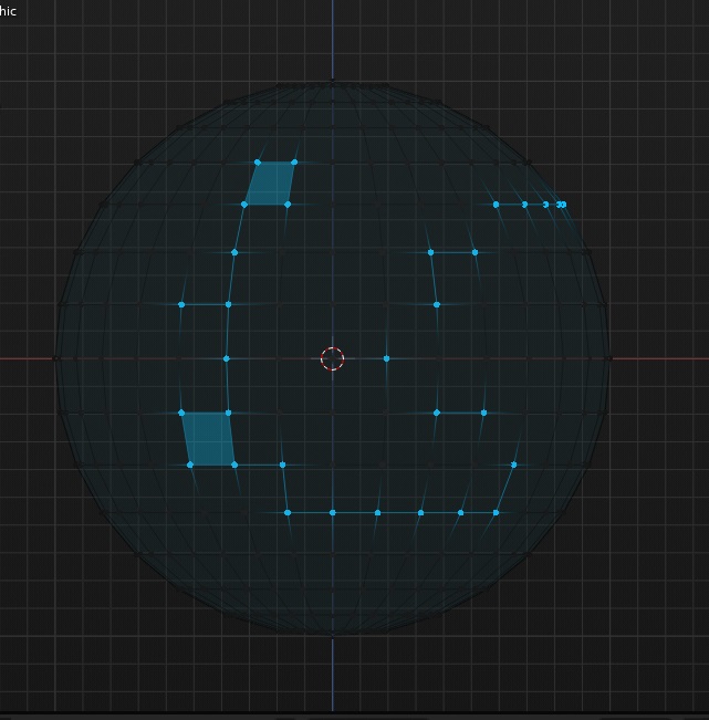
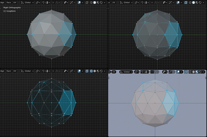
The Face Angle Text is too dark (it’s deep blue) to clearly read Indices numbers.
For example, enable Developers Extras in Preferences > Interface, then tick the checkbox Developer Indices in the Viewport Overlay dropdown menu.
A color like FFD290 works well.
Thanks for pointing this out! Learned something new today. The color looks great!
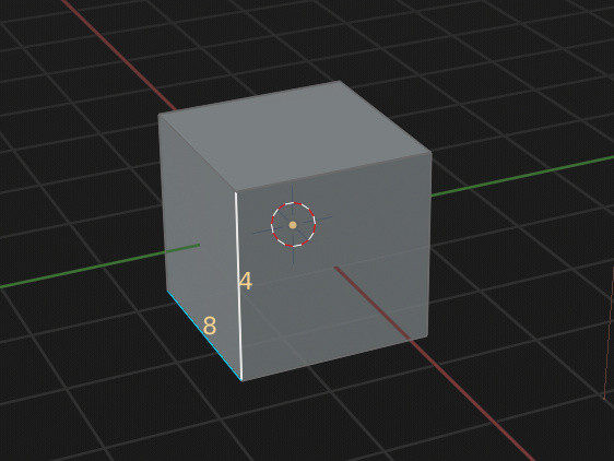
I’ve also changed some other overlay colours. Check it out: blender_pro.xml (40.7 KB)
Hey Paul, your theme looks like exacly what i want but can you make it more accessible with opening it’s own threat or something like this: https://blenderartists.org/t/awesome-theme-for-blender-2-8/1120656 so we dont miss any updates.
Blender Pro beta 3
Check it out and let me know where you would like to see improvements.
blender_pro.xml (40.7 KB)
Thanks Alperen! I’ve created a topic on Blender Artists: https://blenderartists.org/t/blender-pro-beta-3-theme-for-blender-2-8/1171532
Here’s an update for Minimal Dark that will work with all the new stuff in the release:
minimal_dark.xml (42.2 KB)
Blender Pro is now on GitHub.
Published my theme here: [Theme] Dunkelbunt – Dark theme with extra colors - Released Scripts and Themes - Blender Artists Community
Try it out and let me know what you think! May need some tweaking here and there.
