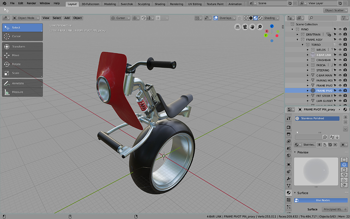
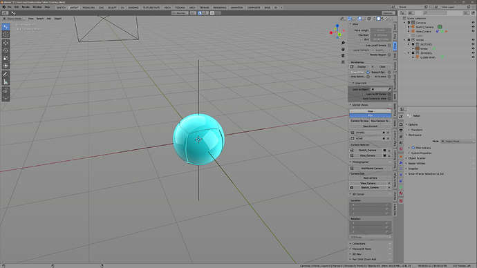
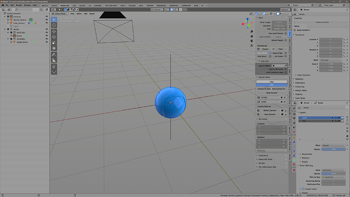
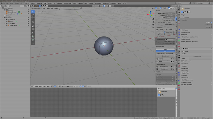
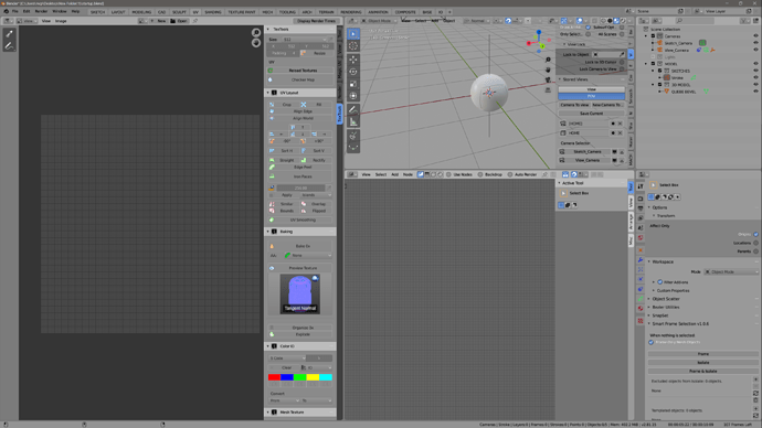
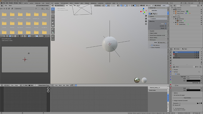
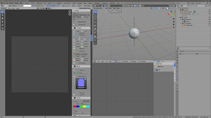
Mi favorito!
Hello - I LOVE THIS THEME - thank you so much for creating it … i love you
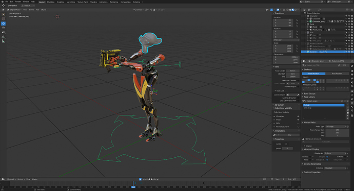
i am using it now for a few days and sadly i have noticed a smal bug i dont know how to fix … i hope you can help me please … when i switch the tabs Layout Modeling and Scultpting everything is fine but the Tabs UV Editing , Shading , Rendering, Composition and Scripting are oneway directions you cant switch the tabs anymore because they disappear it seams that the whole bar is hidden …
hope you can tell me how to fix
Hi, I’m glad you like it.
Does it happen when you start with a new blend file? Or only when you open an already existing one? If it is the latter try unchecking the “Load UI” tick box when you open the file.
You can also try “File --> Load Factory Setings” But it will reset your custom settings so make sure you have a backup.
Also, does it only happen with my theme?
thanks you … i found a fix for it … i simply had to drag the window down a bit reveal the menu top bar … so now its perfect  at some point I will maybe replace the main red color to blue or yellow … i guess there is not an easy one color adjustment menu right ?
No, you have to change them manually.
Alternatively you could open the theme file in text editor and use the replace function.
I’m noticing how now it has become versatile blender …
with some themes + the colorful wireframe, I am sure that children in schools will be crazy.
I’m right or am I having a backround a bit nostalgic and so amused for it?
Summary
where can i find the .xml ? thanks
Sorry for double posting my theme, but I couldn’t edit my old post.
I renamed it from Default++ to Stockholm I get that the old name was a bit ambiguous. But it was more or less just a work in progress name.
So it’s the same neutral grey interface, higher contrast on input fields with brighter background and dark values and bright orange when selected. I themed the new Settings view. Other than that same accent colors, Orange Blue and Green.
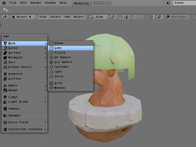
Menus are Opaque, for better visual reading of the menu items.
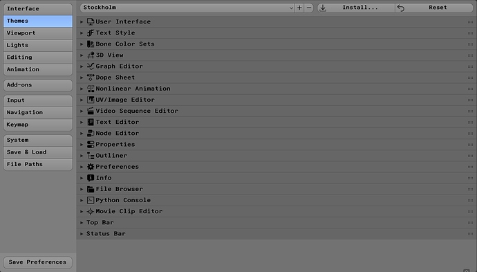
Settings View, with slight different values to clearly distinguish each section.
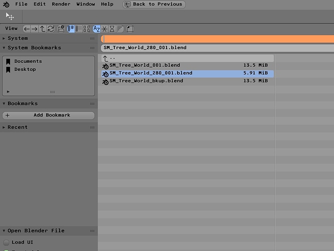
I personally like the File Explorer to be bright and easy to read. File location text field selected to show the Orange accent color.
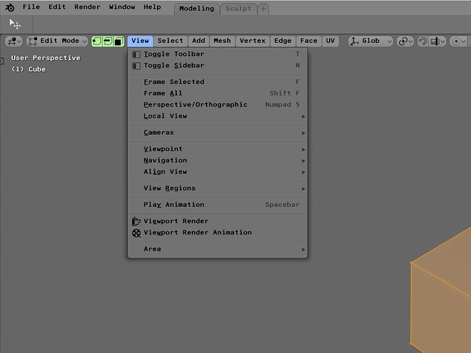
Green accent color on Vertex/Edge/Face check boxes.
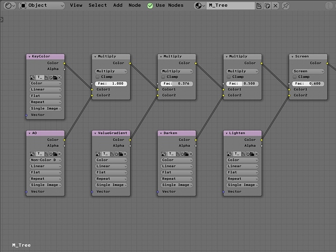
Nodes have all same grey color, I leave it up the user to chose colors if needed. Personally it gets just to much visual clutter if all nodes have a color. By default I only give Texture Nodes that purple color so it’s easier to find Texture inputs in the node tree.
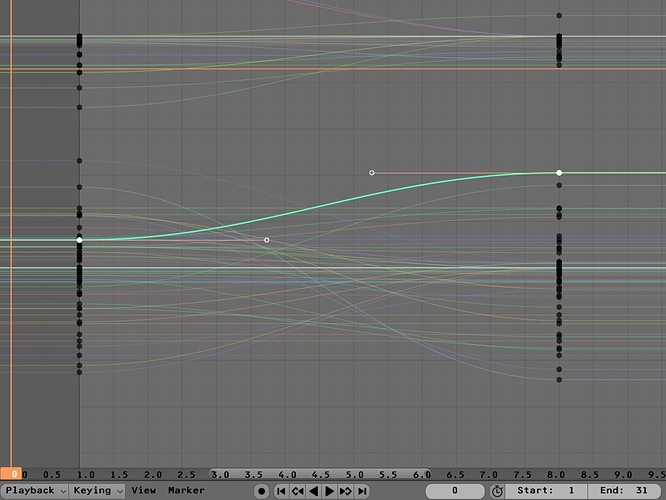
Curve Editor.
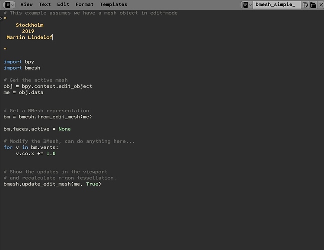
Text editor, with syntax highlight.
Download it here, and let me know if any part is missing or looking weird.
- Updated Axis Color, less Saturation and fixed values for Hue.
stockholm.xml (42.1 KB)
I am using F25 Bank Printer Font
Only because it is a mono-space font, and nice for code. I really wish we could have a set of built in fonts with Blender - and the ability to have bold mono-space fonts for number/value inputs.
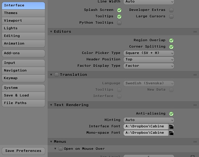
Under Interface and Text rendering and Interface Font / Mono-space font you can open the F25 Bank Printer font (or any other font file) as seen in pic above.
Hi Martin,
Thank You for your theme! It’s fantastic!
P.S.: Being an Ubuntu user, I have a trick for the same users of this operating system who do not know how to install the new fonts present in the theme. The following page shows the simplest method to install them: How To Install New Fonts In Ubuntu 18.04 and 16.04
Thank you! Glad you liked it. A quick side note, you don’t actually have to install Fonts in the Operating System or any Font manager app to use them with Blender. You can just download fonts and have them in a folder anywhere on the drive. Then follow my last image, to load them into Blender.
I am using the same font for both Interface and Mono-space. Mono-space references only to the built in text editor in Blender.
So if you like you can just use the F25 Bank Printer font for Mono-space Font and coding, and have default or any other font for the Interface.
Thanks for the clarification 
Like some others in this thread; I don’t feel that dark themes work for me personally while working for long periods of time. That said; I also don’t like things “too bright” either. So I created my own “Soothing” Medium or Lite theme. It reads well with all the icons & text.
Feel free to give it a try; and perhaps some of the adjustments I’ve added could help Pablo put finishing touches on the Blender Light Theme.
OLD:
NEW:
I will try to update with more photos. Since just creating a “Blender ID” for the first time; I am limited in what I can include in my first post.
**Here is the xml file if anyone would like to try it out:
mcp-lite.xml|attachment (40.8 KB)
would love to test this theme, will you share the xml ?
thats a problem, every time I tried, I received a message saying new users can’t upload files 
Maybe you can upload it on http://graphicall.org or google drive ?
Hi there
This Theme looks fantastic!! But the download seems to be broken… Can you reupload it? Would be great. Thanks
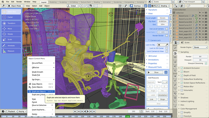
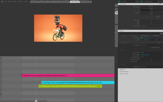
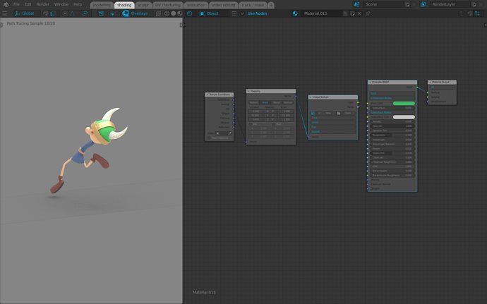
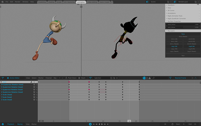
Hi! Thank you for kind feedback) I updated the post with correct file link. It’s pretty strange, I was tested attachment when upload this ![]() May be they delete attachments by some timer… By the way I also attach theme in this post. I hope Sunpower will serve you well
May be they delete attachments by some timer… By the way I also attach theme in this post. I hope Sunpower will serve you well ![]()
viadvena_sunpower.xml (40.7 KB)
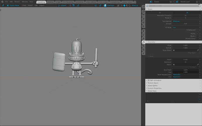
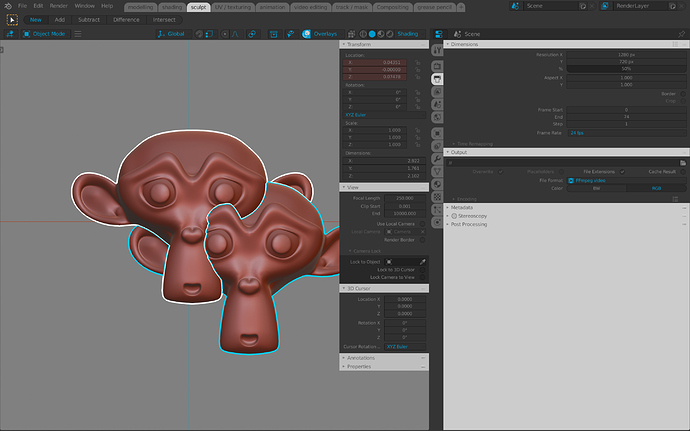
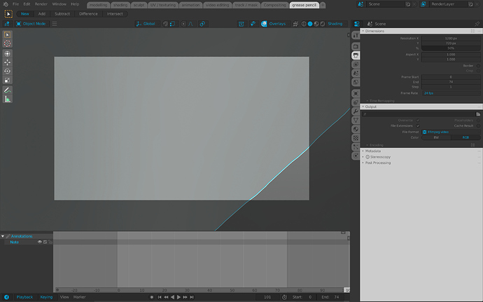
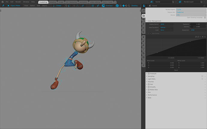

!["Sunpower" [Theme for Blender 2.80]](https://devtalk.blender.org/uploads/default/original/3X/7/2/72441eb7874293f912a5e9193fbfc2e35a131ce7.jpeg)
