i got a question, does the icon color coding affects these themes?. since now they are monochromatic and will be themable ,they all will have to be adjusted later on!!!


Default++
Although it’s a continuation of my version on Default++ from the 2.5 Default Theme, it has become more like a Marmoset theme unintended. Anyways it’s a very distraction free, neutral theme. Opaque menus for the win. The blue and orange accent colors from 2.5 Default Theme but de-saturated a bit with the additional green accent color for Check boxes.
default_plus__plus_.xml (41.4 KB)
*Update with new Settings view.
Install from Settings view.
Happy Blending!
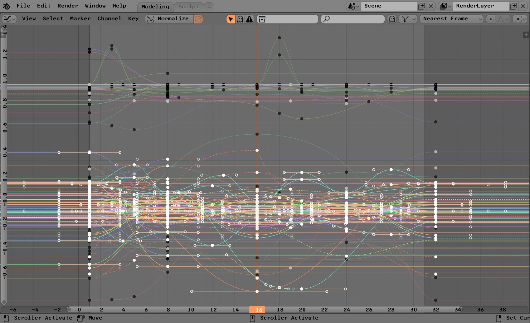
How do I make the toolbar transparent? I have region overlap enabled and some themes have it transparent ,but others don’t. I’m missing a setting somewhere.
Edit:
OK, looks like Region Background alpha under 3D View.
Are you going to share these? I would like to try them
Had some free time and made a theme based on one of the most iconic palettes in computer history - Windows xp’s “Luna”, blue. I always found the idea of software using other software’s palettes fun. Hope this isn’t seen as too much of an oxymoron (because open source and microsoft).

Ps. The only thing i couldn’t find how to edit is the selection color when having text selected. Where can that be found?
luna_blue.xml (52.5 KB)
OK, here’s a Godot theme I was working on and stopped. It could prolly use a little more tweaking ,but this is the general look.
godot_3_0_0_default.xml (52.4 KB)
That Godot theme is just amazing 

I call this one 28X Green because it’s not much different than the default 2.8 theme. Though I like it better. Because I like green.
EDIT: I edited the axis colors
I can’t upload because I’m a new user on this website, so here’s a dropbox link: https://www.dropbox.com/s/ujwvniv57o6y4oh/28x_green.xml?dl=0
Hey kame, really diggin this theme! Hope this will get into trunk!
Best regards!
This is nice, as someone who teaches both Blender and Maya, I think that many of my students would appreciate this theme to help them feel more at home. I would love to see you finish it. 
I like this one a lot, It’s got an odd rustic and leathery vibe to it.
It’s unique without being over the top.
 the best color scheme I’ve seen for a 3d app.
Pro3_modified is great for long hour blending. Maybe showing in sliders the chosen amount in your active blue colour would even enhance how easy this theme is on the eyes.
Your blender_medium themes node-type headers with strong colour code is a great idea, this will make big node systems a lot more understandable fast. I would love to see this as a standard in all themes in 2.8
I use energy in Blender 2.79 and it truly is the best theme I’ve tried. It has really excellent contrast and I quite like orange as a highlight colour (the Blender logo is orange too  )
)
Nice work!