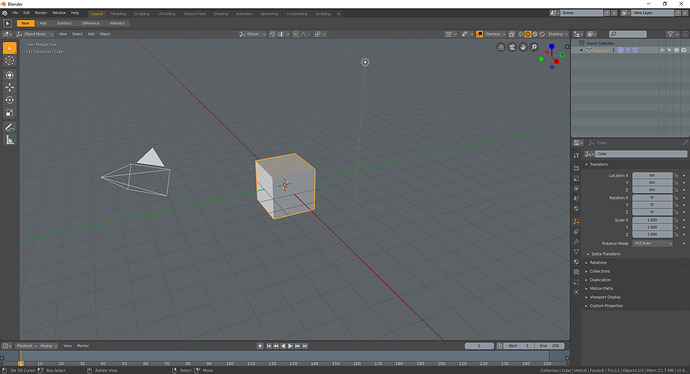
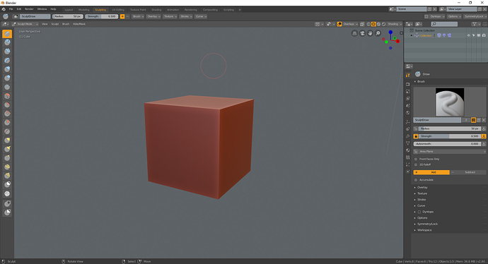
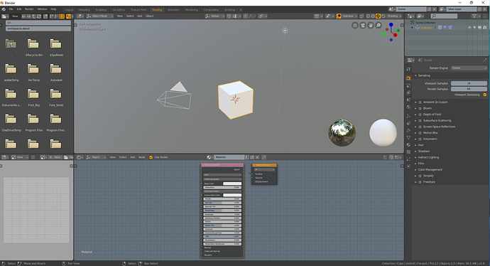
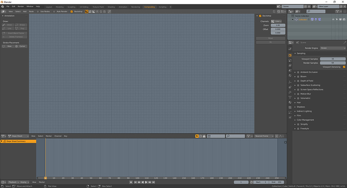
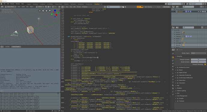
revamped the modo theme from blender for my own use:
#UPDATE: Made some changes in the Scripting Workspace to make it more behave like in Modo(see picture below). Also I did some changes for the Icons in the Outliner to seperate them better.
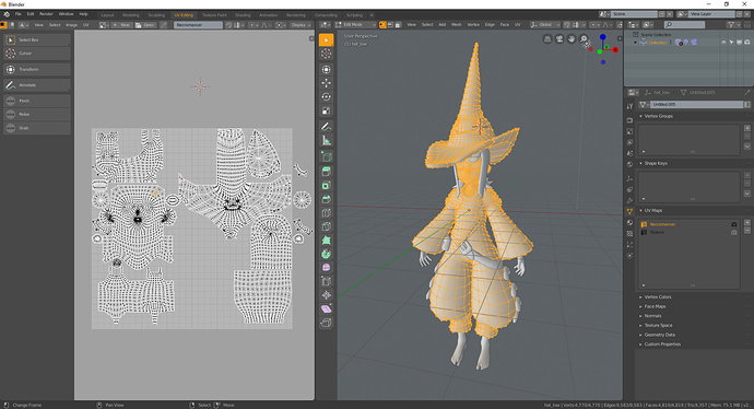
2#UPDATE: I add for the Material Output in the Shader Node the same color from the shading icon to be more consistent. I also worked on the UV Editor to make the selections consistent from the selection colors. Sadly you can only change the color from the edges in the display settings from the uv/image editor which would be great if you could do this in theme itself. And you can’t hide the facedots which get pretty noisy if you enable it.
3#UPDATE: Fixed the colors for the new setting panel.
I was at the moment forced to make the outliner window background darker because blenders selection on the outliner is sadly pretty inconsistent.
modo12.xml (41.4 KB)
