I just registered so apparently i cant upload the theme file itself. Anyone knows how long i have to wait?
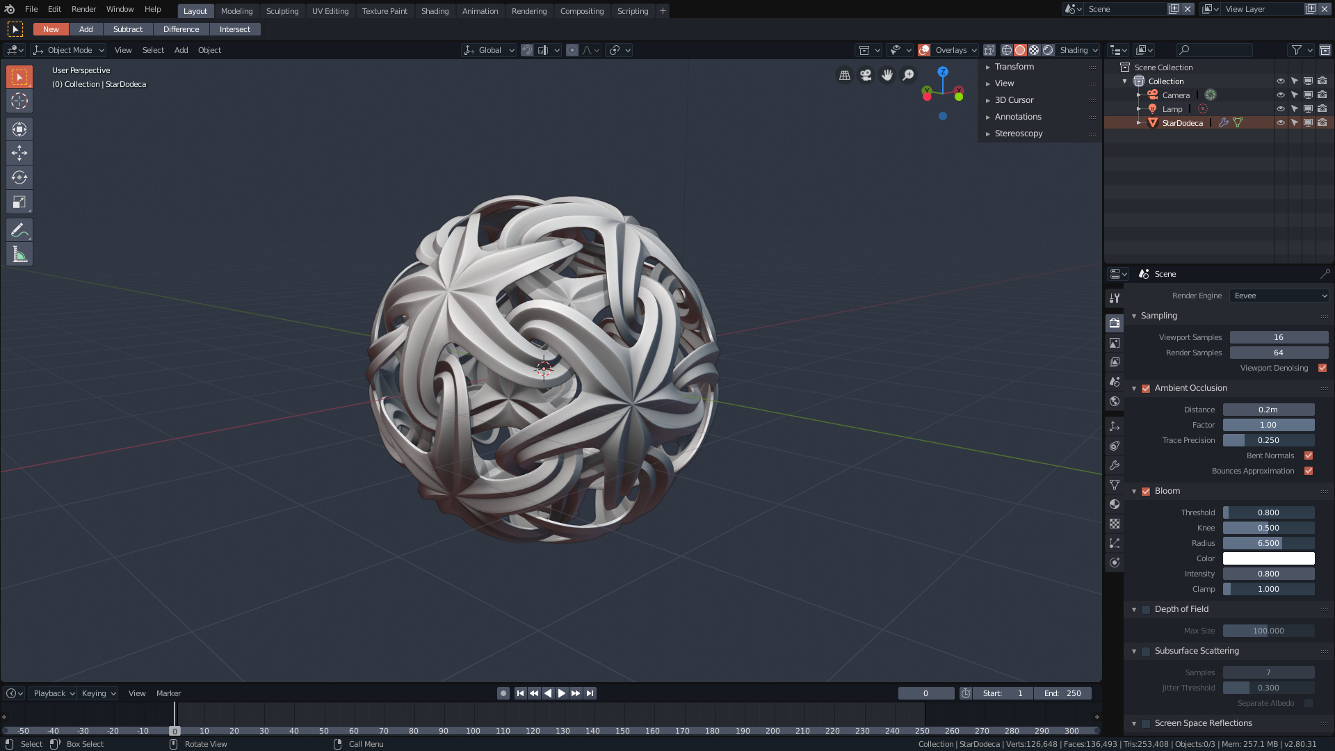
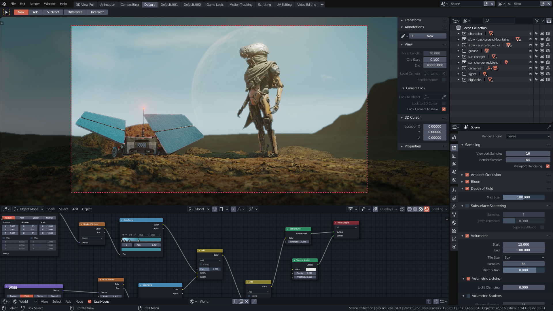
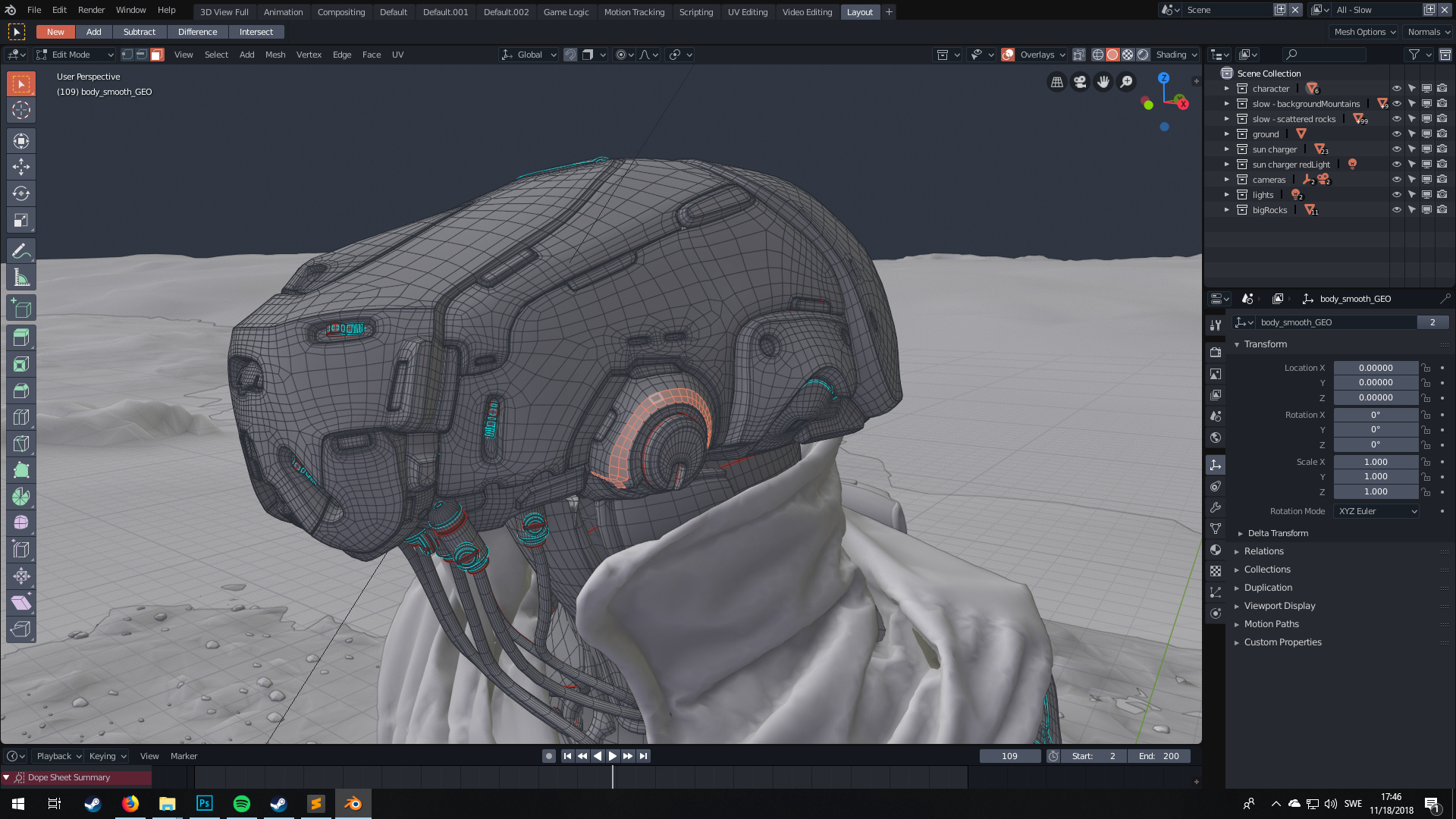
Here’s a screenshot at least
EDIT:
Now im trusted! ![]()
odyssey.xml (52.5 KB)
(52.5 KB)
I just registered so apparently i cant upload the theme file itself. Anyone knows how long i have to wait?
Here’s a screenshot at least
EDIT:
Now im trusted! ![]()
odyssey.xml (52.5 KB)
(52.5 KB)