There’s a reason most graphical UI’s are a shade of gray.
there’s a reason why programmers use colors to identify syntax.
High vibrancy theme relies both on chromatic+value contrast rather than only value contrast
Pure value contrast is pretty painful on eyes during long work sessions, since you constantly need to focus your eyes in order to delimit the boundaries of information
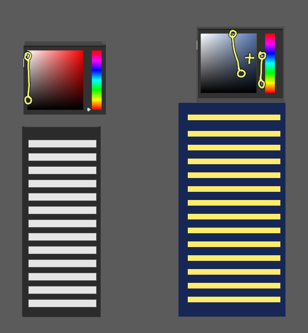
While color, you don’t need to focus your eyes to understand that something is pink, blue or green (unless the user is colorblind)
just look at the image below and see which one requires less effort to quickly notice toggle boxes, text, window limits, and all other relevant information
Plus, I easily spend >10 hours a day in blender, and i love colors, I’d choose crazy colorful over gray workspace any day
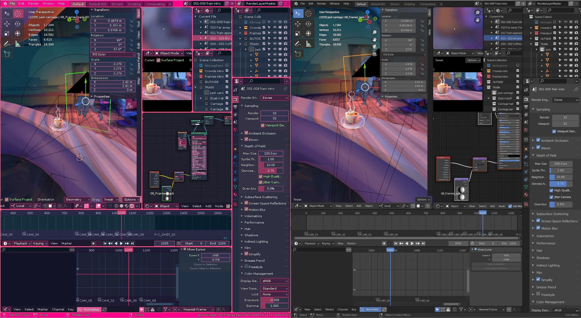
be a bit nicer to others, i’m sure some users enjoy colors ![]()