Hi,
For those that don’t like flatty and transparency things:
4 Likes
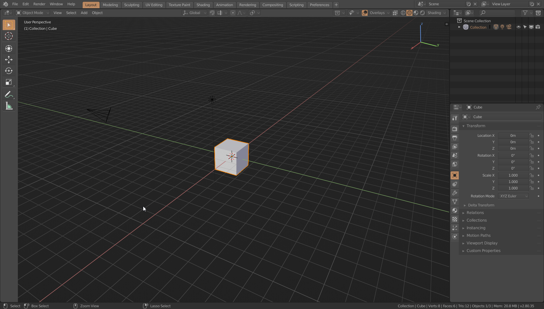
Pastel green for both day- and nightime. Text is bright, BG dark (better readable than opposite), Editor outline is white for better distinguishability of different windows, yet not blinding, since it’s so thin. Timecursor strong green. Properties tabs enhanced visibility. Topbar contrast enhanced.
grinsegreen.xml (39.9 KB)
1 Like
As said, selection is not very visible. Face dots almost invisible. Other than that, this is within my top 3. Looking forward for improvements. Nice job!
thank you very much ! i was looking for this theme fixed
1 Like
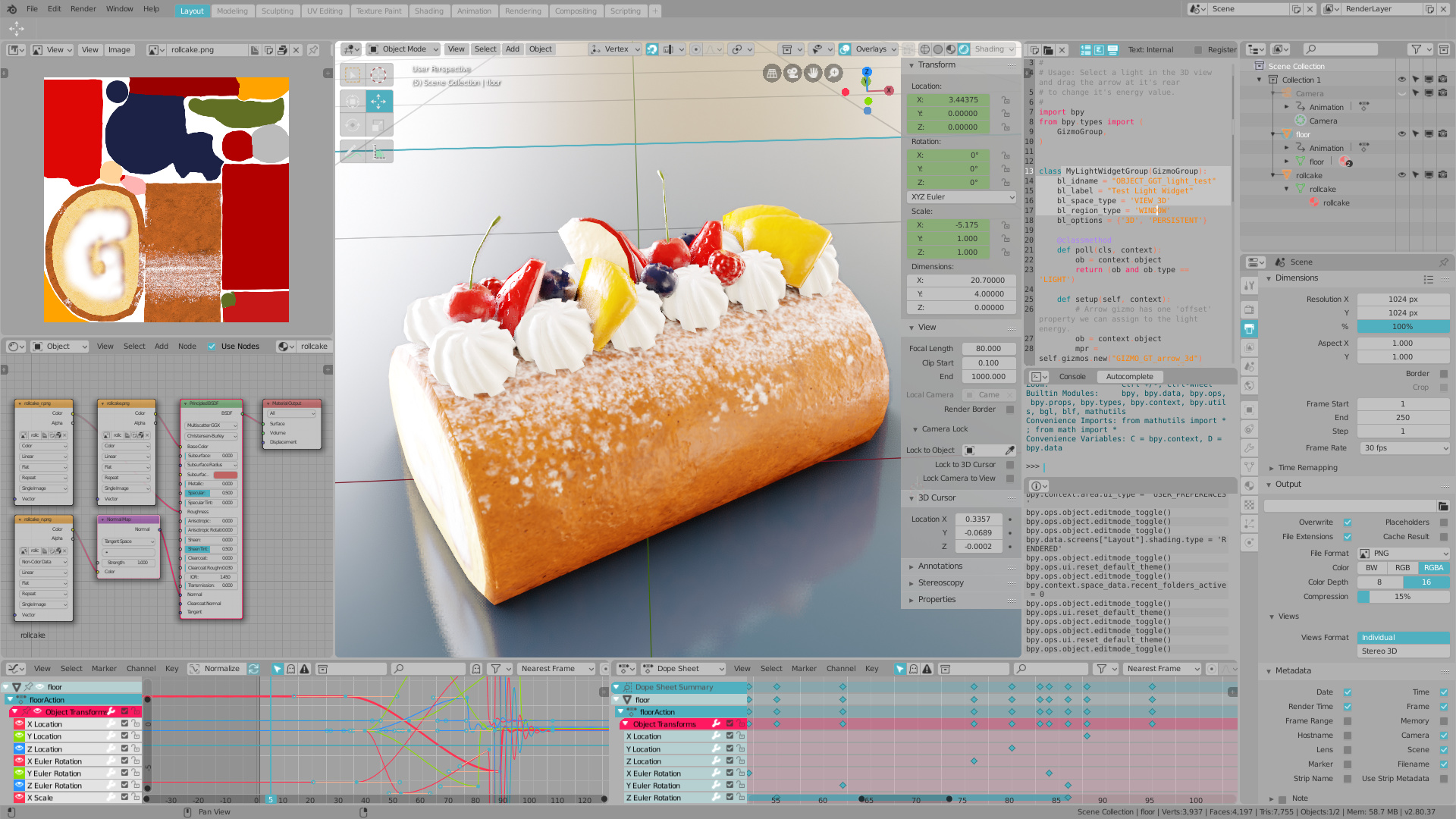
This is my first posting here, but I thought some may find this useful. The intent of this theme was to get new users used to the different sections of the screen. My 2 kids have found it useful in acclimating to the 2.8 design. Once familiar, a user could easily switch to another theme.
I called it “Tutorial” since it is a good way to separate the areas of the main viewport to help users understand the layout. The top and status bars are also colorized to help them stand out and make tabs more visible.
tutorial.xml (41.3 KB)
Marvin is a redish version of the default dark theme with some tweaks to make it more consistent. Hope you guys like it.
For more images (since new users can only post one image per post): https://imgur.com/a/ls1SnKn
(since I can’t upload files for being a new user I’m sharing it via pastebin in case anyone want it)
Marvin.xml: https://pastebin.com/5dS5PuwY
4 Likes
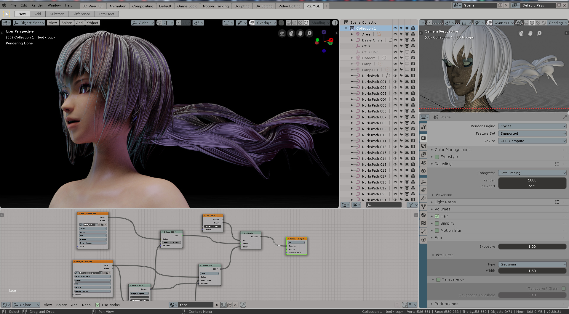
@billrey the XSI proposal originally had 60+ votes. I based the designed off the original software UI colors which was concealed with a whole army of design experts in their field back in the day.
This XSI theme extensively shows the areas where this was improved (not only on 3D viewport but in many other workspace areas as well). Not only did it serve other users to think about what is really important when viewing vertex on UV layouts or tracks on NLA, but it also is easy on the eyes. First time users find it easy locating important things and experienced users quickly fly through color coded ui by muscle memory (they associate what comes first and what comes after on every step of their 3D tasks).
Please re-consider including the theme. I don´t understand how @LudvikKoutny comes and states that “it´s a 90’s interface” but doesn´t clearly states why it doesn´t work -regarding UIX-. Because I can post lots of people (including Blender presentations) where it was CRUCIAL for first-time-users to identify things on the UI the way it is on the XSI theme.
From a UIX design point and many other design reasons, the XSI theme has stood the test of time being LEGIBLE in colors as well as long exposed hours in the monitor, identifying crucial elements quickly.
XSI MOD theme was the first one posting this SHADE OF GRAY for the UI way before all the other themes were posted. How can it be removed as -redundant-? The theme was posted, meeting the community guidelines, and was legitimately voted as desired theme to be included.
3 Likes
Agree with David, having the Xsi theme really helps me get a usefull overview and interaction with the Gui.
For us Xsi users having taken away the Xsi Theme is really a blow : /
1 Like
XSI Mod theme is by far NOT low quality. I personally think you’d be throwing out good effort put into a quality theme, throwing out a target market of developers and 3D power user nomads, throwing out a light grey solution that works with good contrast, good color coding (all light grey themes will inherently look like early 20’s/90’s) - and if you remove all colour coding from the XSI Mod, then you will get a non functional grey “minimal” theme struggling on contrast and ease of use.
The argument on the sentiment of nostalgia and “low quality” is not strong enough. Function over form. End benefit over method. XSI Mod theme ticks those boxes.
2 Likes
The only problem with the XSI theme was its name which draws attention to its inspiration and makes it sound like a nostalgic attempt to re-create a favorite piece of software.
There’s probably a bit of that in it, but overall I think it’s better to consider it as a modern theme based on inspiration from the original software but not specifically an attempt to reproduce it.
Hence a name like “Montreal” might be better, something that is also inspired by the source but says it has evolved beyond that into something new and better which is now completely oriented around making it a good Blender specific theme.
1 Like
Wait, are you talking about the same theme? I am talking about this one:
https://devtalk.blender.org/uploads/default/original/2X/9/983d0de316e6bf9498c6298842b5926e3b6e3911.jpeg
This is certainly not a theme that is on par with all the others selected, quality wise. If you say otherwise, then you are either lying to yourself or are blinded by nostalgia. I stand behind that. Just take a close look at that. That’s just not how any modern software should look.
This is further reinforced by the fact that Softimage XSI 1.0 first shipped in 2000 with the very same theme, not even slightly changed. That’s 18 years ago.
That’s not to say I am against including some soft light gray theme with Blender, I’ve made one myself after all. I just think that official themes shipped with Blender should look professional, and high quality, to not repeat same mistake Blender 2.79 and earlier did with its bundled themes.
And if you really want an ugly theme, nothing prevents you from downloading it using it yourself. What’s being talked about here is just stock, bundled themes. Ability to load and use custom themes is not affected at all.
That’s because XSI had concept of modes/workspaces which were color coded. Blender has no such concept, so the XSI theme uses the very same color set more or less randomly.
I never minded the 1234 colors for anime render and Hairs.
you dearest Rawalanche know much it is not the question at stakes.
Clearly biased against ex-softimage users. There is no trouble using “maya, modo, lightwave” shortcut keys or theme mention or presenting their “standards”, but everything comes to a brick wall halt when we mention “XSI” which is a name isn´t even trademarked anymore…so what gives?
If the original name is problem (I don´t see how that affects UIX color coding which is the CENTER of this conversation), then at least mention to change it. Don´t arbitrarly outcast the voting on people. I checked the theme downloads and “likes”: it surpassed the 70 count. Now lowered its voted count?
Blender everyday is looking more like MODO (even tab and upper bar) No one says anything, but as soon as “Softimage” is mentioned, votes on the theme are not important.
Blatant…
It’s a nice theme. I even picked it initially. But other members of the UI team pointed out that it was the only app-emulating theme picked, and so it stuck out.
If we pick the XSI theme, we should then probably also include themes for Maya, Modo and others.
On the one hand, look-alike themes are a fun way to welcome new users from other apps, but on the other hand it creates expectations that Blender can truly emulate specific apps, which it cannot. Blender’s UI it quite different from XSI, even if the colors are the same.
I don’t mind particularly strongly if we include these sorts of themes or not, but with only 6-8 themes set to be included by default, a lot of those slots would be filled with look-alikes.
Also, when picking the final list, we have to look at the picks together, as a whole, so we don’t pick lots of themes with too much overlap that look too similar.
As for your main accusation, I have never seen or heard anything about a bias against XSI or any users of it, so I wouldn’t worry about that.
1 Like
So full “white” theme is ergonomic. I didn´t see much votes there. The XSI theme was most voted.
At least is unique. I’m not a fan of Blender shipping themes emulating other apps.
why? could you develop your idea i don’t understand
I have just noticed that it is no longer possible to set the background to white in the 3D view. It’s rather a light gray. Anyone else having the same issue? MacOS build.
Okay,I made modern light gray theme.
Light_Gray_4.2.xml (42.1 KB)
My themes
Super_Bright_4.2.xml (42.1 KB)
Fresh_Snow_4.2.xml (42.1 KB)
Natural_Aquamarine_4.2.xml (42.1 KB)
Flat_Dark_4.2.xml (42.1 KB)
True_Black_4.2.xml (42.1 KB)
Fresh_Strawberry_4.2.xml (42.1 KB)
Fresh_Orange_4.2.xml (42.1 KB)
Fresh_Lime_4.2.xml (42.1 KB)
Fresh_Blueberry_4.2.xml (42.1 KB)
Fresh_Grape_4.2.xml (42.1 KB)
Fresh_Peach_4.2.xml (42.1 KB)
Fresh_Coffee_4.2.xml (42.1 KB)
9 Likes