Call for Content: Default Brushes

Hey folks!

Brushes will finally be used and edited as Assets in upcoming releases.
That means it will be much easier to use, add and manage more brushes at the same time.
Let’s take the opportunity to update and add needed default brushes!

General Info

All currently existing brushes will be converted to assets and become part of the “Essentials” asset library.

Brushes will be selected via the new Asset Shelf region. And because they will be Assets, they will be shared and accessible from any file.

Editing the brushes from any file will be supported via the new Drafting feature.

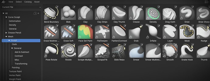
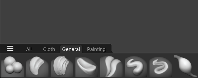
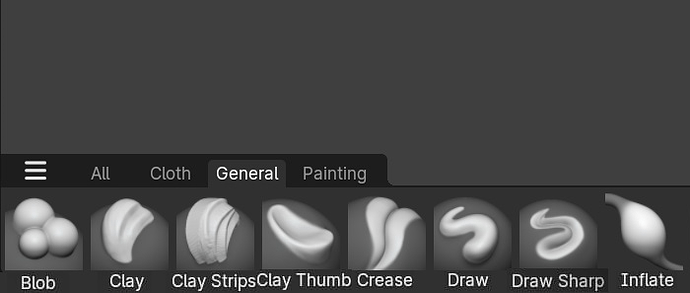
A new set of brush thumbnails is also ready to be implemented for all existing brushes.
The file that was used to create them can be downloaded here.

The full repository with wip and published brushes is also availible.

How to contribute!

Here’s how you can help out making Blenders brushes better.

  • Share suggestions of your changed/added brushes
  • Ideally share a .blend file of your proposed brushes
  • If you included a thumbnail or brush texture, make sure these are your own creations and packed into the .blend

Note:
Curve sculpt & weight paint brushes are not mentioned since their need for customization is low.
Grease Pencil brushes are welcome as well but most modes also lack settings to truly customize brushes.

New default settings

There are often suggestions to fine tune and improve the default brushes.
If you think specific brushes work better with your defaults, this is your chance to get them into Blender by default.

Completely new brushes

What do you think are missing essential brushes? Any brushes that prove to be useful. Or to avoid constant tweaking of settings. Help make the toolset of Blender more complete.

Use of brush textures should also be minimal. Only generic patterns if any.

Some specific brushes that would be useful to expand:

  • A full set of Cloth brushes
  • Elastic brushes
  • Boundary & Pose brushes
  • Painting brushes (For Sculpt, Texture and Vertex Paint Modes)

Current Selection

Expand for a list of all currently planned changes.

The brushes can be downloaded and tested from the svn repository:
https://svn.blender.org/svnroot/bf-blender/trunk/lib/assets/working/brushes/

Changed Settings

  • Mask = Darker Cursor color (0.25 grey) to differentiate the brush
  • Draw Sharp = Falloff is now “Sharper” instead of “Sharp”
  • Scrape Multiplane =
    • “Plane Angle” set to 0 (Turns out this value was always additive)
    • Decreased Normal Radius (Lowers the sampled area for shallower scraping)
  • Mask = Increased Hardness. Lower spacing. Full strength
  • Improved sculpt painting brushes
  • Density = Added auto-smooth to
  • Clay Strips = Tweaked based on Outgang suggestions (Needs testing)
  • Clay = Tweaked auto-smooth and disabled radius pressure sensitivity
  • Nudge & Thumb = Lowered Normal Radius to detect surface direction better
  • Area Plane is now default on all sculpt brush texture mappings
  • View Plane is now default on all Vertex & Texture brushes texture mappings

New Brushes

I marked them with different statuses if they are incomplete or need more testing.

:white_circle: = Merged
:green_circle: = Done
:yellow_circle: = Only Thumbnail Missing
:red_circle: = WIP/Needs Testing
:purple_circle: = Suggestion/Unclear
:large_blue_circle: = On Hold (Needs development/bug fixing)

Mesh Sculpt

General

:white_circle: = Scrape/Fill (Replacement of Scrape/Peaks)
:white_circle: = Slide Pinch (Slide Relax with Pinch deformation)
:white_circle: = Pull (Snake Hook without Rake & Magnify and low)
:white_circle: = Grab 2D (Using Projected falloff)
:white_circle: = Trim (Scrape with locked normal)
:white_circle: = Plateau (Flatten with locked Normal & Plane)
:white_circle: = Crease Sharp (Deeper cut)

:large_blue_circle: Peaks/Deepen (Combination of inverted Scrape & Fill. Not supported as one brush yet)
:large_blue_circle: = Flatten Soft (Less aggressive and deeper) (The default flatten brush was changed to be closer to this)
:purple_circle: = Inflate Smooth (Inflate for shape building. Prevents noise and curling)

:large_blue_circle: = Smooth Surface (Needs better implementation)
:large_blue_circle: = Knife (Draw with stylized deep cut) (Needs bug fix)
:large_blue_circle: = Clay Scraper (Mix of Clay and Scrape brush into one) (Might need proper implementation)

These texture brush presets should come with a dummy texture. Maybe a suzanne face. Or something more useful:

:large_blue_circle: = Anchored (Typical preset for textured brushes brushes. Should use Area Normal auto-masking)
:large_blue_circle: = VDM (Same as Anchored but with a VDM texture.)
:large_blue_circle: = Stitches (Stroke dash ratio settings )
:large_blue_circle: = Rake (Rake texture setting)
:large_blue_circle: = Scatter (Randomized placement of texture. Probably based on Airbrush)

Cloth

:white_circle: = Bend Boundary Cloth
:white_circle: = Grab Random Cloth (Using a procedural noise texture)
:white_circle: = Grab Cloth
:white_circle: = Grab Planar Cloth
:white_circle: = Pinch FoldsCloth
:white_circle: = Pinch Point Cloth
:white_circle: = Pose Rotate Cloth
:white_circle: = Pose Scale/Translate Cloth
:white_circle: = Bend Boundary Cloth
:white_circle: = Twist Boundary Cloth

Many more might be needed. Suggestions and testing is required.

Pose/Boundary

:red_circle: = Pose IK

(Not different enough to warrant new brushes)
:large_blue_circle: = Pose Scale/Translate
:large_blue_circle: = Pose Squash/Stretch
:large_blue_circle: = Grab Boundary
:large_blue_circle: = Expand Boundary
:large_blue_circle: = Twist Boundary
:large_blue_circle: = Inflate Boundary

:large_blue_circle: = Smooth Boundary (Needs dev involvement)

Elastic

:white_circle: = Elastic Snake Hook

:large_blue_circle: = Elastic Scale (Breaks on high strength and long stroke)
:large_blue_circle: = Elastic Twist (Breaks on high strength and long stroke)

Painting

:white_circle: = Eraser Soft
:white_circle: = Eraser Hard
:white_circle: = Eraser Hard Pressure
:white_circle: = Paint Hard
:white_circle: = Paint Soft
:white_circle: = Paint Hard Pressure
:white_circle: = Paint Soft Pressure
:white_circle: = Airbrush
:white_circle: = Paint Roller (Sculpt Mode)
:white_circle: = Paint Blend (Sculpt Mode)
:white_circle: = Blend Soft (Sculpt Mode)
:white_circle: = Blend Hard (Sculpt Mode)
:white_circle: = Blend Square (Sculpt Mode)
42 Likes

I’ll do brush suggestions and prepare blend file, but before that quick suggestions about improving existing brushes and UX.

  1. Mask Brush cursor color needs to be darker. I have it set to 0.25 value. It’s more important than other brushes that use blend grey color, and its not great that you cant differentiate Mask brush from others at first glance. 0.25 is also dark enough that actually looks like what Mask brush is doing, but is still visible on full opacity masks.

  2. Nesting in your first screenshot is bit too much imo. Accessing most widely used brushes for sculpting shouldn’t need three clicks to expand. I say just remove General categoy and have those four categories exposed alongside Cloth.

  3. Is there a need for specific brushes for Vertex Paint? Since we have option to share brushes between modes, can we share Painting brushes between sculpt and Vertex Paint mode and have them in one category?

  4. I see you use Mesh catalog for example, but Mesh is widely used for GN assets since it makes them appear in Add menu under Mesh category. Having all those assets mixed under one catalog might be bit confusing? How about moving every catalog under ‘Brushes’?

2 Likes
  1. Mask Brush cursor color needs to be darker.

I love the idea of differentiating brushes by changing their cursor color. So :+1: to the mask brush color!

  1. Nesting in your first screenshot is bit too much imo …
  1. … Mesh is widely used for GN assets …

I’ll move all brush assets into a “Brushes” catalog to avoid being mixed with geo node tools. Good point!
The nesting of catalogs is needed though. The brushes will in the end be grouped by catalog when listed in the asset shelf. Having a “General” catalog also makes it very accessible to only display those brushes.

Switching between and using multiple catalogs shouldn’t be a big issue for the Asset Shelf in the end because only the higher level catalogs will be displayed by default. Picking which catalogs will show up is highly customizable.

  1. Is there a need for specific brushes for Vertex Paint?

For now, yes. But I will check with the devs if painting brushes for example can be shared across multiple modes.
Vertex and Weight paint mode do this already for example (although these modes should no longer share their brushes in the future)

5 Likes

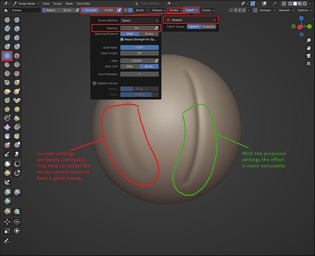
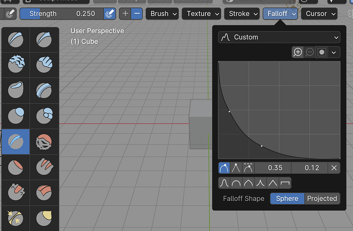
Thanks Julien! For now I have only one suggestion (I’m sure I’ll think of something else later hehe) to improve on the default brushes and it’s for the Crease brush. The current settings make it pretty much unusable. I tend to change it to Strenght: 0.5, Falloff: Sharper, and Stroke Spacing to 5%.

Also, I have a question, maybe outside of the scope of this topic but is it planned to allow sculpt brushes to paint? I still find it odd that we have to use one specific brush to paint, it would be better and more artist friendly IMO if most of the mesh brushes had an option to add color at the same time you’re sculpting.

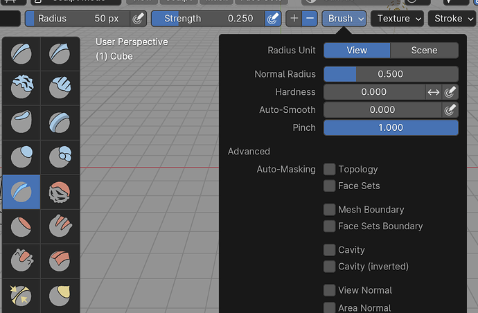
EDIT: I forgot that Pinch should also be set to 1, as @NahuelBelich mentioned a few posts below.

12 Likes

Brush suggstions:

  1. Chisel Brush
    I really like Layer brush because of its ability to not accumulate. I made this brush to easily do perfect cuts in the geometry, to carve out what I don’t need. With persistent base its even better. Its basically inverted Layern brush with stabilize stroke turned on, hardness raised to 0.2, and spherical falloff. Because of this falloff inverted behavior also results in very nice blobs.
  1. Mask Hard
    Since we have Hard variants for multiple brushes now I propose this. I’m mostly using this instead of regular Mask, which is too soft and needs multiple strokes to get to full opacity. It’s a regular Mask brush with Hardness set to 0.8. What’s good is that it mostly avoids gradients and is useful when you want to fully mask some part.

  2. Expand Smear
    Smear brush has modes, one of them Expand which is very good for mixing two colors. You can click on the boundary and it creates mixed color, and you can keep dragging mouse and it expands that color as much as you like. And if you just press on color with full opacity and move cursor it expands that color onto others, making it more useful than default Drag method in most cases.

  1. Sharp Crease
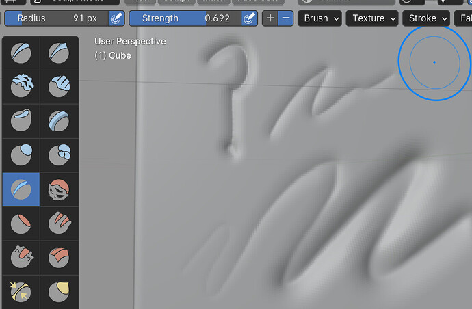
    On Blenderartists many of tried to create Crease brush that felt like “Gio” brush from one of the Zbrush artists, and robin.hohni did create super great Crease brush that feels just :kiss: It feels like pressing a knife in a dough. It uses very generic alpha that can be added as Image asset too once that is allowed.
  1. I see you have Paint Roller brush from color attribute brush demos that is on blender.org, but I suggest you add all of them. Crayon, Spray and Wet Paint are amazing brushes.
14 Likes

I’m confuse…
What will happen to the tool bar?
Can this new shelf be put on the left to mimic the old toolbar?

2 Likes

I like your chisel brush a lot, and the sharp crease is of course amazing. I hope these both are included

2 Likes

@nickberckley Love the suggestions! I’ll add them to the file and list.

4 Likes

I also have my eyes on improving the Clay & Clay Strips brushes. The current defaults don’t feel great. Laura Gallagher did a video once on how to make it more usable.
Some of that is also down to improving the code though …

9 Likes

I have saved Laura’s brush settings and called it Butter Strips, its nice, why not. But mostly for Clay Strips I use Clay Sheets brush that I made (or just copied, dont remember :smiley: ) based on one of the brushes in Sculptors Toolbox. It’s super soft and feels like glazing gently.

If we can get Sculptors Toolbox creators approval (or if we need it) there are two more brushes that I consider essential:

  1. Slice brush, its a scrape brush with Line stroke method and SUPER fast for creating facets. Very good for stylizing work.
  2. Extrude brush. Its a blob brush with Anchored stroke and amazing falloff settings that create cylinder like shapes, but with modifying falloff you can do make interesting shapes with it.

Also Blob Thick brush is very nice. Rest of them are either too funky or not actually useful when you get to real sculpting.

4 Likes

Sorry I’m gonna spam I’m very excited for this feature I hate current brush system :smiley:

I tested the new brushes in the attached file and I’ll give some feedback:

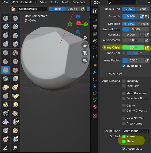
  • I don’t think Scrape/Peaks warrants to be a new brush. Its just checking one tickbox, and its not widely used anyway. I dont think anybody will be bothered by one click so much that they’ll need new brush.

  • Elastic Twist is way too funky and not useful to be “Essential”. I use Elastic brush more than anyone probably and I never found any use for it. Elastic Scale is nice though. I hope Elastic brushes aren’t in the different Catalog, as someone who uses it professionaly it will be a bit annoying for me to switch catalogs between Transforming and Elastic when changing grab brushes, or have General where they will be way too far apart and I’ll have to scroll in thin window.

  • I didn’t find Slide Pinch any more useful than regular Pinch, but I quite like Expand method on Slide Relax, since it does something no other brush does. I would add Slide Expand instead of Slide Pinch.

  • Not seeing too much reason for Anchored and Rake brushes. And since most users will not know why its there, will try to use it and get confused with results, especially since Rake will just do same as Draw brush without textures. I think if brushes dont have clear functionality they dont warrant “Essential” tag.

  • Regular Strength of 0.5 is way too strong for cloth brushes and will confuse those who dont know it. It makes brushes look broken. I suggest 0.1, or 0.2 at absolute max.

  • I think Drag Cloth is supposed to be what is current default Cloth brush, but its changed quite a bit and I couldn’t work with it. it inflates mesh too much when you use it in the middle. Old defaults were better imho.

  • I really don’t like brushes with and without Pressure for two reasons: First (this is constantly a problem if Photoshop), its soo easy to confuse them and pick wrong one, and you’re wondering why is it different. Especially when names aren’t fully displaced in the shelf Paint Hard and Paint Hard Pressure will be two Paint Hards. I think pressure should be enabled by default, with mouse it doesnt make a difference, and when painting if you dont want pressure on some brushes its one click, just like changing brushes. So I don’t see advantage of it except that it clutters shelf.

I see you’re not sure about Pose/Boundary brushes, so I tested them the most, and here’s what I think:

  • Pose brushes for Cloth I find quite useless and weird. Rotate is bit ok, but Scale and Squash are way too weird to be of any use.

  • But Squash/Stretch and Scale/Translate are super useful for meshes? I didn’t know that. I’m gonna use them even if they dont get in. I used it to make Snow base mesh buff and it took couple of seconds. They work pretty well on limbs

  • Smooth Boundary and Expand Boundary is so-so, but Inflate Boundary is quite useless. I never got what I’m I supposed to inflate with it.

  • Cloth brush names should all start with “Cloth” so that they appear together in global catalog. Since only way you can sort items in Asset Shelf is alphabetically, its important they’re not spread out I think. So Instead of Grab Cloth and Grab Plana Cloth → Cloth Grab and Cloth Planar Grab, and etc.

  • Names for Pose and Boundary Brushes get too big and intimidating. Maybe we need to find more artistic names for them? For example, why not name Pose Squash/Stretch just Squash & Stretch? Fact that its based on a Pose brush will be irrelevant for users with new brush system, since its not stored on Pose tool.

6 Likes

Loving all the great suggestions here,

Allow me to include a long requested workflow improvement:
image

Both Lasso FaceSet and Lasso Trim doesn’t have a Stabilize Stroke based on screen space by default,
If included, that’d lead to cleaner cuts and sharper boundaries as everything done with Lasso doesnt seem to be anti-aliased at the moment.

Kind Regards!

7 Likes

pinch brush (inverted)
strength set to 3
autosmooth set to1

This gets a palatte knife sculpt brush, for chocolate cake frosting, oil paints, margarine etc.

For some reason I can’t seem to upload a blend file but its very simple settings for the brush anyway. :smile:

5 Likes

Good job all.

It would be great to have the dam standard brush in Blender which consist in crease + pinch.

4 Likes

im don’t use zbrush, im curious as for your description what would be the difference with this?:


1 Like

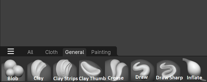
One thing that I think is super important is that the names of the brushes should be displayed on the Asset Shelf as well.
It’s way more readable and understandable and it removes all the guess work required to understand what every brush does or mean ESPECIALLY for new people.

I’ve put 2 examples here of how I think it should look compered to the original.


7 Likes

That’s already possible

1 Like

in the Asset Shelf as well?

Is there a thread to discuss this sculpt mode asset based design UI?
Because a lot of settings that are placed among the brush settings shouldn’t really be there.

2 Likes