Brush Thumbnails Design Feedback

All brushes bundled will be black by default right? Like they’re now. I hope so at least, so thumbnails should be black as well. Otherwise they’re misleading. If the plan is to make Marker Bold pink and Pencil Soft yellow and etc. please no.

1 Like

There could be a checkmark whether to use a dark background or a light one and authors would have to make two sets. So this would be a user decision or is that also too involved?

Regarding the GP Draw changes you made, one thing a lot of other art programs do is have white thumbnails for dark mode UIs and black versions for bright mode UIs while having the UI be the background colour. I am in favour of your change as well as long as what I previously mentioned gets added alongside it

See the post above:

@JulienKaspar One piece of feedback I have about the iconography is that I think the cloth icon could be a bit more readable. The shape to me doesn’t read that well as cloth from a distance. It has too many tiny shapes and the silhouette isn’t as clean as other icons like the hand and joint icons for other brush types.

image

Here are some quick ideas on how the shape language could be improved.

Here they are from a distance:
image

Inverted filled versions:

image

The basic idea is to have some contrasting shapes of curves and sharp edges to give the illusion of cloth being bent. Personally I prefer the one in the middle in the first row for how it has one round corner from the fabric being pulled from the centre, which is contrasting with the sharpness of the corners.


As for which design language I personally prefer out of all the ones being shown in this thread, I think that Julien’s original idea is the most solid. However, with some notes.

The way I see it, having the brushes be just grey with dark contrast like this one is how all 3D sculpting brushes should be done. It is simple and to the point. It also avoids the issue where 3rd party brushes are not following the colour guidelines when most people are already just using grey matcaps, so having simplified icons that explain which brush tool family it’s from is a way to circumvent that problem.

image

However, I think having icons in the corner that are coloured are a good idea. They don’t take a lot of space and the bright colour contrast works in most contexts:
Like these:

image
image

Move the icon to the top right corner however. Since most brush thumbnails are being stuck in the left bottom corner, the icon won’t be overlapping with the thumbnail underneath.

image

Having icons that indicate directions aren’t necessary however, because the brush thumbnail is good enough.
Avoid stuff like these icons:
image
image
image

Just have a select few icons for each colour. Joint and hand icons can share colour for instance. One exception being the cloth joint brush, which can have the same icon as the joint brush, but the colour will instead be shared with other cloth brushes.

Pose Brush (yellow joint icon):
image
Cloth Pose Brush (pink/purple icon like my cloth icon designs and I also change the positioning the thumbnail and icon to follow my design suggestions):
image

The only time I would break from this type of icon design would be for these brush tools:
image
image
image

When certain tools do very specific functions such as Simplify, Draw Face Sets, or Mask, I think it is fine to have only a thumbnail with some colour to indicate what they do. So no additional changes as I see it.

As for paint related tools such as these:


The tint to the paint helps differentiate the colour from the completely grey sculpting brush thumbnails, so good idea there. I would suggest going back to the green iconography for these brushes however. Make the tint slightly green since blue and grey look too similar still. Plus, the eraser icon is orange coloured, and orange and green fit a lot better as contrasting colours than orange and white icons.

Also, move the icons to the top right corner as previously mentioned.

As for which colour that regular sculpting brushes should have for their icons, like these:
image

I think blue should remain as the standard colour, especially since orange is already used by the erasers and smoothing/trimming brushes. No need to re-invent the wheel.

Good work so far! :slight_smile:

2 Likes

Here’s finally an update to the thumbnail sheet. I tried to address all the feedback and issues as best as possible and included some additional updates.

Let me know what you think.

  • New thumbnails for “Cloth” and “Elastic” brush
  • Added an example of an “Anchored” brush
  • New icon for elastic brushes (Based on squash and stretch behavior)
  • Reverted color pallette and icon colors to keep color use simple
  • Reverted icons to the upper right corner for better use of space (The conflict with the “Current File” icon in the asset shelf will be addressed too)
  • GP thumbnails use a light grey icon background without gradients, that supports both colored icons and various stroke values
  • GP Draw thumbnails use simpler black strokes again. Draw brushes should ideally depict a single stroke to not be confused with textured strokes
  • Reworked icons to match the blender UI icons better.
  • Kept subtle rounded corners that match the rounded corners of default theme (Would ideally be a preference slider as well)
  • Adjusted icon colors for Curve Sculpt brushes
    • Yellow = Transform (Preserve length)
    • Green = Extend length / Add geometry
    • Red = Shorten length / Remove geometry

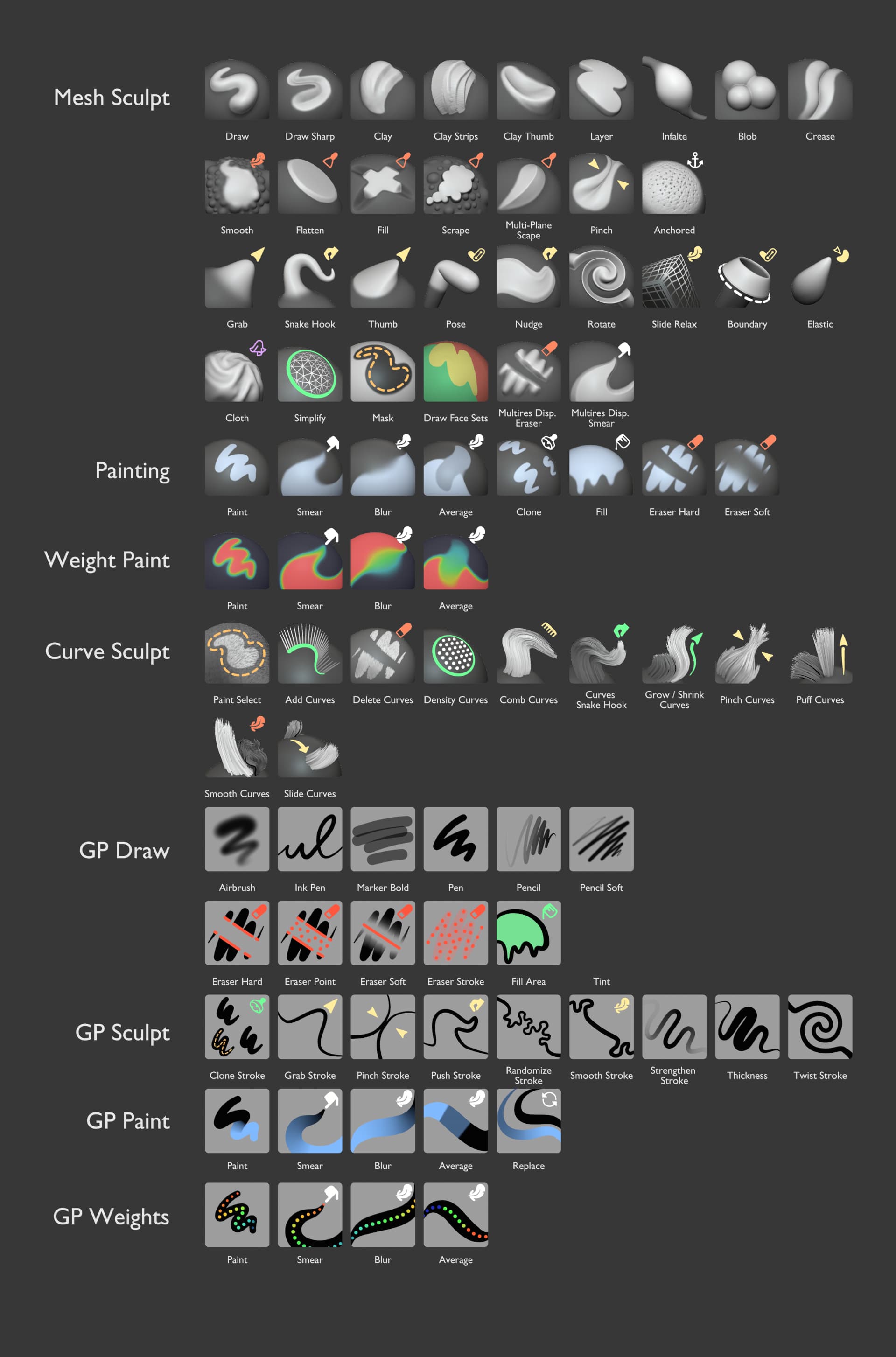
I kept the blue color for brushes that affect “Color”. This keeps them distinct from green, which rather means “Addition”.

Any add/subtract brushes in sculpt mode are not using any color to keep them simple to create and free of unnecessary visual elements.
This will be especially important for custom brushes, since the vast majority of custom brushes will be based on add/subtract brush behavior.

The light grey background is hopefully a good compromise for readability in values. For corner cases like grey stroke color the brush author should adjust that specific background of their own brushes.
No dynamic solution is planned, so strokes will generally be black.
A transparent background is not a good solution because it can cause issues between different themes with the varying background values and selection highlight colors.

With this the base set of brush thumbnails is complete. This means this could go into Blender any time once approved.
More brushes and thumbnails can be added with further development of brush assets and the essentials library.

Some aspects that I’d still like to improve:

  • More appealing Fill & Face Set thumbnails
  • Less deep dark shadows on Scrape brush
  • Better balancing of contrast between filled and line icons
  • Likely a better “Elastic” icon. Ideas are welcome
  • More readable red in GP Eraser thumbnails
12 Likes

An example of how they would look like in the asset shelf (sorted by name atm. Should eventually instead be sorted by catalog)

15 Likes

These look so good! Good design and aesthetic choices :+1:

First of all, great work on the design, it looks great!
Just wondering from design prospective, is it better to make all the brushes have the small icon on them and should it be on the same place for consistency wise.
Top right corner makes sense for me.
It just seems off that some brushes have the icon and some don’t, it breaks continuity in the design and make it seem like a different bundle all together.

5 Likes

Good point. I can elaborate.

The icons should add context that isn’t visible from just looking at the thumbnail alone. They should explain a vital but hidden function via their shape and color.

The add/subtract brushes like “Draw” and all the others do not have an icon because they are perfectly understandable on their own. Same for the Grease Pencil Draw brushes and simple Paint brushes.
The exception for this would be “Anchored” brushes for example, which need to communicate this behavior via an icon.

The icons are also generally in the top right corner. But some that use arrows and lines should then at least keep them away from the left and lower parts of the thumbnail.
I don’t mind if the icons are sometimes placed a bit inconsistently in the case of arrows, since it also helps make those thumbnails more recognisable.

3 Likes

I feel like the corner “category of brush” icons aren’t necessary at all, but I think I lost that skirmish. :wink:

On the rest - they look cohesive, polished, and have good shaping for quick ID. I think they’re pretty nice.

I agree, I feel they add clutter and inconsistency. I don’t think they’re necessary, the spheres communicate the brush effect very clearly.

Addendum : it’s not just that they’re unnecessary, I feel they actively detract from the effect. When I look at those, I see this little icon in the top right, and the meaning that I get is that “there’s something special about those brushes”. But turns out no, the icon is just there because without it the brush effect wouldn’t be totally clear. I think these should either be everywhere or nowhere at all.

10 Likes

Not the feedback on the thumbnails, but looking at mockups of asset shelf I know UX issues that I will have. Since I’ll have at least double of what brushes/tools we have now (and you mentioned more brushes will be shipped than we have now). And they can’t be fit into single line, or even two, we’re gonna need some way to quickly access the list/grid of brushes to select.

There needs to be a shortcut that gives you list/grid of all brushes that you have, similar to B in Zbrush, or currently Shift+Spacebar in Blender, but for brushes instead of tools.

I use shift+spacebar a lot, and I worry about losing ability to select brushes like that, especially with tablet when reaching shortcuts is harder. Same thing for brushes, but grid view instead of list (so that it can display much more) would be perfect.

I can also agree that the icons become a bit redundant when some have them and others don’t. Either have icons for most if not all brushes or leave the thumbnails alone. The silhouettes are practically all readable without them.

A shortcut is definitely needed, yes!
There’s a shortcut currently with the experimental pie menu on N. It’s available in the keymap preferences if “Developer Extras” are enabled.
This pie menu let’s you quickly toggle the header, sidebar, toolbar and asset shelf with quick directional gestures.
But assigning a shortcut to Shift Spacebar also sounds nice and anyone can assign it for now by right clicking on ‘Header → View → Asset Shelf’.

There’s also the idea of a popup version of the asset shelf. But this is not a priority atm. There’s still lots of things to do to properly support the docked asset shelf at the bottom.


About the corner icons:
They do fulfill a specific purpose (provide info on the type and settings). So just removing them isn’t an option. I also don’t have any alternative suggestions outside of what already has been explored :confused:

Without that extra info some thumbnails would be very vague on how they behave and what they do.
Like Nudge, Boundary, Elastic, Cloth, Smooth and Multiplane-Scrape.
Many other planned additions like many Cloth, Anchored, Elastic, Pose and Boundary brushes (which are highly customizable) benefit from extra iconography and color to categorize them.

3 Likes

I don’t think it’s a good idea to try and define exactly what the brush does in a thumbnail icon. It doesn’t matter we don’t know it’s an anchored brush, or it’s a variation on the grab brush… the user will explore and try those brushes, and they will know exactly what each brush does within a couple seconds. What matters is that the thumbnails are distinguishable and can be mentally associated with their effect. Right now these corner icons make the entire thing less legible because they’re next to each other

5 Likes

Thanks for the feedback! Later this week I’ll do another pass of a more minimal thumbnail design. :+1:
No icons. Minimal use of color and graphical lines. Stronger communication from the thumbnail about brush behavior.

9 Likes

Here’s a version with no icons. Colors, lines and arrows are still used as a substitute in a lot of cases.

It’s actually closer to a very early version I had this year.
Some thumbnails were also tweaked:

  • Smooth brushes are more similar in their shape language and directions
  • Dual-purpose brushes are more obvious like “Grow/Shrink” and “Fill/Deepen”
  • Slightly more readable red for grease pencil brushes (Still could be better)
  • Consistent use of blue for color
22 Likes

That’s looking like a complete win, Julien.

2 Likes

These are great.
Though, the Anchored thumbnail is a bit Trypophobia inducing. Maybe something else could be anchored?..

3 Likes