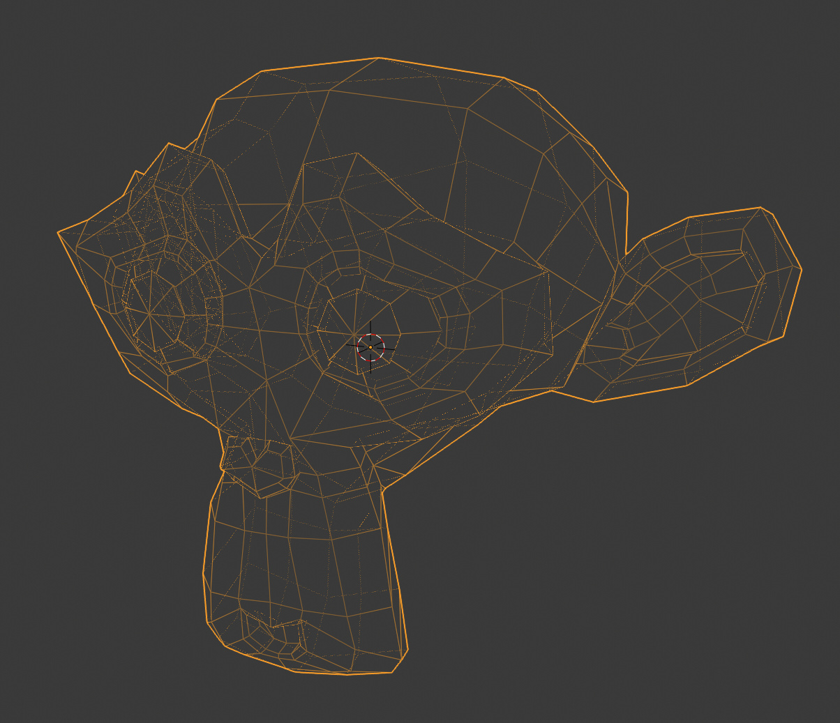
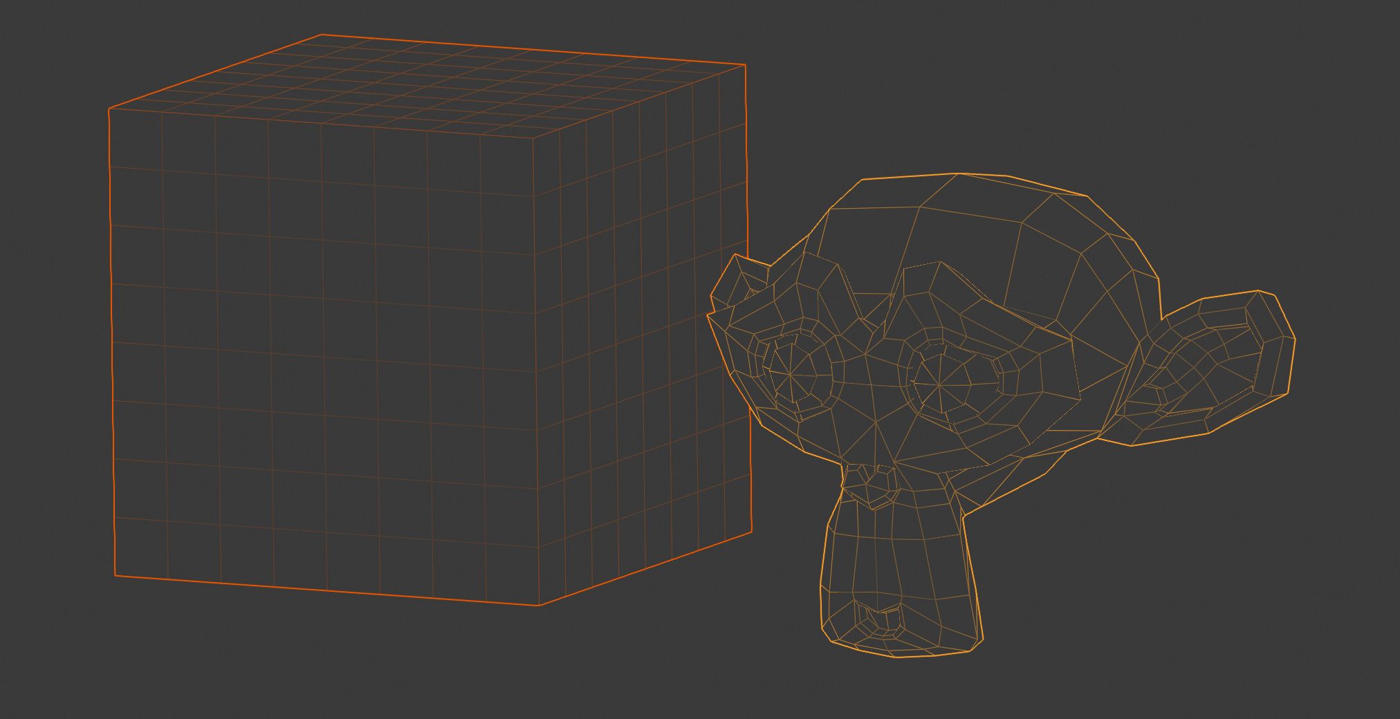
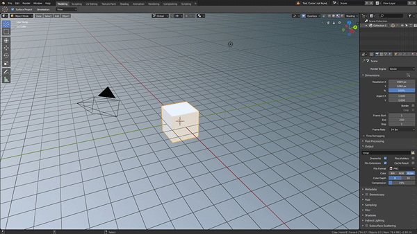
On a cube, ok, on this, this is not usefull at all.
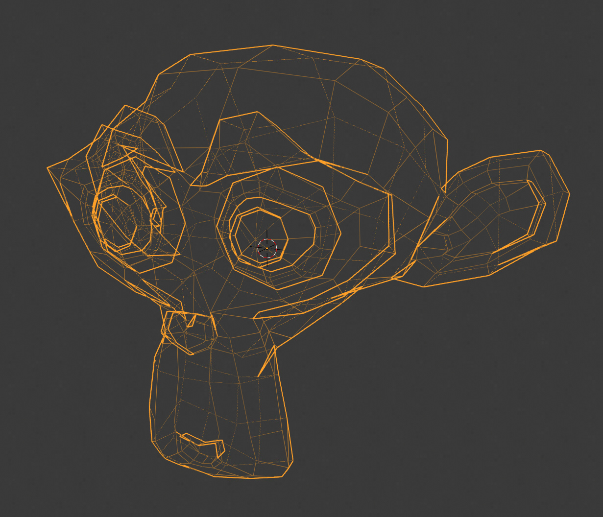
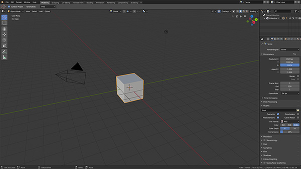
This example is better, but far from 2.79 as you can see.
On a cube, ok, on this, this is not usefull at all.
This example is better, but far from 2.79 as you can see.
If blender can be better than other software, it’s a great thing IMO.
After 12 years on maya, having to press F 1000x per day is a pain, trust me.
People want what they use, I ask for beginners.
I made a lot of tutorials, I help a lot of beginners and this issue came a lot.
Right, but that is the tricky thing about setting good defaults:
For most things that are hard surface models, or architectural structures, it makes sense for the wire display to be below 100%. For organic models it makes less sense.
The wire display set to somewhere between 0.8 and 0.9 seems to work well on both types of objects:
Maybe the BF should take a bunch of beginners and experienced users for a day and ask them on which part they struggle on this new blender.
Or make a big survey and see the results, that could help understand what people needs.
The trouble with rotate around selection, is that if you have a bigger scene and you select something in the foreground, you’ve now moved your focus to somewhere else. This can make you lose your place easily. Especially if you are inside a corridor, and you select that corridor. Now you rotate around something that you are inside, which makes no sense.
I’m not categorically against it, I’m just saying that you have to weigh the pros and cons, and the full consequences. Things are not always as obviously correct as you might think. This is not a widely used or popular default in any other app either.
“People want what they use”
What does this mean?
I understand whit big scene, but, a beginners will not use big scenes.
Experienced users know how to change defaults, not beginners.
I mean, most of people ask for feature they use, they don’t care about others or beginners.
Designing software using surveys is not a way to make good coherent designs. Your results will entirely change depending on who you ask and how you ask the questions.
You’ll also get a type of confirmation bias, that goes towards whatever the current defaults are - many people don’t change defaults, so they tend to use whatever we happened to pick. Case in point: Right click select. Nobody would use RMB select if it wasn’t for the fact that it has been the default for many years.
If you ask experienced Blender users, or experienced industry veterans, or complete beginners of 3D software, you’ll get different answers.
Designing and implementing solutions requires one to have a coherent vision for how all the parts fit together, otherwise you get a chaotic mix of directions and competing paradigms.
Being mindful of the different types of users we have, their needs and problems is indeed important. Many things we are addressing in Blender 2.8, but there are also many more things that would be good to improve.
I spend a lot of time with all the types described above - veteran Blender users. veteran users of other software and complete beginners too. There’s still a lot of fairly low hanging fruit that will make Blender more delightful to all those categories.
I can confirm all words of pitiwazou about wireframes.
I’m not a pro, but using blender for 2 years for different purposes. There is a lot’s of bad and weird things about Blender, but also tons of great and cool stuff. Blender is a very different software - I see it as tool, which user will deep into only if he need full control on what is going on and he is ready to troubles.
Every Blender user unlike others has it’s ‘own’ Blender version. That’s the power which made it popular in my opinion.
So, there is going a big problem on unifying Blender UI and at same time making it customizable. I think Blender 2.8 needs at least one design iteration to see where things is going. We should trust devs for now.
A little bit off topic, but I think you see the point 
I think the default should be that complete wireframe is visible. Toning it down via surface angles could have its uses on complex scenes, but then again I think a wireframe only on selected objects would help much more… Its really just weird that not the ‘whole’ object is shown by default.
id vote against the “rotate around selection” behaviour as a default, feels way too intrusive.
kudos billrey to do all of this communication, its really not an easy job to go into discussion with all these passionate people out there…
@billrey About rotate around selection and zoom to mouse position etc, those are viewport navigation options, so I think they should be available in the viewport menus, also they are options that people switch all the time, keeping them in the preferences is quite painful.
In c4d for example, those options are available in the viewport menus, they are very easy to access and makes more sense.
And yes, I wish rotate around selection and zoom to mouse position were enabled by default.
Hi guys, 2.8 is looking amazing and after playing with it for some time is hard to go back to 2.79. ![]()
The default grid color looks realy nice and pleasant in the default modeling workplace. But in some scenarios it looks too intrusive and almost gets confused with objects wires.
Maybe grid color in theme settings should be rgba instead of rgb to be more consistent across different scenarios without having to adjust the theme everytime you go to a different mode.
Some mockups below comparing what we have now and using an opacity=40% for grid color.
Also we can ajust the grid color brightness to compensate the opacity loss and keep the same apearance as we have now in the default workspace.
When Border Select is enabled clicking anywhere on the screen places the 3D Cursor. Is this the way its supposed to work or is this a bug.
The Border select is non standard and very awkward to work with.
When the Border Select tool is enabled clicking any empty part of the viewport should deselect everything.
Modifier keys Shift Alt with drawing a box should be used to Add or Subtract from the current selection.
This is standard in most programs.
This is how it works, because you need to click AND drag to use the tool.
Those options actually exist in the tool settings/topbar… But they are not implemented the standard way.
So yeah, the default enabled option should be “New”, with the ablity to hold shift to activate temporarily the “Add” option, and of course ctrl or alt to activate temporarily the subtract option.
+1
…
Thanks for the screencaps …I know that the user needs to Click and drag, this breaks blenders design guidelines as well besides being completely non intuitive … 3D Cursor, Select Move Rotate Scale are supposed to be modes and the 3D cursor should not be active in the Select mode.
I have a small suggestion regarding the delete menu in Edit Mode:
Instead of having to use Mesh->Delete->Face I think it would be beneficial when at least the standard deletions and dissolve operations can (also?) be found using for example Face->Delete or Edge->Dissolve.
Another suggestion would be adding some small undo and redo buttons (arrow symbols maybe?) into the header.
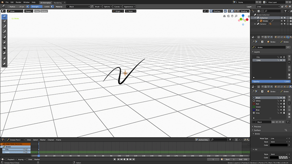
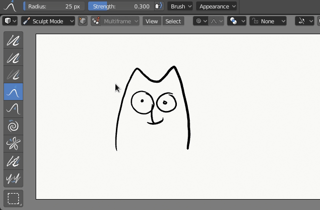
Some notes about Grease Pencil.
This is a few things that i think need to be changed. Maybe it is already in todo list, but maybe not?
Then using drag tool there is a threshold, a small distance need to pass to start draging, it’s need to be removed
In unknown reason brush circle are disappears, or displays from previous tool:
For the window corner ‘grabbers’ - i would propose just have a dark grey triangle which appears on mouse enter that area - job done. It then remains unseen until required…
Edit: I see you’ve considered proximity - would go with that 
Current crosshair is a liiitttle bit misleading.
I haven’t tested the workflow fully as yet but visually i love the new layout and look of the UI in 2.8… It feels like a huge step forward - blender almost feels like a ‘normal’ app and not some obscure alien landscape which is what i think everybody ‘outside’ of the blender community wants. Blender could very quickly become a serious contender if it keeps moving in that direction. An easily adoptable UI that is consistent with what people ‘expect’ when they open a new app for the first time.