Hi all,
Congratulations for the excellent work on Blender 2.80 version.
It is becoming a very attractive and interesting piece of love.
This is not about me, but it may be relevant for you to know that I’m 52 y.o. and I have a background working in visual FX (for many years) using mainly Lightwave, Vue, Terragen, 3D Coat, Fusion and some other software.
I have a simple consideration based on my experience using 3D software.
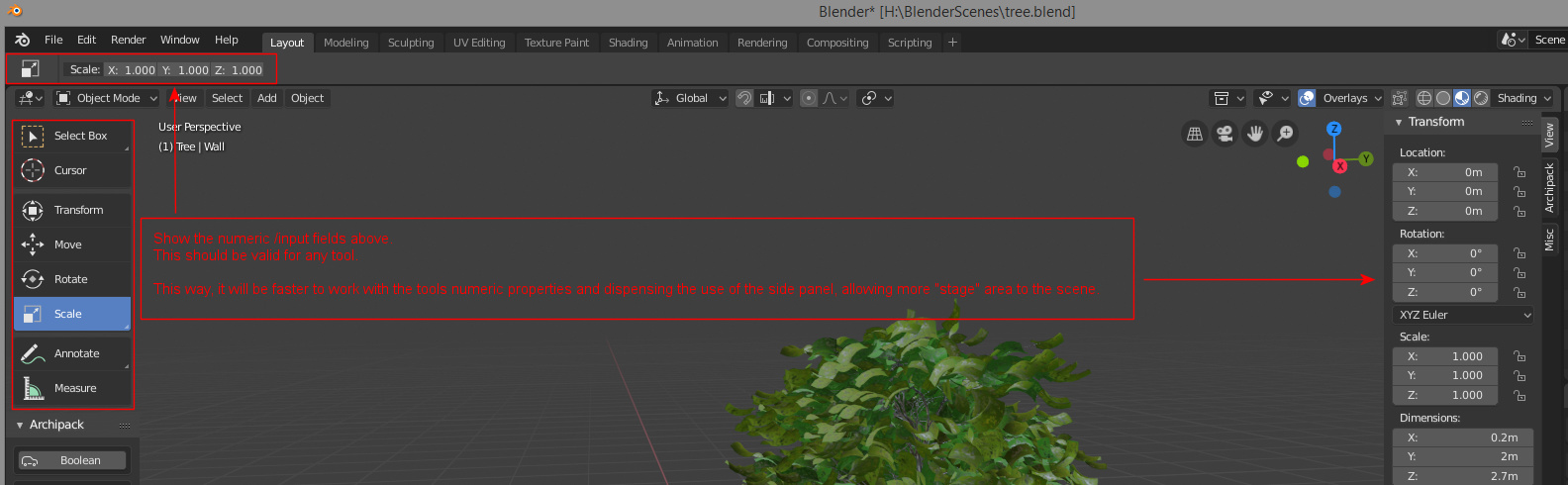
To me, it makes much sense having the numeric values (input fields) near the selected tool in the UI.
(see attached image for example)
Many thanks.
2 Likes
The top bar seems to be used for tool options, so putting the numerical options for the tools in the top bar makes sense.
The only issues I see with this:
- It conflicts with the existing tool numerical options popup
- The top bar doesn’t have enough space for a more complicated tool like bevel.
Overall though, I think you’re right that the placement of the adjustments for the current tool is a little awkward.
Yes, I understand that some tools need a bigger “space” to show all the parameters involved in it.
To that I would suggest that each tool present the basic “operators” on the top bar and add a small icon that, (if clicked) would expand to a full tab with all the numeric parameters and values.
(See attached image) to understand the concept.