the radius is working but new and subtract dosen’t work for me.
I’ve submitted it as a bug report on developer.blender.org.
wrong! its very useful, don’t break UX
Well I don’t want developers to completely replace the current behavior I just would like them to add a switch to turn it off, read my last paragraph:
“Please add an option to turn this behavior off if it’s not already possible. Thank you.”
It is great that it works for you but for me this behavior is the “wrong” one. A simple switch in the preferences would make everyone happy.
Use hotkeys for your fav functions, for example to shade smooth push W(RMB)-S.
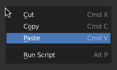
See those lines under the letters, this is shortcut key. Its speedup your work really well.
Beautiful! I didn’t know that one. Is there a shortcut for toggling Transparent mode?
Nevermind. I just found out it’s ALT + Z. Please add the keyboard shortcut to the tooltip!
Hot damn! Didn’t know you could do this either.
Here’s a new papercut. Ever since the 3d Cursor has had a rotation, its been interfering with my workflow a bit, and I find myself having to frequently open up the N panel to reset its rotation.
For example, when using Add Cube Tool from the T panel, by default everything is created in the orientation of the 3D Cursor.
Perhaps there should be a quick way to reset the rotation of the 3d Cursor?
When using the Snapping Pie Menu to reposition the 3D Cursor to the World Origin, shouldn’t the rotation reset itself?
A couple of paper cuts regarding the Bisect Tool.
When you bisect an edge (or edges) and then try to move the position of the slice using the gizmo, it should show you where the slice will appear with a vertex, but instead there’s absolutely no visual indication of where the slice will appear.
Also, when you slice a face, and then immediately try to slice the highlighted edge, the gizmo breaks.
@youthatninja, @r4p7or_3D, @billrey
(shifting of the context menu position based on the last chosen option)
This feature is actually broken, and gives a bad user experience.
In some cases, this speeds up the process, Yes, but in general (if you don’t want to repeat the operation) it looks like a random shift of the menu position.
There is a big problem with long menus like in edit mode, when the menus don’t fit in the window then it shifts, and the wrong item is selected. So this feature just doesn’t work and can lead to mistake.
The topmost item under the cursor. This is good and it is also a standard behavior in just about every application.
Not sure about the other OS, but on the Mac by default no item is selected, and a click will just close the menu.
Probably there may be a compromise solution - the menu opens so that not one item is under the cursor, but the last chosen option is selected as well. And it is possible to use the space bar as well as enter to activate the selected option. Although I’m not sure if it will speed up the process.

Please add an option to turn this behavior off if it’s not already possible.
Please do NOT add more options, make Blender convenient for everyone by default.
![]()
Great. I think it will be great too if enter close window without pressing ok button.
For certain things I like other means than keyboard shortcuts. Nothing wrong with shortcuts but you will soon run out of those easy to reach and those hard to reach are actually slower than for example context menus or toolbar icons etc. At least for me. Another disadvantage of shortcuts is that you have to remember them exactly. Context menus, pie menus, toolbar icons give you a hint (you can quickly glance over them) in case you forgot where the certain function was or what was the shortcut.
Don’t get me wrong shortcuts are great but they are not the magical solution to all UI issues. I am glad that Blender is being improved in those non-shortcut areas. It used to be all about shortcuts in the past. You would hear a lot of advanced users say “just use shortcuts” as an answer to any complaint about other UI elements. Fortunately this is not case anymore. But Blender still has a long way to go - it has no user customizable toolbars that could be dragged and docked anywhere, no tear off menus etc.
In my opinion the key is to make Blender’s UI fast and intuitive in all areas. Best application UX will let you use and customize anything you want. Those who want to use only shortcuts can do so. Those who want to use other UI elements instead of shortcuts should be able to do so (without any barriers in the software). Those who want to use combination of both should also be able to do so. At least that is my dream when it comes to UX. I love applications that offer wide range of UI elements for users to choose from and make their own UI and UX which will suit them best.
Yeah, you are right. My description was not precise. I simplified it. I just wanted to say that the standard way is to show the top of the context menu where the cursor is. I actually like that Blender immediately places the first item under your cusor. It kind of gives you a head start - you are already “inside” the menu. And if you go after the first option in the menu it allows you to do a very quick combo: right-click, left-click (no cursor travel necessary). So I would keep this behavior.
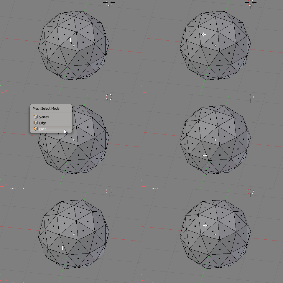
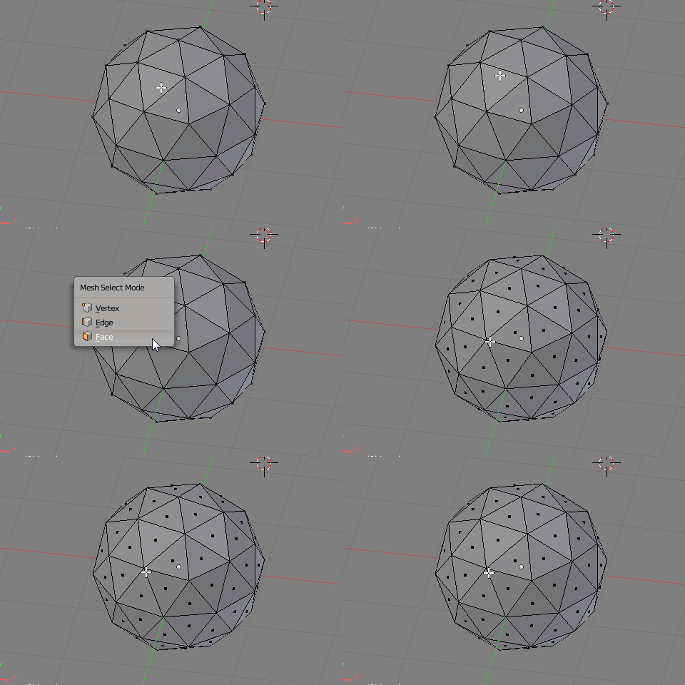
To further illustrate the issue with shifting context menus let’s take a look at the context menu from Blender 2.7 (I believe it has been removed from Blender 2.8 - unfortunately) that lets you quickly switch among mesh components (vertex - edge - face). This context menu of course constantly shifts its position relative to the cursor and that forces you to slow down, reorient. If it were not shifting it would be a rapid way to switch the components because there are only 3 items in it and you can easily remember those positions.
This is what easily happens when you for example try to quickly move the cursor roughly to the spot where Faces item should appear and expect it to be there - you totally miss and the menu disappears (in the GIF it is a bit exagerrated of course):

No problem when the menu is fixed all the time:

What is worse is that it makes no sense to shift the position of this particular menu because if you are working with say edges you will not want to select Edges again.
I know this is moot because this menu is probably no longer available in Blender 2.8 but it illustrates the problem well.
Memorise and work with the menus based on the where you see the menu. Don’t approach these menus like quick muscle-memory menus, we have pie menus for that. This makes even more of a point since we now have a context-sensitive menu (w), where your options aren’t always going to be in the same place.
This functionality is rooted in all the menus, it’s also what makes the confirmation menus fast to use, and it’s a godsend whenever you’re performing a repeat (or similar, as similar tools are grouped) task. learning to orient yourself by the visual rather than mouse movements in this case would be advisable, this is what most blender users I expect learn to do, and I’d say they’re no worse off for it. In the GIF, you’re clearly expecting the menu to open downwards, that’s the mistake. If you want to work fast with that menu, you should be either expecting it to open somewhere in the middle, then using visual reference to judge, or use the V E or F keys.
Which brings me to another point. The other thing about these menus - there is those hotkeys for quick use, so the way they currently work is the best middle-ground. Don’t discount the hotkeys as something separate or as some sort of band-aid. The hotkeys provide the quick memorised access, whilst the location provides quick repeat access, this is the best of both worlds.
As for which menus should do this and which shouldn’t, it’s almost certainly better to keep the same behaviour for all menus, rather than cherry picking ones that magically don’t follow that behaviour, for consistency.
If something is in a context menu, rather than in your favourites or hot-keyed by you, you probably don’t use it all that often other than the random times you use it a few times in a row. This means you’d be searching the menu for the option you want anyway, and if you remove the preconception that menus start at the mouse and move down, you can learn to orient yourself by the visual of where the box appears and be just as fast, if not faster half the time because you’re starting somewhere closer to similar and related tools you’ve used recently.
Whereas in your examples you’ve cherry picked a very specific situation in which
- you know the one option in the menu you want
- you care using this tool as quickly as possible
- you presumably use it frequently enough to have it’s location memorised, yet it’s not on a hotkey or in a pie menu. OR, you’re just not using the hotkey, yet you care about using this tool quickly.
- you didn’t use the other tools available to you to put it on a hotkey, or the favourites menu
- you’re not using (or this option doesn’t have) the in-menu hotkey
- you’re not performing this action repeatedly
That’s a pretty specific case, and a corner case, being that this is something that exists in a menu, rather than on a hotkey or pie menu.
Lastly, repeat actions are where all the speedups matter, once-and-done actions are always slower, and shouldn’t supersede repeat actions. Ever gone around a model marking seams? what about merging that bunch of wayward vertices together? Should some obscure option at the top of that menu be made ever so slightly more memorise-able at the expense of those repeat-heavy tasks?
I know and I’ve learned how to use these context menus (wait, reorient, don’t count on muscle memory) but that doesn’t make them any faster. That’s the whole issue I am talking about - I would like them to be faster to use and I will gladly trade the “benefit” of the last option under the cursor for this because it is not a benefit for me. I always use a simple hotkey for that (which has the advantage that it doesn’t matter how you called the action you are repeating - from a menu, by a hotkey, clicking on an icon etc.)
The GIF is just for a demonstration how weird the behavior is and how it can put people off. Because of that behavior I actually don’t use context menus that much and I am planning on replacing them with pie menus. That is a shame because sometimes context menus are quicker than pie menus - no reaching for any key - just right click. Since I use a wacom stylus for everything moving the cursor quickly is very easy for me.
Like I said earlier I like to use a simple hotkey for that (it is universal and very quick) so I don’t see this as losing any functionality or advantage.
That is not true. At least in my case. Switching the mesh components with context menu is a good example (Blender 2.7). It would be the fastest and easiest way for me were it not for the position shifting.
I agree with that. That’s not what I propose.
Memorise and work with the menus based on the where you see the menu.
Learning to orient yourself by the visual rather than mouse movements.
That confused me. The menu is shifted, with the aim that it would be possible not to look and just click. But you suggest “orient yourself by the visual”, what then sense to shift this menu?
Moreover, if you orient yourself by the visual, it is much easier to read once from top to bottom, rather than from the middle (where your cursor) down then back up.
It’s also what makes the confirmation menus fast to use.
This is absolutely the wrong approach! Then delete the confirmations altogether.
Look at the warning in other programs or OS, there is always the default selected is a some safe button such as cancel. This protects against mistakes, this is the purpose of the existence of these warnings.
And it’s a godsend whenever you’re performing a repeat or similar task.
And it’s hell when you perform a random, non-repetitive operations.
I’ll say. There is some common (default) behavior, familiar to the user, used everywhere. When you add some useful function for some specific cases (repeat task), this function should not break the general usage, as it is now.
In addition, there is a special function Repeat History…
If you’re waiting and reorienting then you’re still too focused on defining the menu by the mouse position. You should be picking up the menu location as quickly as it appears if you’re at the point where muscle memory of the menu will come into play, and the menus appear immediately after pressing the key. If you know the order of the items, and you can see the rectangle that is the menu, you should know where the item you want is, if you use it enough to know it’s location in the menu.
Not in blender you sure aren’t, the last operator function gets overwritten often. Between deselect all, and any other intermittent operations you might want to be doing (for instance, maybe you want to move a vertex between all those seam marking operations), it’s use is somewhat niche. Whereas the repeat-ability of the context menu continues to function when the repeat operator can’t.
Yes, your cherry picked example that effectively should just be a pie menu.
No.
Blender’s work differently specifically because they’re integrated into a fast-working environment. In such a state whilst working quickly, the appearance of the menu, because it is unintentional by the user, is therefore unexpected, and is enough warning.
See aforementioned priorities. Most work will consist of repetitive, or similar, tasks grouped together.
The problem is that Bender doesn’t exist in a vacuum, or in some “fast-working” parallel universe. On the contrary, it is used together with other programs and OS, where there are some “rules”, familiar and understandable behavior.
For example, the appearance and position of a alerts window. I always automatically move my gaze in the center of the screen when expect to see such warning, just because all programs do so and I see it millions of times every day.
But Blender, by some misunderstanding, likes to show a tiny imperceptible warning under the cursor, somewhere in the corner.
hehehe man this happens because blender and the comunity that surrounds it, are like that blindfolded juggler balanced on a unicycle on a rope between two worlds: between the artistic passionate one and the technical schematic one that sometimes you love sometimes you hate that lead us to seeing a completely new perceptive dimension that only few can define well and that I like to compare in metaphor to the intro of bruthal legend when the main character passes from an anonymous world to its god dimension thanks to the strength and light of the community 
But you have to wait for the menu to appear and then you have to reorient (or orient) - take a look at where the menu is, register the rectangle like you wrote. This might be very quick but it still adds a certain delay. With fixed menu I can actually get away with moving the cursor miliseconds before I right-click so technically I am not waiting for it. And I don’t have to orient or gauge any rectangle because I can make pretty good guess. The cursor is already on its way to the spot. This is why fixed menus are much quicker. With non-fixed menus you also task your brain with a little bit of extra processing - I know this is not much but it can add up. Working with fixed menus feel smoother. And that is important too. It’s not just about speed. I would rather think more about say topology than focusing on UI behavior.
But I think at this point this is just hair-splitting. The bottom line is that there is a perceptible delay when working with shifting menus. The experience is not as quick and smooth as with fixed menus no matter how you approach or adapt to shifting menus. Try using a well designed fixed context menus in another application for a while and then go back to Blender. You will see the difference. At least that is my opinion.
Like I said i will gladly trade this for quicker fixed context menus. I know I can’t have everything. There are also other ways and alternatives how to deal with those situations, also the repeat operation could be improved but that is for another papercut or thread.
There’s nothing wrong with cherry picking a very important (at least for me) context menu albeit from older version. This context menu is very important for me. This is where the fixed behavior would really shine. Simple, quick, intuitive. It should be brought back to Blender 2.8.
Why should it be a pie menu? That’s on every user to decide that. Pie menus are great but short context menus are often quicker (you don’t have to reach for any key and even remember any key).
Exactly. This is what I also wanted to say. When you are switching between various applications it is much smoother workflow when the basic UI and UX principles are harmonized.
Another compromise could be to make the context menus fixed only in the “industry standard keymap”. I personally would be OK with that because I will use the industry standard keymap.
Or just to make at least a switch in the preferences for those of us that like the fixed menus better.
To Antoiz: I don’t want to take this feature away from you. If it works for you that is all that matters but it doesn’t work for me. That’s why detailed options and switches work wonders. Everyone can fine tune their UI and be happy.
