Yeah, they’ve done this so that you can tell the difference between edge and face select mode - too subtle for my liking.
I just learnt you can turn the face dots back on in the Overlay panel - checkbox Center under Mesh Edit Mode. Smaller than they used to be, but still helpful.
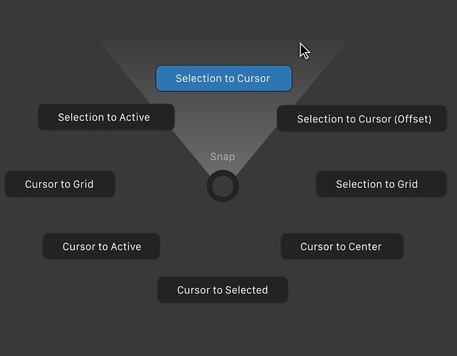
trust me, the reason why you hate the pie menu, is because by default have a too wide radius, and because they do not have a visual feedback like this that tells you that the command is already active just move a few millimeters the cursor …
in addition they have that animation of appearance, which seem to slow down everything (and on heavy scenes you notice a real slowdown) look like a toy
With these tricks of corrections your mind would better accommodate the obvious speed that the pie menus have.
At the moment they seem slow, because the mind thinks of having to wait for the appearance of them and then that it has to go on the button to enable the action …
because it is used to years of old use with classic menus.
Yeah, could be, but I prefer to search in a left aligned menu of 3-4 options than in a pie menu that obligate me to read all the pie menus and remember all positions.
For me is other decision thinking in visual design and not in users that work with blender.
I made these remarks because I also have a certain difficulty to disaccustom the mind to many years of use in a certain way …
so I understand your point of view …
I’m sure that pie menu design could be better, but if the user, in this case me, doesn’t want to remember hundreds of new pie menus, must be a easy option to change pie menus by menus (what I think must be by default, but it’s more personal)
In the Info editor, Alt+A does not deselect. It’s the only editor that uses the old A toggle for both selecting and deselecting.
Cmon guys, why no one care about lack of this prev feature
now im on a “deaftalk:(c)”
Maybe because no one is using blender for modeling seriously. But are you sure that feature was in 2.79? I remember a discussion about this
I think you can increase the facedot size in the preference.
Is there any plans to get rid of the camera changing places when switching the top themes and going to local mode? Sorry if I’m interrupting anything but this is a maddening paper cut. Thanks for reading.
The local mode issue was solved recently.
Not sure what top themes are.
Awesome, thanks so much! Figures crossed on the rest of it.
Also here is a video that covers many of my same paper cuts, at 13:40 he runs into the same camera issue.https://www.youtube.com/watch?v=IJ3YFK2uBa0&t=271s
Hey, I like your idea except the double click part. Using double click to change the value would slow the workflow down.
I’d like to suggest:
- Let the single click as is (single click for inserting the value)
- Instead you could replace the single click to ctrl + single click for changing the value as the cursor position.
- And/or ctrl + mousewheel for changing the value as the mousewheel scrolls.
- IMHO, it’s more convenient and wouldn’t slow down the workflow, instead it will speed it up.
PS: ctrl could be replaced by shift or alt; I think ctrl is more relevant and natural though.
EDIT:
Forget about my suggestions above.
After some thought, I agree with you and double click wouldn’t slow down the workflow.
Double Сlick, LOL.
When I enter a value (from the keyboard) and then click into another field, it only confirms the current input and I have to click again to enter. It’s already two clicks, slow and annoying. Triple click? No, thanks.
And let’s agree that these are two types of input fields:

they are the same and both work the same way. Just one of them has an extra visualization, but it’s not a slider, it’s an input field.
@jenkm We developed the subject a little more. Your contributions and suggestions are welcome here.
Link
The one below is a value slider, it has a hard maximum, so it displays the current value relative to the maximum (in this case 1), the one on top is a number field which allows for any number, hence a percentage of maximum -infinity- cannot be displayed, as there’s no such thing.
That approach has several drawbacks:
- mis-clicks become a whole lot larger of a problem.
- Imprecise. the larger the value difference between min and max, the less less likely you are to hit the value you’re after. And if it requires tweaking after clicking (by dragging), you mayaswell have click+dragged.
- Imprecise again. If the dragging behaviour only uses the space of the slider, then now you have no way of setting values without bouncing over and under the value you want (worse the higher the mouse sensitivity is, or the smaller the panel is).
- not all value sliders have bounded ends, being able to adjust whist above or below the bounds would be a pain in the ass.
- It’ll change the value to some arbitrary mouse position if you try and click+drag over multiple fields to edit them in sync.
- It’s inconsistent with the other value field types.
The current click-to-edit, drag for fast edit, shift+drag for slow edit handles all situations quickly and effectively. It’s also consistent with all of the other value field types.

