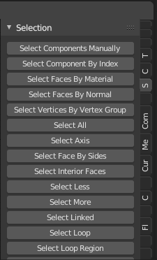
Image from the Sorcar addon, could be handling things differently to fix the ‘issue’ but used as example here since it illustrates the problem I’m writing about well.
Sidepanel Tabs get squashed and truncated beyond usefulness.
What is happening:
- Tabs get truncated, sometimes beyond the first letter even.
- When trying to scroll the list of tabs it instead scrolls through the tabs, switching them.
-
- A nice to have alt function to the scrolling but should reside under Alt modifier + scroll wheel instead.
What should be happening:
- If too many tabs to fit them all, truncate up to first word but not beyond, if truncate at all.
- Scrolling over them should move the tabs into view to reveal the ones outside of the view.
-
- Scrolling while holding Alt modifier key should both scroll the view and at a similar rate switch through the tabs so that the active tab is always in view.
Bonus feature I’d appreciate, but not at all high priority:
Having a extra moveable sub area divider to be able to expand the tabs into two columns(rows?) in case there’s enough of them to warrant that need.