Blender UI paper cuts

Note that @wevon is talking about the constraints there though. :slight_smile:

Hopefully what William wrote is valid also if you say constraints :wink:

1 Like

Suggestions:

  1. Right justify the text.
  2. Reduce the button size.
  3. Arrange the buttons into two columns. (If the horizontal width is to small; the buttons wrap to a single column.)

The above would help streamline the UX and save vertical menu space.

Icons would be a nice addition.

1 Like

Yes, indeed - the overall plan also should include constraints too. Different areas may be nodified at different points in time, so this factors into which changes make sense to make when.

1 Like

Good to hear! Maybe the solution will help shader nodes to be better represented in the properties as well.

Here’s another minor quirk - linked proxies show an Edit mode in the menu and the pie menu, but clicking it takes you to Object mode. It should be grayed out or not there at all. Barely effects usability TBH, as long as you know you’re working with a linked object. If someone else opens the file though it could be confusing.

1 Like

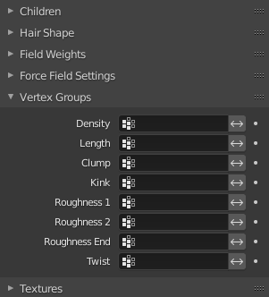
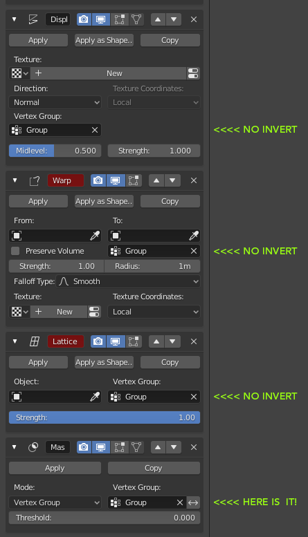
Some vertex weight field here and there have an ‘invert’ button while some don’t.
Please place that invert option everywhere, it can easily save us the dumb operation of adding a useless (inverted)vertex group!

examples:

image

17 Likes

Possibility to press E to chose a color with color picker like any others color-input of blender.

12 Likes

The grid flow layout in the Navigation tab makes it so text on some buttons and labels are ellipsed until you reach a ridiculous width.

image

Solution

In the class USERPREF_PT_navigation_zoom in file space_userpref.py, calculate a new column threshold to pass as columns kwarg so that it stays fewer columns long enough to not cause overflow ellipsis. Example code below.

        ui_scale = context.preferences.view.ui_scale
        columns = (context.area.width / ui_scale) // 470
        flow = layout.grid_flow(row_major=False, columns=columns, even_columns=True, even_rows=False, align=False)

Before

After

23 Likes

You might want to submit that as a diff to https://developer.blender.org/differential/diff/create/

1 Like

Particle ui : no option to select existing particle, so instead i need to create a new instance of particle in order to select the existing one.
Screenshot_1

if the material ui can choose the existing material maybe the partical ui can have that too :smiley:
Screenshot_2

11 Likes

we would need columns with minimum and maximum “expansion limits”.
and after a certain expansion, which automatically forms a new column and all the functionalities are divided between the two columns (or three in case of greater expansion.)

it makes no sense for a column to stretch beyond a certain limit if it is not possible to read or reach the instruments, just as it makes no sense to have such long buttons or sliders.

this is what my intuition suggests …
but I can’t understand what the problems are in terms of coding or design, of not inserting certain limits like this.

Selecting sculpt brushes in sculpt mode is a pain if you have more than 24 custom brushes. By default the brush palette displays 24 brushes. If you want to see more you have to use the up/down arrow keys or a scroll wheel, which advance 1 brush at a time. A scroll bar or resize-able popover would be much faster for those with tablets.

13 Likes

Why not capital B?

image

:upside_down_face:

2 Likes

Blender 2.79 used to have the smallest grid scale shown when in an orthographic view, and if you had units as metric or imperial. You could roughly see how your objects are scaled without whipping out the ruler.

I can’t find a way to show it in 2.8 and it would still be pretty useful and doesn’t take too much space on the UI.

5 Likes

https://developer.blender.org/T61286

One UI nitpick I’ve had for a while now is the fact that when selecting edge loops for UV unwrapping and using Ctrl+Shift+Click to select the shortest path of edges, it checks “fill region” every single time you pick a shortest path, even if you disable it after the first time. It would be helpful if it remembered your selection or made it a toggle. I use shortest path all the time when selecting seams for UV mapping and that extra click adds up quick.

9 Likes

Developers hate the shift key. :slightly_smiling_face:

Something related, The blender.exe is lost in the middle of all those other files (not visible with out scrolling, and you can zoom past it with out even seeing it). Most other programs spoon feed this process a bit more, so first timers may not even know too look for a .exe file. So if possible, it would be handy if that .exe would be in the folder before the cluttered one. That way its stands alone and also it would save us common users a double click and a search each time we gab a new build.

1 Like

Hello, me again.

We used to have shift+uparrow and downarrow for delta frame offset . This is an essential key binding for compositing and rotoscoping works.

I have checked creating two key with shit+ up and down arrow without any conflict. Please bring it back in default blender if it’s alright.
Also just a tiny proposal: instead of creating delta for each, is it possible to give a global delta in the timeline panel. So that we can choose the delta as needed?
Then we don’t even need to give different key bindings.
Thanks.

Did anyone notice that Outliner search is completely useless? You can search for something, let’s say all objects starting with “Plane”, but then you can’t really do ANYTHING with those search results. You can’t for example select all the objects you searched for. You just searched for something that’s pretty much throw away. You can’t even box select all the search results manually, because box selection doesn’t scroll the outliner vertically, so you are only limited to what’s visible in the current scroll segment. The only way to select objects you’ve located using search function is to select them by clicking them one by one and holding shift. How the hell did not anyone see this?!

So not only is there a complete nonsense of outliner pre-selection and then having to right click to actually SELECT the selected things, but then there is a THIRD form of pre-selection, which is used by search, and can’t even be used to actually select the objects.