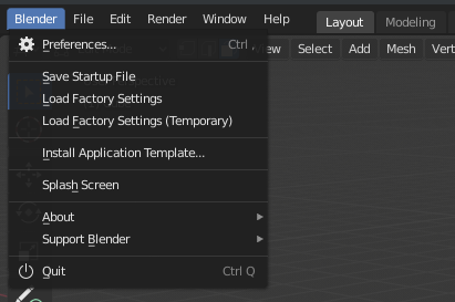
Blender’s biggest issue which has caused most of the damage to its popularity, growth and therefore also funding was the general weirdness of many of the decisions, mostly in regards to user interface. Since 2.8 project is mainly focused on mitigating these, let’s not throw the sticks under our feet again:
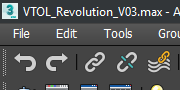
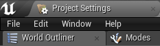
In pretty much every software out there, “File” is the leftmost, first menu entry.
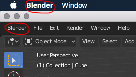
None of the software contains the menu entry named after the software itself.
Quit/Exit is always in the File menu, at the very bottom.
About menu is always in the Help menu.
Preferences and software settings are handled differently, sometimes in the “File” menu, sometimes in the “Customize” menu, sometimes in the “Preferences” menu.
Regardless, keep in mind Blender is not an unicorn. People will use it alongside other software. Let’s not reinvent already existing, and well working wheel. Let’s not turn menus into the new right click selection.
My suggestion is to put these into “Customize” or “Preferences” or “Settings” menu which will sit between “Edit” and “Render” menu. I’d also suggest making “Window” menu a sub-menu of this new Customize/Preferences/Settings menu.
Let’s also put Quit and About back where it belongs.
Yes, I know you want to use this weirdness to imply these settings are Blender-wide, not scene-wide, however preferences getting automatically saved within the software are already well known, and completely expected behavior pretty much everywhere except the Blender land, so we don’t really need to go above and beyond to let users know about that using weirdly named and weirdly placed menus.
My personal favorite solution is Customize menu, with:
Preferences
Save Startup File
Load Factory Settings
Load Factory Settings (Temporary)
Install Application Template
Window Sub-Menu
Then, Splash Screen, About and Support go to Help menu.
Quit goes back to File menu.
Window menu should stay. That menu is more common and defacto standard than customize would be. And while a Customize menu would be a definite improvement over the current situation I still feel that many of those items shouldn’t necessarily be menu items at all.
Yes, true… Factory settings stuff should be in the settings window itself, so could be the application template. As for the window menu, I did not suggest for it to go away, just to become sub-menu of Customize menu, as it’s not used that often.
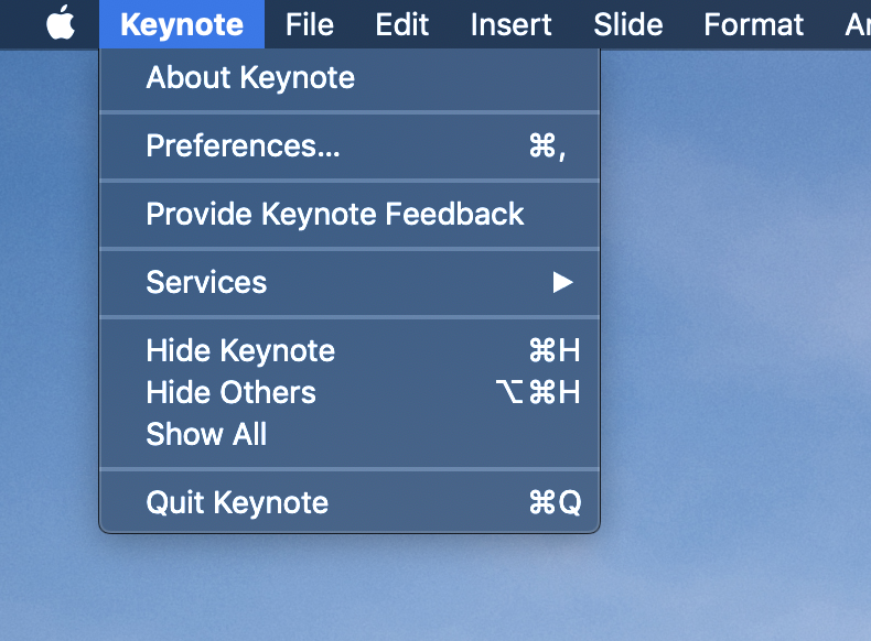
Sure. I have to admit I never used mac. I googled most of these apps, and some others on Mac, and indeed they all have text labeled as a name of the software left of the File menu.
Out of my curiosity, is that text actually a menu? And if so, what’s in there?
Oh, okay, that explains it. I’d actually be for this if it could be Mac specific only, but I reckon that developers would not be happy about maintaining a Mac specific menu, and Linux doesn’t have this concept either. So I still think that Windows/Linux standard would be more fitting here.
I’m leaning toward the idea of changing these per-OS. So our menus could be more PC-standard on Windows and be more Mac-like for Mac users.
Of course one complaint is that it is too much work. It is not. The other one is that it is best to keep consistency for tutorials and such. But every major piece of software that ships on multiple OSs will alter things like this to suit the platform.
I’m mac user… and I preffer to have same menu in all my builds. Enough pain was these days using the Blender App menu, how to have a different menu if I’m working home or office.
Some things just seem weird and wrong when you are not used to seeing it, or right and normal if you are. One way or another might not be objectively better or worse but will be seen quite differently to Mac users versus PC. It is just a bias (of many) we have to be aware of.
All those Mac responses,. Let’s think about the majority of the users windows and then Linux and then Mac. These days windows software is mostly ported to Mac . Mac’s are no longer a major operating system to develop for sure used to be like that in the past for the graphics industry but that’s many years ago. Rather be glad the hardware of a Mac is still supported as apple doesn’t put lots of effort in graphic drivers.
I understand the problem but I actually prefer what developers did so far. ‘File’ menu should contain items in regards file operation not the app itself. In that way not only I’d find the new menu more minimal but also logical. Even though that’s a current Windows user experience does not mean it’s better.