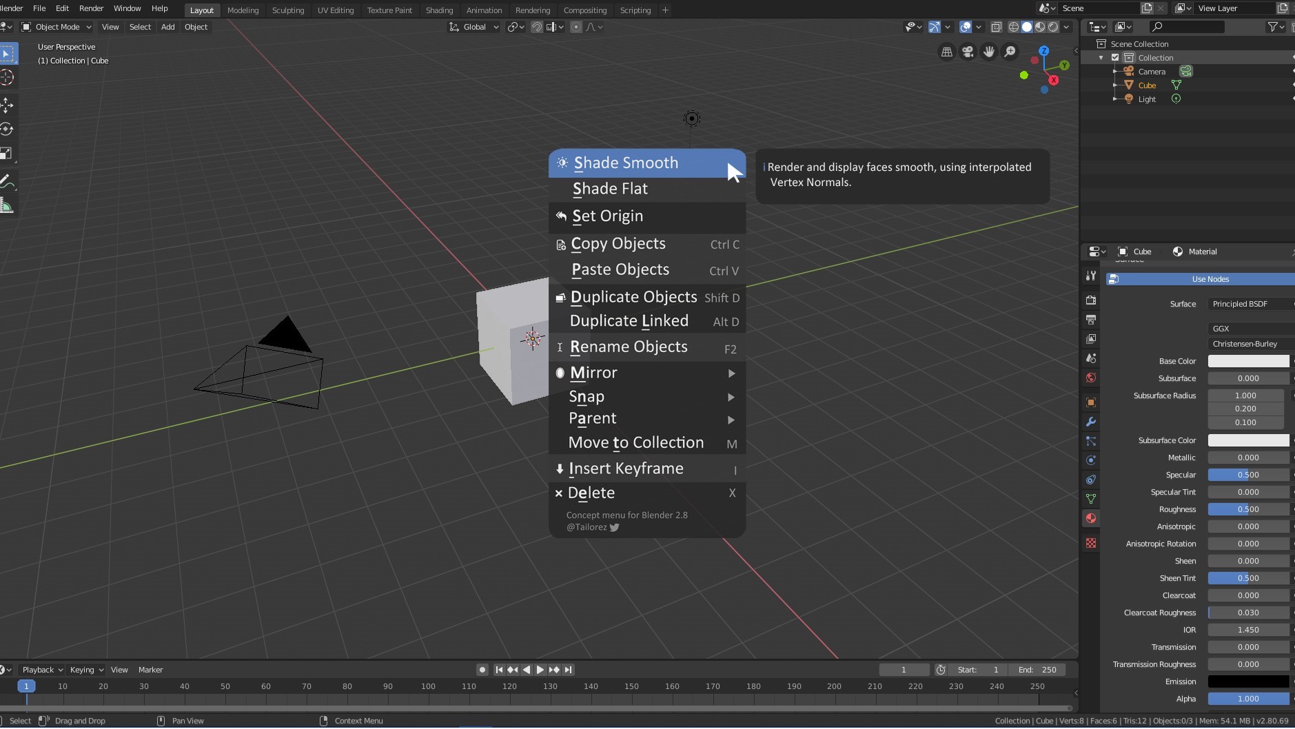
With Blender 2.80, the UI changed completely. Only the right-click-menu (for example the “Object context menu”) did not. I made a concept and uploaded it on YouTube (1min, https://www.youtube.com/watch?v=dpb8g5Qlaas).
Is it possible to implement it within the final 2.80 version?
What do you think about it?
hmm, are the corners of the panel more rounded than the current one and the other ui elements like the workspace tabs etc ?. If thats the case nope, its not very consistent witht he rest of the ui. The same for the font boldness, I like the default sharper font better, the same its in the header menus. Also about the icons, they add too much and they are kinda redundant, plus there are many addons that dont have icons for the menu items once added so again possible inconsistency. Style of the icons need to be the same wiht the rest of blender UI, meaning they have to be designed by the same guy and I dont see the guy that worked on the icons giving him extra round of work by populating the menus with icons.
If I understand correctly, you propose three changes:
- Larger radius for the corners
- More entries with icons
- Alternating background colors instead of separation lines
Rounder corners make it look less consistent, more icons add visual clutter and so do the changing background colors - aside from being harder to understand, because it looks like some entries are highlighting instead of conveying the notion of groups.