“Houston we have a problem”.

7 Likes
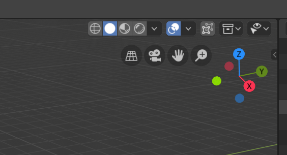
The stuff displayed in the top bar with your “free empty space” are all global things like tool parameters that are common to all views. The stuff in the header bar in the 3dview like the shading modes are local to that view and so need to be inside that view so if you have four different 3dviews you can have each with its own shading mode. Thus it’s not easy to use the available top bar real estate to relieve the crowding there.
You can middle-mouse-drag on the header bar to get to the end of it when the editor isn’t large enough to display all of it at once.
Thank for tip, but “if you have four different 3dviews” it’s lead more problems with width this header bar. Scrolling left-right will be more painfull and timeconsuming.
I think we should at the very least move the Collection Visibility panel into the Sidebar. Then we regain a little space.
Earlier in 2.8, the tool settings (orientation, pivot, snap, proportional editing) were all together in the top bar, which did make the 3d view header a lot less crowded. It was moved back to the 3d view for a variety of reasons, but considering the fact that they aren’t viewport settings, it did make a certain amount of sense.
I think names “global”, “overlays” and “shading” can be removed and left just icons, which shorter like snapping.
They are very obvious without the text…
2 Likes
I like seeing them when there’s room, but having them collapse away when there’s not enough room would be worthwhile I think.
2 Likes
Hi Folks. I started this post because I was confused why everyone has 4 visibility icons and I see only 3 - I am guessing that the ability disable objects from all viewports (screen icon) has been removed from views level and it can only be applied to collections at scene level (within the outliner). A bit confusing (specially since so many 2.80 tutorials look wrong)… but logical… unless I’m missing something.
Other user feedback:
I don’t understand why the render and viewport visibilty controls for collections are not keyframe-able since that would be so useful (well to me at least).
I am confused that if one sets up a collection to be indirect or holdout in the view that there is no visual indication of this (that I can find) One has to open the controlling dialog and see the setting. There is a screen grab from a.monti way back in october 18 which shows a table showing these settings, but that dialog seems to have dissappeared. … hope something like it is coming back.
I am confused that if you want to see which elements are going to be rendered you now have to do the rendering since there is no longer (that I can find) the “display only render” switch that used to make only objects that were render enabled show in the viewport. I know you can switch off all the overlays… but that’s not the same thing. In my opinion, getting confidence that you’re going to render what you expect to render before leaving the machine to work through the night is rather key!
I’ve only just tried to port a 2.79 project to 2.80 for the extra perfomance, but have wasted lots of time rendering things with errors in because I couldn’t quickly visualise the scene before rendering, like I could with 2.79.
The visibility toggle settings are being worked on still. The previous solution with two toggles for viewport visibility was confusing.
You can follow further discussions here:
https://developer.blender.org/T61361
The inability to keyframe visibility is a technical issue to do with the new ‘Copy-on-Write’ dependency graph in Blender.
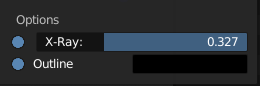
Tiny UI nitpick: I think the values for X-Ray are flipped. It doesn’t make sense that more X-Ray means seeing through the mesh less. Off should be 0 instead of 1.
7 Likes
Exactly my thoughts.
What do you think about this?
-
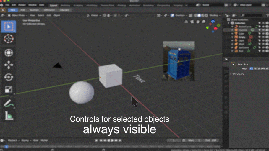
Controls for Select Object
-
Controls for add…
Same dynamic panel for add, selected object or active tool.
Faster for workflow and optimizes space.

20 Likes
This makes sense to me as well. I think it would be nice if the tabs of the Properties editor were rearrangeable same as the sections of settings in them. The floating Last Operation panel seems a bit distracting to me even after a fair period of time I have given myself to get used to it. It feels a bit cumbersome to hide it so it doesn’t get in the way and I always have a fear of missing it when I need to maximize it because clicking away makes it disappear. But it is not a huge issue by any means and it is in no way a problem - I would say it is pretty much the same as in 2.7 if we are talking about convenience to use it. I would feel very comfortable to work with it if it was in the Properties Editor while it is still possible to make it callable by a hotkey in the 3D viewport, however I can already see an argument against it - currently you can have any tab open in the Properties Editor and access the last operator settings at the same time so this would limit currently existing functionality.
Faster except if you work with a big screen, two monitors, custom layouts,… so the 95 % of the proffesional users needs it near to work confort zone
The 2.79 float panel was better because you can show under mouse and only when you want it.
2 Likes
I was about to write it … you anticipated my answer …
the question is that these are all tools that only concern the 3D view, and as a logic wants, should be only in the 3D view, as well as the other tools all become in their respective area of work …
maybe in a place and in a better condition than the one now, and that it is like a piece of art … “a better always visible”
I could also accept that for reasons of space optimization, when not in full screen mode these are stored in the property panels … as long as they are also available when we are in full screen 3d view mode, and in confort zone for big screen’s more monitors etc…
the basic question, and I’ve already written it somewhere in the forum,
is that the panels of the properties should also become more context sensitive according to the various areas of work in which we find ourselves … object mode, edit mode, vertext mode, sculpt mode, paint mode … etc …
The magic object context menu recently developed in the 3d view teaches and shows that this could be a good way …
The floating panel would always be there as a parallel panel, for all the cases you mention. Calling it with the shortcut.
2 Likes
When snapping is turned on, only the move tool uses it. The rotate, scale, scale cage, spin, etc… tools should also snap when snapping is on.
Ideally, holding the Ctrl key should visually update the toggle at the top of the viewport so that we can see when it is actually on or off, but I hear that’s a pretty non-trivial task.
I know it’s been asked before, but it would also be so much nicer to have snapping per-editor. I don’t really need moving my nodes to be all choppy because I’m also moving objects around on a grid.
1 Like
However, the distance problems are still similar, you can`'t work with a full screen layout and force you to be constantly changing the properties area tab instead of using it for what is intended.
Wanting to put there everything that happens in blender seems more like the maya homesickness that users have.