Yes to this. Perhaps more squircle than circle though. Meshmixer takes care of allowing the user to click on obscured faces of the view cube by including arrows that point inwards. So there’s a distinction between “these sides you are presently looking at” and “these sides you are not”
Im not sure if it was by accident or if it was the reference, but many of the main concepts of the new blender 2.8 interface are basically used in 3DCoat, not photoshop nor other standards.
Dedicated spaces, top bar, tool shelf and space bar tool shelf, etc
For reference, 3DCoat its a better example of prof of concept about how would it work rather than other softwares, at least at the moment.
I don’t care about looks of UI. Just want it as fast as possible. 
2 Likes
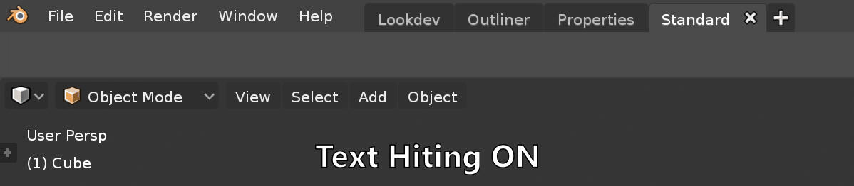
new text hinting make text in blender hard to read. my eyes drain.
i wish its not default.
top with text hinting, bottom without text hinting
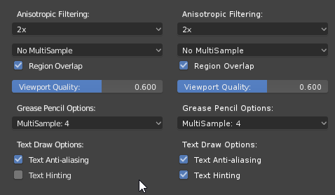
left side without text hinting, right side with text hinting
2 Likes
maybe text need more space ‘kerning’ to make more readable and without text hinting. text hinting make text not smooth. or it’s need antialiasing.
The idea behind hinting is made more narrow and clear the text solving the bad rendering effects
will there be a new way to select snapping options? Because one must to click many times to get settings right
For example to vertex:
- ctrl + shift + tab
- select vertex (menu closes)
- ctrl + shift + tab again
- select active (for example) (and again menu closes)
- the same thing to select other options
also there is no snap ON/Off icon
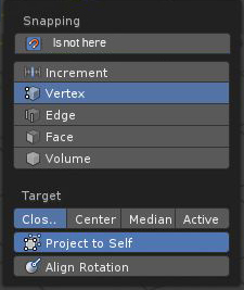
I don’t see why the activate snap must be isnide the menu when you need the info when you are modeling.
I don’t understand what information?
I just want to set snapping from increments to vertex and Target to Active. To achieve that, one must to open this menu over and over (with shortcut) and its slow.
Here you told that… (stupid points to fill the 20 letters limit)
info is ok but, you also need to active/deactive snapping without reaching Header of viewport.
you can always deactivate using Ctrl when you use any command.
no, for example finding the center of two or more vertices with /A/ (Add snap point) doesn’t work while holding ctrl
Hello great people!
Any UI refresh planned for the splitting & joining of interface regions?
IMHO it is too complicated right now, and new users can get confuse on how to use it.
Also today I ended up with this nightmare:
1 Like
It seems like a lot of things are hidden away in menus i wish there was a way to keep menus open or have them be a separate window like in photoshop
Perhaps add a little lock in the corner of a window so that when a tool is selected it is always open or the option to make a custom window that you can drag certain functions into
as mentioned by many others here before, I too find that the current implementation of the single-column layout has made some major trade-offs compared to the old design. I don’t mind the single-column layout as a concept. The extra scrolling is hardly an issue with all the options we have to collapse unneeded menus.
I personally just find it much harder to navigate the interface now that the text of the properties is outside of their value-sliders. In 2.79 the text and property created one visual entity that was easy to grasp at a glance and visually separated from other properties. So you dind’t have to keep track of which text is on the same line as its property. Sure the values now (2.8) are visually clearly separated from their names, but to what intent? Is it really that important to have the values clearly distinguished from the text if now the corresponding name to each value becomes harder to find and easier to confuse.
Another minor issue is that when you resize the properties area, the switch from a single- to double-/tripple-column layout happens for each category at a different time. A consistent switchpoint for all categories would keep the UI from jumping too much. It’s probably just because it isn’t polished yet but wanted to mention just in case it is overlooked.
Imho the video made by Jacques Lucke some months ago was the perfect solution for both of these issues:
Link to his video showcasing possible responsive layout
Given the positive feedback it received from the community I truly hope the UI-Team will reconsider their decisions concerning value-sliders. So or So I will of cause keep using blender, but it would be a shame to not at least try to keep the conversation going. And thank you so much developers for all the great features that you added to 2.8.
3 Likes