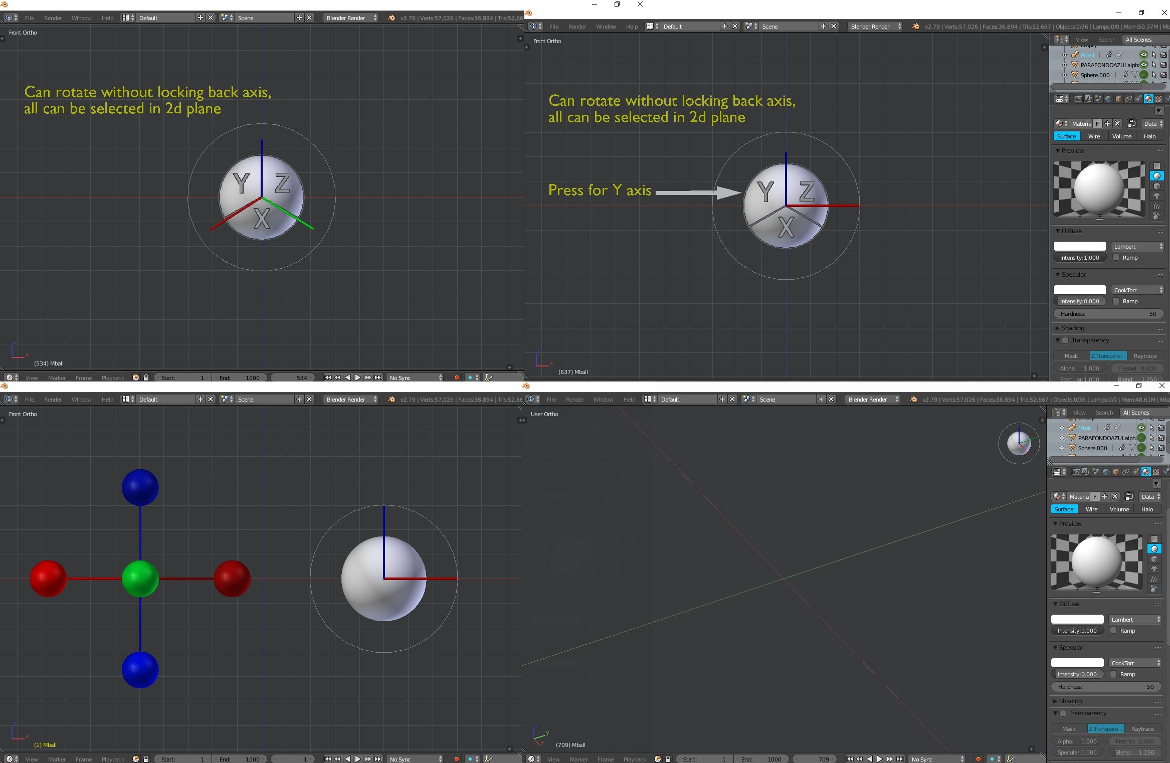
Prototype to fix view tool
I think the current tool is a good job but I see some deficiencies and I want to provide some ideas to solve it
I have not worked on the aspect because it is only a prototype, but need color or the letters x, y, z for axes.
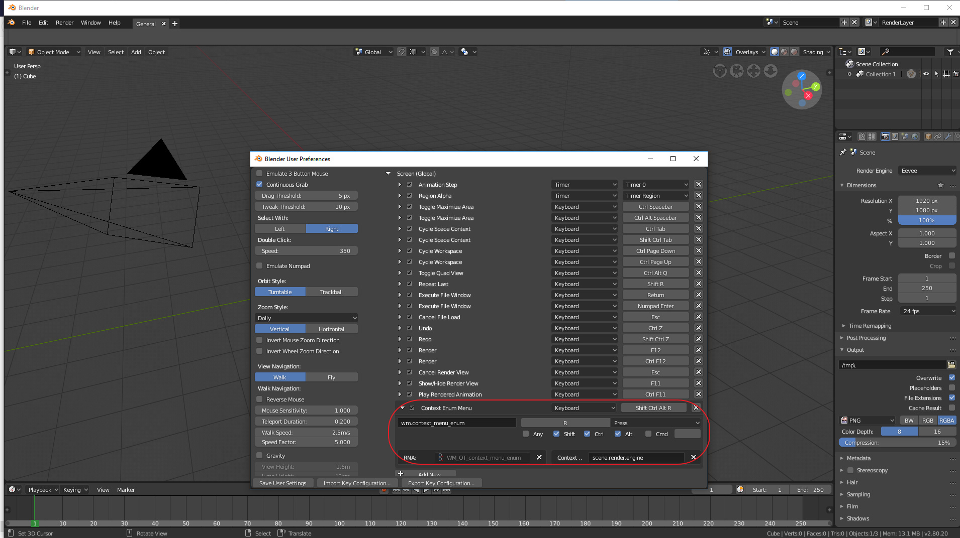
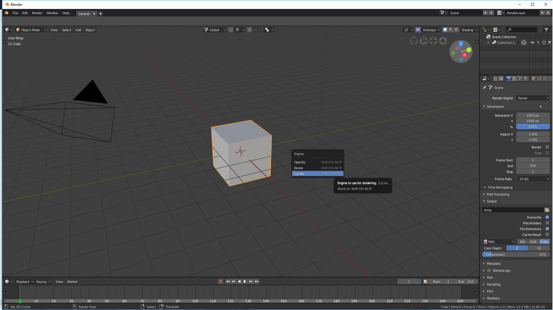
About the render engine switching accesibility, I know the discussion is about how blender should be by default, but just in case anyone finds it usefull, you can set your own shortcut to the render engine selector as a pop up, like so:
My thoughts about it:
Render Engines selector should always be accessible and not in Properties Editor. You for example could be looking to match as much as possible about how your scene looks in Eevee and Cycles, for example when you are in Material, Lamp or any other Properties editor tab. So as it is now, it is not so agile, you must continually return to Render tab to make the change. One could argue that being selected Cycles engine, LookDev with Scene Light and Scene World it looks like Eevee, but I think it is not a solution, you might also want to have LookDev without those features enabled. Also, when 3D View editor is narrow, Shading/modes options are the first to disappear in header.
About Hardware selector or Cycles Compute Device in User Preferences. I think that this should be an option within “Performance” item in Render Tab with an extra option to enable hybrid use of CPU+GPU, all this so that settings can be saved in the .blend file. From the current way in User Preferences, for example it will bring many headaches for those who do .blend files for GPU benchmarks. There will be many wrong results in benchmark with new users or distracted users who forget to uncheck the CPU box. .In fact, there have already been some confusions regarding this in Blender Artists forum.
With a similar argument you can justify any control in the topbar because you needs it in some workflow and you want to don’t make an extra click to move to properties area ¿Why not to put cycles samples in topbar? it is really something that happens a lot of times, moving this value for some reason… But render engine selection is something that you made few times each week (when normally you don’t make any change in months). I don’t remember any program with a option like that in the mainbar.
Also it’s a strange thing for new users.
1 Like
I’m not sure why you’re giving those examples. Cycles samples were never located in Blender 2.79 top bar (bar where Menus and Scene selector live). When Wazou said “The render engine must go in the top bar of Blender like on 2.79 IMO”, I understand that he was referring to bar above, “like on 2.79”. So he was asking for a feature to return to where it always was, and I was giving one more reason why it should go back there.
Yes, I remember it. Blender before 2.8 had it there.
All people here we know that blender2.79 have that option in the infoarea and it was a bad decision that confuse new users. The original option of render engine in the mainbar doesn’t have any sense and the reason that you told, make less clicks, is valid for any other control of the interface, controls that any user need to change in any session a lot of times, but not to select render engine. That rarely you need to change it inside same project.
1 Like
I think you should constantly see in the interface the engine that is being used, especially to know at a glance if in a tutorial they are using one engine or another.
5 Likes
All people? In the forums I have not seen many people complain about Render Engine selector located in that position in Blender before 2.8.
I think that you do not use Eevee very much at the moment, otherwise you would have realized that my proposal does not refer just to a problem of doing fewer clicks.
The location makes a lot of sense to me, Render engine is something global, and for every render engine many changes are generated in the interface, especially in options of Properties Editor tabs. So for me, it makes a lot of sense that something that generates such a big change in configurations in all Properties editor tabs, is not located in one of the Properties editor tabs. It is logical for me.
Even more so now that we have Eevee, that’s why my initial comment. Many people will want to verify from the beginning of the project that their work looks as similar as possible between Eevee and Cycles, which requires constant change between engines. Before I had written about possible solution with LookDev mode, but I also see there drawbacks.
But this is all I have to say, I’m not going to follow the game of people trying to distort what you write. Much less if those people are not Blender developers. So my concern/request is posed, I can be right or wrong, but that’s something that Blender developers will decide.
I think that you misunderstand my message.
Blender have a lot of “global” parameters, and we don’t see any of them in the mainbar.
I have used eevee a lot, also porting old cycles scenes to eevee, but i don’t see why it’s important to switch engines each few seconds. To check if both engines give same solution is a work for developers, not users.
Nice! do you have the patch for this? Only thing I’d add is the perhaps an empty label to the left of the Ridge/Valley text (where the checkbox would be), so they align with the rest.
Here it is: space_view3d.py - Google Drive 
As I said though this is quite a terrible way to do this, for I had never looked at the UI code before;
after some miserable failures using columns I tried to follow an old tutorial in the documentation and I used the split.split thing to separate the rows, so adding another empty label on the left for Ridge/Valley would be complicated with this method (I think the only way to align the text with the others would be to have an icon also for those properties).
I wasn’t able to find other panels throughout the UI with similar layout to take example from so I tried that way, but for sure there is a better solution for this.
Why the area split widget disappeared in 2.8? Now it’s difficult to split and join areas.
It’s actually easier in 2.8 because split/join can be done from all 4 corners now, whereas in 2.79 only certain corners would work. Only the visual indicators are gone for the moment.
2 Likes
the new rounded corners that enables to colapse and subdivide from any corner its a great update, but if aim its a problem right click between windows enables a popup to choose subdivide or collapse that option is still enable and testing it, it is posible to enable the operator so split window an split any window not only the one that originally right click on, nice little feature
I want to share this video about blender 2.8 feedback. I made a video in spanish but Pablo told it is long, so I go to redo the video impressions in short videos in english to share with community. It’s the first video about new viewport. I hope you like it.
8 Likes
really good video you bring up a lot of good points i hope one of the devs see this.
1 Like

That’s better than nothing, it’s important that something is there to warn you against clicking it. Window division was one thing that threw me off hard when learning Blender, it’s very easy to do it by accident and hard to recover from it without looking it up. Keep the huge arrow overlay on merge, of course.
Now here’s some of my own gripes with 2.8, in no particular order and based on latest:
-
If ctrl+alt+U is unused, why not keep user preferences on it?Something broke the first time I ran this. Disregard. - Spacebar search is one of the best things about Blender. Now the space bar is… “Baby’s first 3D application menu”, is what I’d call it. Big, big waste and fixing what isn’t broken. A hundred "yuck"s to that one.
- Main top menu is just a crippled Info window. Sorry, that’s how it is. I liked being able to turn it off and treat it as any other window. Now its functionality is spread across two different panels, only one optional. And now I can’t turn it off in the main window, or turn it on in a slave window. How does the current tabs thing even work with multiple windows?
Back in 2.7x each window had its own view, and that was it. Now it seems that you’ve added the slave window as a band-aid fix for the menu being duplicated in a “main” window, but that opens its own can of worms. (Which window does the slave “belong” to? What is its role in a workspace? How do I save its window layout?) I think this entire change was a fix for something that wasn’t broken; the Info window provided exactly the same functionality, and back in the day it took me some time to notice that it even was a window at all. Tabs are not an excuse here, you could’ve added tabs to Info as well. - Speaking of tabs, if you want to keep the tabs, consider for a moment that tabs tie the amount of workspaces available to a user to… the screen’s width. Anyway, if you really, really like the idea of tabs so much, then make them behave like tabs: let me reorder them manually instead of sorting them by name. Let me close and open them with the middle mouse button, a classic from tabbed web browsers that many of us are used to.
- Toolbar, oh the lamented toolbar. At the moment things are quite backwards; T-panel (where tool settings normally lived) acts as a toolbar while eating a disproportionate amount of space, meanwhile the horizontal toolbar acts as current tool settings, providing a laughably scant amount of space for it, which, just like the tabs, is woefully dependent on the screen width.
Do you like using several smaller displays instead of a big one? Well too bad, because Blender now officially hates your guts.
The T-panel’s space issue can be fixed by resizing it, which exposes the obvious blunder here; these happy, little user-friendly buttons could totally fit in the top toolbar, and it’s a much more fitting place for them. I’ll get back to this in a moment. - The stub for the new Redo could be even smaller. If I hide the Redo, that means I don’t need it at the moment, and I rarely do. Let me use my screen space as I please, and consider letting me hide it entirely with a hotkey. (which the old T-panel did, but I don’t miss the scrolling and folding. This would be the best of both worlds.)
- The ctrl+tab pie menu… actually, there’s nothing wrong with it, but I’d like some options here. 99 times out of 100 I want the weight paint mode anyway. Hopefully I can bring back the old behavior, and put the pie menu on some other key.
- Scrollbars are too subtle. Why hide them if there’s space reserved for them, and they’re always clickable? Don’t like the size either; you’re saving a few pixels but then all the new buttons and spacing in Properties negate that, by enforcing a minimum width, wasting all that space either way, especially with the new fancy menu layouts. In fact, the only property menus that use space wisely are the ones that haven’t been messed with. New ones just force you to do a whole lot more scrolling.
Blender has already undergone a UI overhaul once, and much of the old stuff had good reasons behind it. I see a lot of change for the sake of change. Slow down. Think about what’s actually broken before fixing it. We can always make a fork that cleans things up, but I’d rather not see it come to that.
And finally, my proposal for the tool-panel fiasco, which I bet is far from original. Return tool settings to the T-panel where they belong, and put the friendly little tool buttons in the top bar, where those belong. Finally, let me customize said top bar like Maya did (now there’s a legit use for a bar like that), and make sure I can kill it without crippling the application. (As it is, it’s almost as if you want to force me to keep it on.)
Next, stop horsing around with the menu/stats and put it back into Info, and add an option in prefs to turn the tab bar back into the old dropdown, where I could put dozens of views Workspaces™ without having to upgrade to a 4K screen. Finally, let me switch between those using Ctrl+arrows like before, as they seem to do nothing useful at all right now.
In short, find an actual use for the toolbar or axe it, and stop messing with the rest, it was never broken.
I’m pretty sure that changing the default navigation to alt+m1,m2,m3 and keeping hotkeys consistent would still do far more to retain new users than trying to imitate a certain someone’s pretty but poorly thought out mockup.
New video review about blender2.8 about the new column layout, the new problems that generate and how to solve it
6 Likes