I agree completely. I’ve brought up that point many times. I created a proposal on rightclickselect.com for this and brought it up in a live stream. I don’t understand why it was left as is. My thought is that if you reduce the height of the dope sheet, it only shows the selected objects keys. If you have the transport tools in the dope sheet and tweek the shortcut keys a little, then there is no difference in functionality, other than having to set it up manually to show only the selected tracks.
And what’s the difference?
All that needs to be done here is make it easier to select through the transparent faces and turn off antialiasing to make wireframe mode work like before. Am I right? I know that before it could be toggled pretty quickly with one key, so that would probably help, too.
To begin no current user in the industry will be able to find the wireframe without help. Something that was really simple like clicking in the icon…
1 Like
AA, dithering, hotkey, separate mode…
3 Likes
They definitely need to add more setting for wireframe and need to make it a seprate mode with the same level of customization as the other mode like the proposal i made at Wireframe mode mockup and suggestions its quite concerning that it was removed in the first place since it is such a basic feature that every program should have in the first place. Hopefully if it isnt added in 2.8 it will im 2.81
3 Likes
I have no idea what’s the sense of removing the wireframe mode too.
2 Likes
I think that initially taken from the emphasis of modernization with eevee and with the use of opengl 3.2 they thought it would be useful to modernize the methods of interaction and visualization … i remember that he will talk about it in a conference a few years ago … and on paper it seemed like a good idea not to use the wireframe in favor of transparency, but in practice it is proving inconvenient
1 Like
Why were Shift+S hotkey (Walk Navigation) removed?
2 Likes
We don’t want something just because it’s “modern” we want something that works
5 Likes
Turn of objects for render is kind of annoying right now. There is a semitransparant scrollbar covering 2/3 of the camera icon which makes it very difficult to turn objects of. Individually it works ok, but turning of many is a nightmare.
5 Likes
I believe it will be reinserted later in development …
same thing for single object display ("/" on numpad)
1 Like
Hm. I think, that the reason to “remove” wireframe it’s not in the removing, but in moving it from display mode to overlay, to make it appear not only in as single wireframe mode, but also on top of matcap and render mode:
And it’s cool feature to have ability to edit model in render mode. I think, it’s great solution.
But, in addition to this (this cool modes) I think we need to get back wireframe and box modes (nobody needs box mode?) as separate display mode. There is a lot of advantages of this mode, starting from selection issues to geometry checking, and it described below. Now we can make an analog of wireframe mode by tuning around 3-4 properties, but in 2.7 we can do it just by pressing one key. Of course, we can make a shortcut for this like an add-on, but it will be great if it will be in default.
2 Likes
This is one of the reasons I don’t like the new hiding scrollbars and would like to have at least an option in the preferences to turn on the proper classic wide scrollbars that are always visible.
I don’t understand one thing - 2.8 got the new vertical toolbar with the huge buttons that waste a lot of space and at the same time it also got these tiny hiding scrollbars that try to save every pixel of space but at the expense of usability and ergonomics.
1 Like
Hm. Try click on one icon and drag over all icons. It’s very quick, and you can move cursor over the scrollbar. And it also helpful in 2.7x
I also added to the suggestion that Blender should also unify NLA + Timeline/Dopesheet, so that we could have something more of an “Animation Layers” style of editing. Where I can, for example create a walk cycle, then create a secondary hand motion action separately and add both actions together and see both actions on the same space that I can also move the keyframes around (which is timeline/dopesheet).
Nowadays to add two actions together we MUST use NLA, which not only is a separate inconvenient space, we cannot edit keyframe positions on the NLA editor, so we have to go back and forth between two editors.
Also when you want for example to export these two interconected actions (walk+hands cycles) to a game engine, Unity for instance, the FBX export doesn’t support the NLA workflow, so I’m FORCED to bake a separate action, which is a destructive workflow, since after baking I lose the ability to edit them separately on the baked action. Forcing me to edit on the separate actions then RE-baking again, then Re-exporting, etc.
I believe Maya and other softwares have a proper supported Animation Layers workflow, where I can add multiple layers of actions on top of each other on the same editor and edit them and export them without baking.
I agree that being able to use a wireframe as a overlay can be usful but for most situations its not very practical hopefully the devs add a sperate wireframe mode along with the overlay option
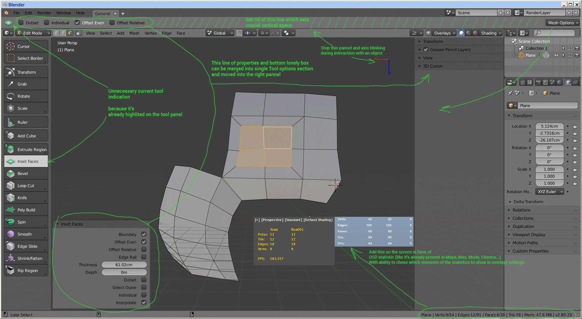
I wish it was possible to get rid of that nasty white info bar, it’s so annoying to tweak the model with constantly blinking lines on top and bottom of the screen. Here how it looks:
it makes my eyes bleed.
I wonder why not to make this info in form of an onscreen Hud
Some example how it can be arranged and shown on the screen:
argghhh only one picture for new users!!!1111
4 Likes
- " The answer is silence " status alert!! You not the first who don’t like NEW interface and try to propose something more usable. But no one care!!! AHAHAHA…


- ONLY ONE PICTURE for newpeasants !!! AHAHAHA… Who came up with this stupid rule
I know) but at least i tried, after all we have 2.79 which is more or less usable.