Hello Blender Development Team, and thank you for your effort trying to build Blender into unique way as professional tool which corresponding to all important and necessary standards to the CGI industry.
You did a lot, and we can’t wait to see finally the latest result with 2.80, which will be the Top of the top i think!
However, because I’m professionally involved into UI/UX and 3D building cockpit electronics for automotive industry, I would like to give you my feedback for the latest version build of 2.8
To be more straight I will upload some images to compare both 2.79 and 2.8 and what I think is positive and negative into the current way of development.
Please, look my comments bellow.
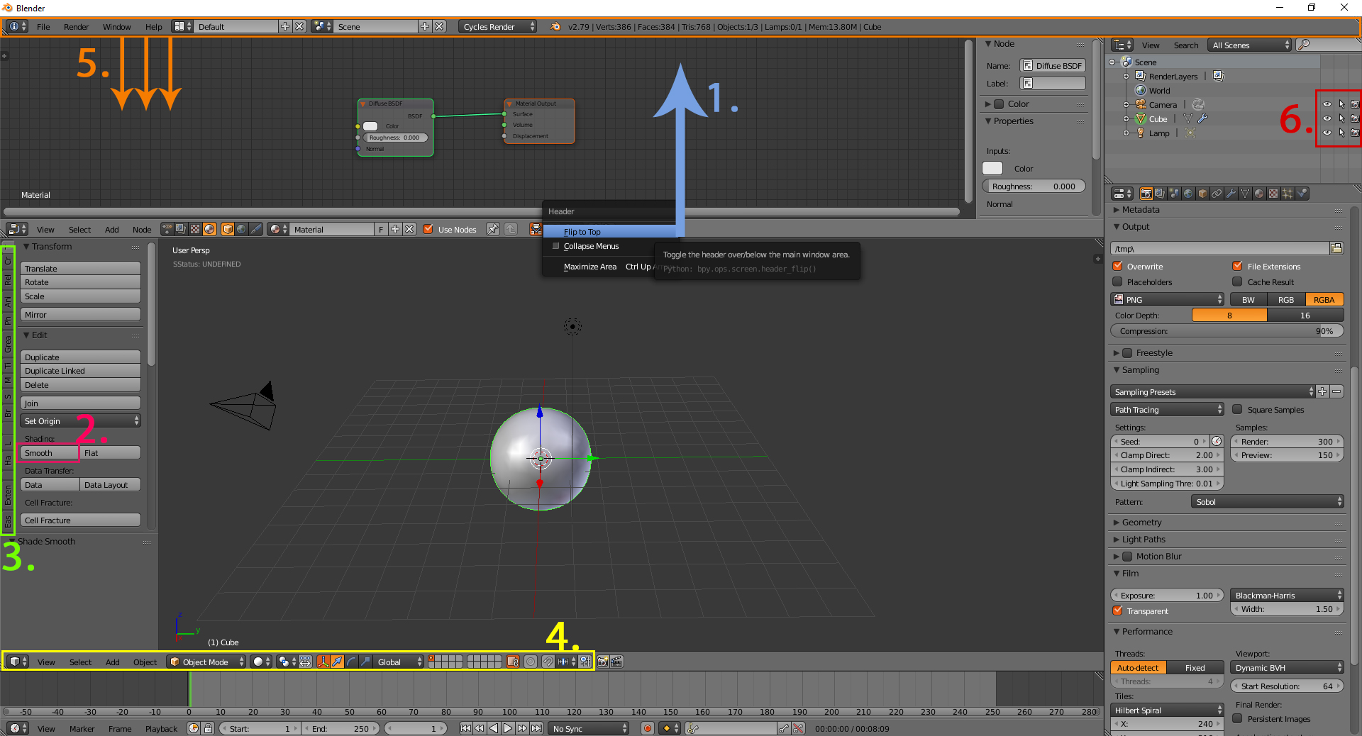
Here in this image I’ve marked what I miss into the new version of Blender and what is negative for the UX from my perspective. The numbers are corresponding to the comments and feedback.
1, Currently, the new build is able to switch the main menu line to top and bottom, by right click option. However by default the menu line is straight top, and into the next picture will show you why this is negative in using it as default in that way, but not like before.
-
Now for the current workflow we have the nice left panel including the icons for move, rotate, scale etc. I clearly understand that in this preview for 2.79 and before there were placed add-on settings, anyway for the initial workflow of the user, he/she can easily find the plugin and operation to use by looking on the specific menu. Now there is no such think, also I can’t believe users will use and press those icons instead of the unique short keys - for G-grab, R-rotate, S-scale. My question is, where i can find all those add-on properties now? Simple example also, is smooth geometry button. Currently, they not exist or they are difficult to be founded…
Please, confirm the post so I can continue upload the next images. -
I really believe the add-on vertical menu bar is super original and useful from the user professional point of view. I think this should be saved for 2.8, for any practical use to the workflow.
-
One of the best thing in Blender is the super flexible customization and the switchable behavior for the UI.
The header bar -4- now 2.8 is separated top left and right, and I really don’t like the idea of clicking first up-left to change the shading mode, then up-right to change any pivot point property for the orientation; smoothing selections or any other option for that menu. I’ve tried but it makes me super slow…
I really don’t like the current situation with that menu there. Suggestion is to keep it back in raw on the header menu like before, it’s 100t better for the UX . -
About -5- the system - printing the processes behind this menu after dragging it down.We can see any operation blender is doing in a form of code event list.
This was really nice and cute - UI-secret-space for running the backlog and watching the dynamics in the code side. Currently, the new version is not containing such thing, or at least I can’t see it, and it looks more user straight and flat from this -developer perspective - If it’s up to me as a designer - I would keep it for 2.8 if there is an option for it. -
The missing options for hiding, locking and rendering in 2.80, were quite useful in 2.79 for the way they worked. Now, 2.80 I have go trough the Outliner and filtering menu to click and make it happen, now I’m using 2ts more clicking to make the same operation like before. By the way - everything should be separated in collections, from UX perspective it will make the user to think and relate everything to ID-group from the really beginning, which is good but, compare to the previous concept with the grouping, it not a huge benefit now, or may be I’m not familiar enough to it.