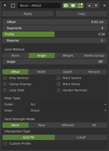
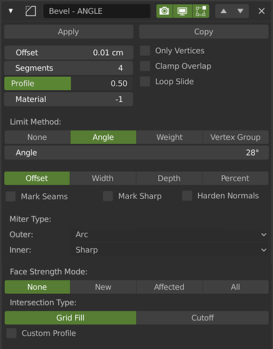
Bevel Improvements

This may be a topic for a larger thread, but I’m curious: Here we have two Blender developers working on the same feature, and one seemingly doesn’t know what users use the most, while the other does?

Is this a breakdown in communication or what is the background here?

Resorting controls

I am not against resorting it in general. But as @HooglyBoogly I prefer logical groups over how often something is used.
Just a thought on that. Blender could instead support userdefinable colormarks (like a thin colored outline) for ui elements in blender, so users who would like have more focus on some specific controls inside panels could mark it via a context menu entry “Mark Important”.

1 Like

Hans and I work together on Bevel. Sometimes we discuss in private messages, sometimes we discuss here. How is that a communication breakdown? The two things you quote are not in conflict with each other.

2 Likes

Just a clarification: I did not remove the Percent and Width options. I would never do that. They were just appearing in a wrong place, that’s all.

If they are still available I read your patch description wrong. Sorry for that.

It’s not how you discuss things that I was pointing out, but what. You did not seem to have information on what users use the most, while your coworker implied that he had that information.

I have not seen any details regarding what Blender features users use the most in publicly available information yet (but perhaps I just haven’t found it), so I was simply curious about that.

First of all, from all your posts on this website, I have never seen one that wasn’t either angry or inflammatory…
And again, in this case you are inventing conflict out of nothing.
In here, one person is talking about the most used options, which is easy to estimate, based on a small sample. You can look at some tutorials, some presentations, or at people working around you, and easily gather which options are used the most.
You cannot figure out all information this way. There are hundreds of different workflows in blender, each using the tools slightly differently. There is no tracking in blender to give such a detailed information. You can’t guess how the changes you make will affect all those workflows. It is not the case of devs having different information, but this information being sufficient for one thing but not the other.

Only the outliner makes me angry. :wink:

I’m not inventing anything, but trying to find out exactly what data Blender developers have when it comes to UI design decisions. Surely it must be centralized somewhat and not up to each individual developer?

Or is that one of the new standards and practices that Ton Roosendaal mentioned he wants to implement, now that Blender has had a huge influx of money?

I’m just looking for answers, because the UI design communication from Blender is so very, very quiet.

1 Like

Yes, I’m also interested in where the developers get their feedback from. Is it feedback from professional users, professional modelers, studios who are involved in complex modeling, rather than modeling simple things?
Do not take it as a mockery, trolling or disrespect, it is a discussion. It may look a little rude, but it’s true as it is. These questions sound as they are formulated by users in their heads.

I would like to share what principles I was guided by when creating the mockups of the bevel modifier.
Look here. Things like Offset Type, Only vertex, loop slyde, harder normals, miter type…how often will you click them when interacting with the modifier? These things are selected once or several times when the conceived method is not working, that’s all.
And things like bevel size, segments, profile (may be) you will be tweeking very often. Even when you decide that you are finished, you will make another object and decide the bevel on the previous object is small or large, and you will change it so that it looks better surrounded by new objects. You change the size, then you decide that there are too few segments for this size, add segments, maybe change the profile if the angle is sharp and the bevel looks elongated. And it is possible that you will come back to them very often. But they are scattered across the interface, you need to search them every time. In addition, each time you will need to read and weed out those buttons that you most likely will not use, and constantly stumble over them.

The decision to push the button somewhere, because now it will not need a title … this is a very weak excuse if this button just interferes.
Rarely used pieces can be shuffled as you like (of course not, but yes at this stage), but often used pieces should be assembled with a convenient design.

Of course, there can be a huge number of cases when a button becomes frequently used. But I proceeded from the principles of the STANDARD, consistent creation of a bevel, in the most ORDINARY case, which, as it seems to me, happens more often than rare and specific ways to create a bevel.

and again i say “often used / rarely used”, of course this is subjective. But I tried to simulate the most standard and simple, and effective!! way to create a bevel.

1 Like

Both of us are volunteers. We’re not being payed to “maintain consistent communication with the community” or something. And anyway I’d agree with Howard that there was no inconsistency there. Besides, there’s no real data on any of this. I’d appreciate it if you kept the discussion focused on bevel.

In order to keep the UI relatively more simple, one of the goals post 2.8 is to not put too many controls on one line. Even the offset drop-down I proposed is a bit more complex than most other UI. Also, personally I’m not sure that making the modifier panel shorter at the cost of readability is worth it.

2 Likes

Perhaps this makes ui simpler. But this makes the interface more fat, and navigation on it becomes not simple.

I suspected that compiling four drop-down lists in a row might not be the best solution.
Then they can be marked in two rows and two columns:
No Limit______No Strength
Offset________Grid Fill

This is unbelievable, and the work that you both do is worth paying :slight_smile:

1 Like

Sure, I didn’t realize you were volunteers, with all the money flowing into the Blender development fund recently. :wink: So the standards and practices will then hopefully also apply to volunteers in the future, and hopefully there will be a centralized process to handle UI design decisions as well, which I also really hope will be public so we can read about it.

1 Like

Im using booleans and bevels a lot, during blockouting, finding shapes while working on my assets, but I miss one feature. I was thinking if there is any possibility for “infinity” bevel/chamfer? I made a small video just to show an idea:

https://drive.google.com/file/d/11b3n9Og_BPMByN7IfUYDyZd8alGNYrAY/view

8 Likes

could we get some weld / remove doubles with bevel when clamp is on?
wevh3wOEaX

I love how the edit mode behavior now looks like the modifier itself but now that weld is a thing we’re able to use weld with clamp off to allow for quick bevelling to limits without issue but it relies on following all clamped bevel mods with weld.

3 Likes

My goal is not to make the menu shorter. The main task is to place all the most frequently used and tweakable buttons together and at the top.
Yes, it is possible that in some places the readability has decreased, but due to better sorting and ordering, navigation through the modifier has become easier. In this concept (5), all buttons are located exactly in that position with the workflow that I personally use and by many other users. Of course, this can still be changed and improved.
Additional labels disappeared, but instead you can come up with names shorter and better describing the purpose of the buttons (just my English is very bad and I could not come up with good names). In addition, Extra annotations do not always provide a clear understanding of the purpose of the buttons. You will have to read tooltips and instructions, and try in practice what all these names mean.

4 Likes

I face the same problems with bevel - I even changed the UI theme just to try to make the important parts more visible. But it barely helps.
It’s very bad UX if I have to search for the most basic parameters of a modifier.

That said, I seriously love your 5th proposal.
I might add back the limit method as a toggle button row but that’s it.
It should happen.

Visually and functionally speaking, I like any mock-up that does not sandwich those 6 check boxes between other UI elements especially long sliders. With my preference being to place those check boxes at the very bottom (mock-up 4 or 5).

The current Bevel UI is the absolute worst right now; aesthetically unpleasing to look at, cumbersome to use, and placing options which aren’t used very often (seams, loop slide, sharps) above something very fundamental (number of segments).

2 Likes

You both should have spoken up when we were working out the UI updates in the summer of code thread…

And sorry but we’re not going to put 2 or 4 dropdowns on the same row without any labels. Maybe it works for people familiar with the tool, but please recognize you’re not the average user.

The feedback of the most important options is useful though.

1 Like

We can’t be everywhere and I participated a lot in the summer of code.

This is my proposal, nothing fancy, but way better IMO.
The most used settings are first.


Or this one, I prefer.

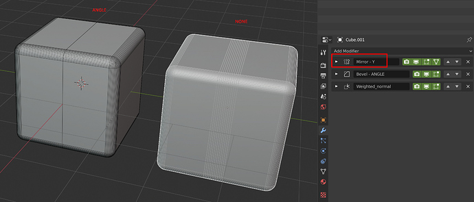
Also, why put None as default for the Limit method, it should be angle since it’s way more used, in fact, I never used None.

An example, we use a lot the Mirror modifier, but with None, we have a bad result.

8 Likes

hah great culmination of the thoughts above, Wazou. I’d like that!

And @HooglyBoogly, how could we all be there in the exact moment when coders (kind of) accept feedback? Why can’t we have feedback now?
This topic is just another example of a critical mass accumulating when we realize that many other people have problems with the same features. We amplify each others voice and that’s a good thing.

1 Like